Introduction
A Lounge Room Without Wall Pictures can feel incomplete, even when the sofa is expensive, the rug is layered beautifully, and the lighting looks carefully planned. The walls are not empty by accident; they are part of the room’s visual language. They carry tone, balance, rhythm, and personality. In interior design terms, wall art is not only decoration. It is a meaning-making element that helps the room communicate mood, identity, and structure.
That is why. matter so much. The right artwork can make a room feel serene, polished, welcoming, dramatic, or contemporary. The wrong artwork can make the same space feel awkward, crowded, underdeveloped, or visually disconnected. In other words, wall pictures are not just “something to hang.” They are a design decision that influences the whole room’s perceived quality.
Most people don’t struggle because of bad taste—they struggle because they don’t follow a clear system. They choose artwork that looks good on its own but ignore scale, proportion, spacing, and placement. As a result, art can look too small on a large wall or too high above a sofa, making the whole room feel unbalanced or disconnected.
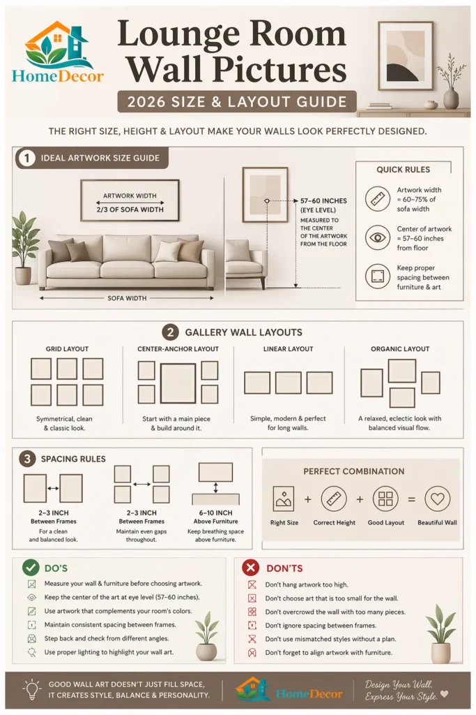
Professionals use simple, proven guidelines to avoid this. For example, artwork is usually hung at eye level (around 57–60 inches from the floor), and pieces above a sofa are often sized to about two-thirds of the sofa’s width. These rules help create a sense of balance and visual harmony.
This guide gives you a practical, easy-to-follow system for choosing, sizing, and placing lounge room wall pictures so your space feels modern, polished, and well-designed.
Why Lounge Room Wall Pictures Matter
Lounge room wall pictures do much more than fill a blank wall.
They can create a focal point, define the atmosphere, connect furniture to architecture, and give the space a sense of completion. A thoughtfully chosen artwork can make the room feel more grounded and emotionally coherent. It can also subtly direct the eye, leading attention toward the sofa, fireplace, feature wall, or conversation area.
A lounge room usually contains large furniture pieces, but the walls are what shape the overall composition. Without the right wall art, the room can feel like a group of separate objects. With the right wall art, it feels like one cohesive design story.
Think of wall pictures as the finishing sentence in a paragraph. The furniture may already state the main idea, but the wall art completes the thought. It gives the room closure, clarity, and emotional punctuation.
How to Choose the Right Wall Pictures
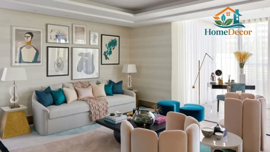
Start with the focal point.
First, every lounge room needs one primary place for the eye to land. This visual anchor, therefore, should be the first thing people notice when they enter the room. Without it, the space can feel scattered or indecisive.
In most cases, the strongest focal points are found:
- above the sofa
- above a fireplace
- on a feature wall
- near the TV wall, especially when the television is part of the main composition
However, do not let every wall compete for attention. When multiple areas try to become the star, the room loses clarity. Instead, choose one dominant wall first, and then let the rest of the room support that visual hierarchy.
Match the mood, not only the color.
A common mistake is choosing art by color alone. Color matters, but mood matters more. Good interior styling is not just about matching paint and frames. It is about emotional coherence.
A calm room usually pairs well with nature prints, muted landscapes, water scenes, soft abstract work, or gentle line art.
A bold room may suit strong contrast, graphic shapes, oversized abstract pieces, or high-impact photography.
A warm room often benefits from earthy tones, organic textures, and imagery that feels soft and inviting.
An elegant room can work beautifully with monochrome art, classic sketches, refined photography, or minimal compositions.
Here is a useful way to think about it:
| Mood you want | Best lounge room wall pictures |
| Calm and relaxing | Nature prints, soft landscapes, water scenes |
| Bold and modern | Abstract art, strong geometry, contrast pieces |
| Cozy and warm | Earth tones, photography, textured prints |
| Elegant and timeless | Black and white art, framed sketches, classic paintings |
| Light and airy | Minimal line art, soft neutrals, simple landscapes |
If the room feels peaceful, the art should feel peaceful too. If the room has energy, the art should carry that same energy. The best wall pictures do not just look attractive; they reinforce the room’s emotional tone.
Use the proportional rule.
One of the most reliable sizing principles in wall styling is proportion. A common guideline is that the wall art above a sofa should span roughly 60% to 75% of the sofa’s width. This proportion helps the composition feel related rather than detached.
This matters because scale changes perception.
Too small, and the art looks lost, underpowered, or low-budget.
Too large, and the wall can feel compressed or overworked.
Just right, and the room feels structured, polished, and settled.
This proportional logic works because the eye naturally compares objects to one another. When wall art respects the scale of the sofa or console beneath it, the room feels designed rather than improvised.
Balance visual weight
Two pieces may have the same dimensions yet feel completely different in a room. That is because visual weight is not only about size. It is also about contrast, color depth, frame thickness, density, and texture.
For example:
A dark abstract canvas feels heavier than a pale sketch.
A frame with a thick black border feels stronger than a thin white frame.
A highly detailed image feels busier than a simple composition.
A gallery wall with many pieces creates more activity than one calm oversized print.
This is why wall styling is not only arithmetic. It is visual psychology. Good room design balances the room’s energy, not just the measurements.
Perfect Wall Art Size & Placement Guide
This is the part where many people make avoidable mistakes. They choose beautiful art, then place it too high, too low, too narrow, or too far away from the furniture.
Ideal height rule
A reliable rule for lounge room wall pictures is to place the center of the artwork around eye level. In many homes, that means approximately 57 to 60 inches from the floor to the center of the piece. This placement helps the art feel comfortable to view and keeps it visually connected to the room.
Eye-level placement works because it reflects natural sight lines. When the artwork is too high, it starts to feel like it belongs to the architecture rather than the room. When it is too low, it can feel squashed or accidental. Eye-level hanging creates balance.
Above sofa placement
When art is going above a sofa, the goal is to connect the art to the furniture below it without letting the pieces collide.
A practical approach is:
Leave a gap of around 15 to 20 cm between the sofa and the bottom of the artwork.
Keep the picture or grouping centered over the sofa.
Make sure the width of the art feels proportionate to the furniture.
Avoid hanging it so high that it floats above the conversation zone.
Better Homes & Gardens recommends artwork above a sofa in a size relationship that is often around two-thirds of the sofa width, and that is an excellent baseline for most lounge rooms. It creates a controlled, elegant relationship between the furniture and the wall.
Spacing between frames
Spacing is one of the hidden details that separates a polished wall from a chaotic one. In multi-piece layouts, every gap matters. If the distance between frames shifts too much, the whole arrangement can look unplanned.
Useful spacing ranges include:
Gallery wall: 5–10 cm
Grid layout: 3–5 cm
Mixed layout: 6–8 cm
Small paired frames: 4–6 cm
The exact number is less important than consistency. Repeated spacing makes the layout feel intentional and well-edited. In visual terms, consistency is a signal of order.
Best Lounge Room Wall Picture Ideas for 2026
Here are twelve strong directions for lounge room wall pictures that feel current, adaptable, and easy to style in real homes.
Oversized statement art
One large piece can have more impact than a dozen smaller pieces. Oversized artwork creates instant focus and gives the room a confident, high-design look.
Best for:
Above a sofa
Large empty feature walls
Rooms that need one strong anchor
Example: a large abstract canvas above a neutral beige or cream sofa.
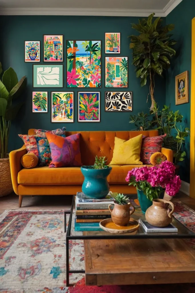
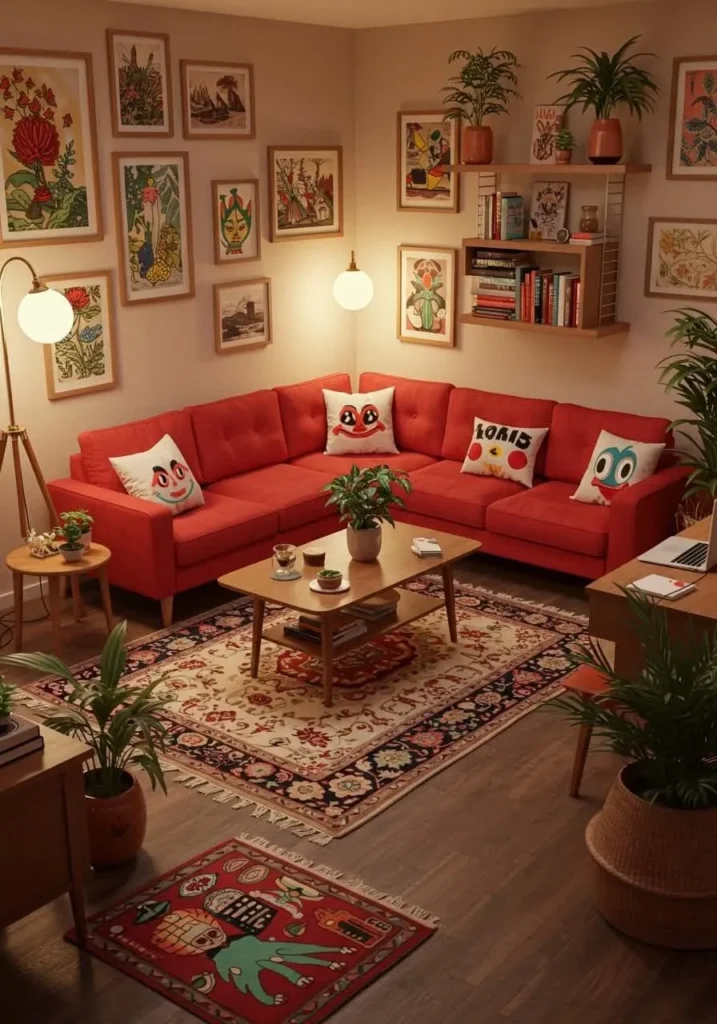
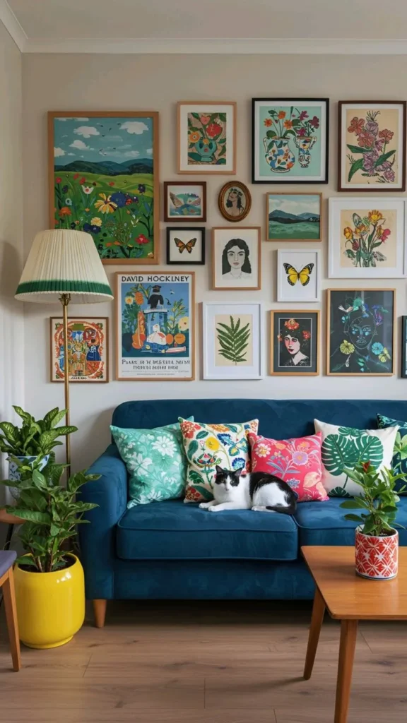
Gallery wall
A gallery wall remains one of the most flexible and popular ways to style a lounge room. It allows you to combine prints, photographs, drawings, and meaningful pieces in one composition.
Best for:
Family lounges
Creative interiors
Walls that need warmth and variety
Example: a mixed-frame gallery wall with one anchor piece placed near the center.
Symmetrical grid layout
A grid layout creates a neat, architectural feel. It is highly controlled, visually calm, and ideal when you want the wall to look elevated and formal.
Best for:
Formal lounge rooms
Matching frame sets
Large open walls
Example: six matching frames arranged in two rows of three.
Black and white photography wall
Black and white art never loses relevance because it is timeless and adaptable. It also works across many color palettes, from soft neutrals to dark contemporary interiors.
Best for:
Modern rooms
Monochrome schemes
Calm, elegant spaces
Example: framed black and white city photography above a low-profile sofa.
Abstract modern art
Abstract art adds energy without requiring literal subject matter. It can carry emotion through line, color, scale, and gesture rather than narrative.
Best for:
Neutral rooms
Modern interiors
Bold or creative spaces
Example: a cream, blue, and gold abstract painting that ties into the room’s accent tones.
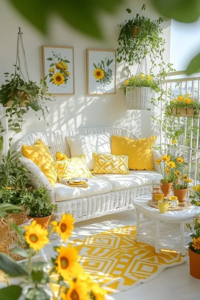
Nature and landscape prints
Nature-inspired art introduces softness and calm. It can make the room feel more open, restorative, and grounded.
Best for:
Cozy lounges
Family spaces
Rooms that need serenity
Example: a misty forest print, a coastal horizon, or a quiet mountain scene.
Minimal line art
Minimal line art remains very relevant because it is simple, flexible, and easy to integrate into modern homes. It is especially effective when you want the wall to feel light and uncluttered.
Best for:
Scandinavian interiors
Minimal homes
Compact lounges
Example: three minimalist face-line drawings in thin black frames.
Mixed media wall
A mixed media wall combines different forms of wall decor to create layered visual interest. It may include art prints, mirrors, shelves, woven objects, and framed photographs.
Best for:
Boho interiors
Eclectic spaces
Feature walls
Example: one large print, two mirrors, and a small floating shelf styled together.
Picture ledges
Picture ledges are ideal for people who like to change their decor often. They let you lean and swap pieces without committing every artwork to a nail hole.
Best for:
Renters
Casual modern interiors
Seasonal styling
Example: three framed prints leaned on a narrow ledge with a vase and a small sculptural object.
Personal photo wall
Personal photos make a lounge room feel intimate and emotionally rich. They turn the wall into a story rather than just a surface.
Best for:
Family lounges
Travel-themed rooms
Personal living spaces
Example: a black-and-white family photo wall in matching frames.
Corner gallery layout
Corners are often overlooked, but they can be very effective when styled with intention. A corner gallery can make an awkward transition feel purposeful.
Best for:
Narrow walls
Open-plan lounges
Rooms with unusual layouts
Example: a corner arrangement that rises lightly on both sides of the wall junction.
Single centerpiece above the sofa
Sometimes one piece is the strongest answer. A single artwork can deliver clarity, calm, and confidence without competing with the rest of the room.
Best for:
Small lounge rooms
Minimal homes
Rooms that need visual breathing room
Example: one bold framed canvas centered above the sofa.
Gallery Wall Layouts That Always Look Expensive
A Gallery Wall can appear polished and luxurious, or it can look messy and rushed. The difference comes down to layout discipline.
Structured grid
A structured grid works best when symmetry and calm are the goal. It is excellent when the frames are the same size, and you want the result to feel elegant and deliberate.
Use it when:
Your frames match.
Your room feels formal.
You want a composed, high-end look.
Organic gallery wall
An organic gallery wall feels softer and more editorial. It allows different sizes and shapes, but still needs a clear structure underneath.
Use it when:
Your pieces vary in size.
You want a relaxed but curated effect.
You like a collected, artful mood.
Linear row
A linear row is simple, neat, and visually restful. It works beautifully above long furniture and in narrow spaces.
Use it when:
You want a minimal aesthetic.
The wall is long and horizontal.
The sofa is low and wide.
Center-anchor layout
A center-anchor layout begins with one primary piece and builds outward. It is a practical way to introduce balance while keeping one item dominant.
Use it when:
You have one favorite artwork.
You want one image to lead the eye.
You want symmetry without strict uniformity.
A gallery wall looks expensive when it feels edited. It should look like a deliberate composition, not a random collection. Planning, spacing, and focal hierarchy are the key variables.
How to Match Wall Pictures With Interior Style
The most successful lounge room wall pictures do not fight the room’s style. They extend it.
| Interior style | Best wall pictures |
| Modern | Abstract prints, bold black frames |
| Minimalist | One large artwork, simple line art |
| Boho | Warm tones, woven textures, mixed media |
| Classic | Framed paintings, portraits, and elegant photography |
| Scandinavian | Neutral art, soft shapes, line drawings |
| Luxury | Oversized art, symmetrical sets, dark frames |
Modern style
Modern rooms work well with strong geometry, confident color blocks, and clean framing. The art should feel decisive rather than overly decorative.
Minimalist style
Minimalist styling uses fewer pieces, but each piece should have more visual authority. One larger artwork often works better than several small ones.
Boho style
Boho interiors thrive on warmth, texture, and relaxed combinations. Mixed materials and softer framing often feel more natural here.
Classic style
Classic rooms benefit from symmetry, elegant framing, and timeless imagery. The goal is to create poise and refinement.
Scandinavian style
Scandinavian decor often uses light tones, natural softness, and clear simplicity. The art should feel calm and breathable.
Room Layout & Space Planning Tips
Different room sizes call for different wall art strategies. A one-size-fits-all approach rarely works.
Small lounge rooms
Small rooms need visual breathing space. Too many pieces can make the room feel compressed. In compact rooms, a single strong artwork or a small, carefully controlled layout often works best.
Best approach:
Use one large piece rather than many tiny ones.
Keep the color palette restrained.
Avoid overcrowded compositions.
Use light tones if the room already feels busy.
This works because simplicity helps the room feel larger and calmer.
Large lounge rooms
Large rooms need presence. A small picture on a big wall will disappear and make the room feel underplanned. Bigger walls generally need larger art, wider groupings, or more expansive layouts.
Best approach:
Use larger frames.
Build gallery walls with intention.
Choose layouts with horizontal spread.
Allow the composition to occupy enough space.
TV wall strategy
A TV wall needs balance more than decoration. The art should support the screen, not compete with it.
Best approach:
Keep the styling minimal.
Use small side pieces only when needed.
Avoid heavy visual noise around the screen.
Let the television remain the functional focal point.
Fireplace wall strategy
A fireplace wall already has architectural importance. The art should reinforce that importance, not overwhelm it.
Best approach:
Use artwork above the mantle.
Keep proportions balanced.
Avoid stacking too many competing elements.
Long blank wall strategy
A long wall gives you room to create rhythm. This type of wall often benefits from spread and horizontal movement.
Best approach:
Use a triptych.
Choose a wide gallery wall.
Try a horizontal row of prints.
Select larger framed pieces with strong alignment.
Color, Lighting & Furniture Coordination
Color matching tips
Do not match every color Exactly. Exact matching often looks flat and over-controlled. Instead, use color relationships that feel intentional but not repetitive.
Better strategies include:
Matching undertones rather than copying identical shades.
Repeating one or two room colors inside the artwork.
Using contrast to bring the art forward.
Using a neutral frame to connect different colors.
This approach makes the room feel layered and more sophisticated.
Lighting tips
Lighting changes how wall pictures feel after dark. A piece that looks good in daylight can look muted or flat in a dim room without the right illumination.
Helpful lighting options include:
Wall lights
Picture lights
LED accents
Nearby floor or table lamps that wash the wall gently
Lighting can add richness, depth, and a sense of luxury, especially when the room is used in the evening.
Furniture coordination
Wall pictures should relate to the furniture in both scale and tone. A room looks more resolved when the art and furniture feel like part of the same visual system.
Simple guide:
Wide sofa = wider artwork
Low sofa = lower visual placement feel
Tall furniture = stronger vertical art
Small furniture = smaller or simpler art
A room feels cohesive when the furniture and the wall art share the same design language.
Budget-Friendly Wall Picture Ideas
A beautiful lounge room does not require an enormous art budget. Many of the most stylish walls are created through smart selection, not expensive purchases.
Printable digital art
Digital downloads are a flexible, affordable way to get large-scale art without premium pricing. You can choose your own frame and print size, which gives you more control over the final result.
DIY photo prints
Personal photos can look extremely polished when printed well and framed in a clean format. Black and white conversions often give even casual photographs a more editorial feel.
Affordable frame sets
Matching frames instantly improves the look of inexpensive prints. A unified frame color can make a modest wall look refined.
Thrift store artwork
Second-hand art can be surprisingly strong if you reframe it or restyle it. The value is often in the composition, not the original price tag.
Wall decals and alternatives
For casual spaces or temporary arrangements, decals and removable decor can work surprisingly well. They are especially useful when you want to change without commitment.
The real goal is not to spend the most. The goal is to make the wall look intentional.
Luxury & Premium Wall Decor Ideas
If you want a more premium or high-end result, focus on scale, finish, and restraint.
Custom artwork
Custom pieces bring a personal signature to the space. They can echo the room’s palette while still feeling one of a kind.
Hand-painted canvases
A hand-painted canvas adds texture, depth, and human craftsmanship. It often feels richer than a flat printed image.
Large-scale installations
Big installations create immediate impact. They can transform a room into a more design-forward space with a single move.
Textured or 3D wall art
Raised textures, sculptural surfaces, and dimensional wall work introduce shadow and material interest. They often make the room feel more expensive.
Framed fine art prints
A quality fine art print in a well-made frame can look exceptionally polished. Often, the frame and paper quality matter as much as the image itself.
Luxury design usually depends on restraint. One strong piece often feels better than multiple competing pieces. When the room is edited carefully, the result feels more confident.
Common Mistakes to Avoid
Many lounge room wall problems come from a small number of recurring mistakes.
Hanging art too high
This is one of the most common errors. When art floats too far above the sofa, it loses its Connection to the furniture, and the room begins to feel disjointed.
Choosing art that is too small
Tiny pieces on a large wall often make the room feel unfinished. The scale can seem hesitant or accidental.
Ignoring spacing
Random spacing creates visual noise. Even beautiful pieces can look messy if the gaps are inconsistent.
Overcrowding the wall
Too many pieces can remove calm and make the room feel restless. Negative space is not wasted space; it is part of the composition.
No clear focal point
Without a focal point, the eye does not know where to settle. The room then feels visually weak.
Mismatched frames without a plan
Mixing frames can work very well, but only when there is a guiding concept. Random variation looks unresolved.
Forgetting the room style
Wall art should support the interior, not fight it. If the art belongs to another visual language, the room can feel confused.
Maintenance & Care Tips
Good wall pictures should stay attractive over time, not just on the first day they are hung.
Dust frames regularly.
Keep artwork away from direct sunlight when possible.
Use proper hooks and wall fixings.
Clean glass with a soft microfiber cloth.
Check that frames stay level after hanging.
If you invest time in placement and styling, basic care protects that effort. Maintenance preserves the finish and keeps the room looking composed.
Smart & Future-Ready Ideas for 2026
Interior styling is becoming more personal, more adaptive, and more responsive to lifestyle. A modern room does not need to follow trends blindly, but it can still benefit from flexible ideas.
Digital art frames
Digital frames allow you to switch artwork whenever you like, which is useful if you enjoy seasonal or mood-based styling.
Smart rotating displays
Rotating displays are great for people who want change without redoing the whole wall.
Motion-inspired artwork
Art with Movement, flow, or dynamic shapes can make the room feel lively and modern.
Interactive wall panels
These can bring a futuristic edge into the space, especially in contemporary interiors.
Rotating seasonal gallery walls
Changing a few pieces at different times of the year keeps the room feeling fresh without requiring a full redesign.
These ideas are exciting, but timelessness still matters. A clean, well-proportioned wall outlasts almost every trend cycle.
Pros & Cons of Lounge Room Wall Pictures
| Pros | Cons |
| Makes the room feel finished | Can look cluttered if overdone |
| Adds personality | Needs planning |
| Improves balance | Premium pieces can be costly |
| Creates a focal point | Poor sizing looks awkward |
| Works in any style | Must be maintained |
Quick Pro Tips
Measure the wall before buying art.
Start with one focal piece.
Keep spacing consistent.
Step back and view the wall from across the room.
Use painter’s tape to test the layout first.
Choose frames that match the room’s mood.
Do not hang everything at random height.
These small decisions have a large effect. Good styling often comes from repeated, careful choices rather than dramatic gestures.
FAQs
Choose artwork that reflects the mood you want the room to express. Abstract art suits modern spaces, landscape works well in calm rooms, and personal photos add warmth and meaning. The best choice is the one that supports the room’s tone, furniture, and overall design direction.
Start with a focal point, keep the art proportional to the furniture, maintain even spacing, and place the center of the layout near eye level. Planning the arrangement before hanging it usually produces a much more polished result.
A good rule is to choose artwork that covers about 60% to 75% of the sofa’s width. That proportion helps the display feel balanced, connected, and visually comfortable.
The center of the artwork should usually sit around 57 to 60 inches from the floor, which is close to eye level in many homes. This height keeps the art grounded and easy to view.
Yes. Gallery walls are still a strong choice in 2026, especially when they have clean spacing, a clear anchor piece, and a balanced layout. The key is editing the arrangement so it feels purposeful rather than crowded.
Conclusion
Lounge room wall pictures are far more than decorative extras. They are one of the simplest and most powerful ways to make a room feel finished, balanced, and personal.
When you choose the right artwork, size it properly, and place it with care, the entire room changes. It feels more intentional. More stylish. More complete. It starts to speak with Confidence instead of uncertainty.
The formula is simple: choose one clear focal point, follow the size rules, keep the arrangement tidy, and match the artwork to the room’s mood. That system can turn a blank wall into one of the strongest design features in the entire home.