Introduction
Dining Room Paintings do more than fill empty wall space. They set the mood for meals, make a room feel finished, and help turn everyday dining into a more memorable experience. In 2026, that role matters even more because dining rooms are becoming more intentional again: designers are embracing defined spaces, richer colors, darker woods, sculptural forms, murals, and layered texture instead of flat, neutral sameness.
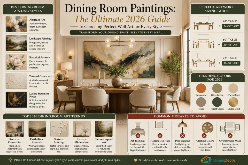
The challenge is that many people choose art based on taste alone, then end up with a piece that feels too small, too high, too busy, or disconnected from the table, lighting, and wall color. The best dining room paintings solve all of that at once. They create a focal point, support the room’s style, and make the space feel welcoming whether you are hosting a dinner party or eating a quiet weeknight meal. Practical hanging advice matters too: BHG recommends centering art around eye level, with artwork generally hung so the center sits about 57 to 60 inches from the floor, and 6 to 12 inches above furniture when placed over a console or similar piece.
Snippet-ready answer: The best dining room paintings are the ones that match the room’s scale, reflect your style, and work with your dining table, lighting, and wall color. In 2026, oversized abstracts, textured canvases, landscapes, botanicals, and mural-style statement pieces are especially strong choices.
What Are Dining Room Paintings?
Dining room paintings are any framed, stretched, or mounted artworks used to shape the atmosphere of a dining space. They may be abstract canvases, landscapes, botanicals, food-themed artwork, black-and-white photography, mixed-media pieces, or gallery walls made from smaller framed works.
In practical terms, dining room paintings do three jobs:
- They create a focal point.
- They add personality.
- They help the room feel styled instead of unfinished.
That is one reason dining rooms keep showing up in design roundups filled with art, murals, and expressive wall treatments. Current inspiration pages from Houzz, The Spruce, and House Beautiful consistently treat the dining room as a place for visual statement-making, not just furniture placement.
Mini summary: Dining room paintings are not only decor. They are atmosphere-setters, scale balancers, and style anchors.
Why Dining Room Paintings Matter in 2026
The dining room is no longer treated as a forgotten formal room. Designers are bringing it back as a real destination space, with more boundaries, more drama, and more personality. House Beautiful notes that formal dining rooms are resurging, while AD’s 2026 forecast points to stronger self-expression, maximalism, tactile craftsmanship, and sculptural wall treatments.
That shift affects wall art choices in a big way. A small, generic print often disappears in a room that now wants stronger visual weight. A painting with texture, scale, or a confident color story can make the entire dining area feel designed on purpose. The trend toward darker woods, richer finishes, and warm interiors also gives dining room paintings a chance to add contrast, softness, or glow.
Why this matters for readers: if the room feels flat, the painting is often the fastest way to fix it without renovating the whole space.
Best Types of Dining Room Paintings
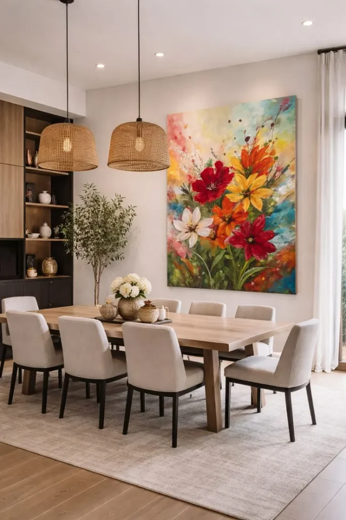
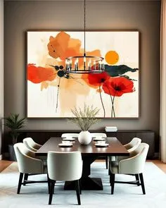
1) Abstract Paintings
Abstract art works well because it does not fight with the table shape, chair style, or light fixtures. It adds movement and sophistication without being too literal. That makes it a strong choice for modern, contemporary, and luxury dining rooms. AD’s 2026 direction toward more expressive and textured interiors makes abstract art especially relevant now.
2) Landscape Paintings
Landscapes bring calm into a social space. Mountain scenes, coastal views, forests, and countryside imagery are a smart fit for dining rooms that need softness and openness. They also work especially well in rooms that already have strong furniture or architectural details.
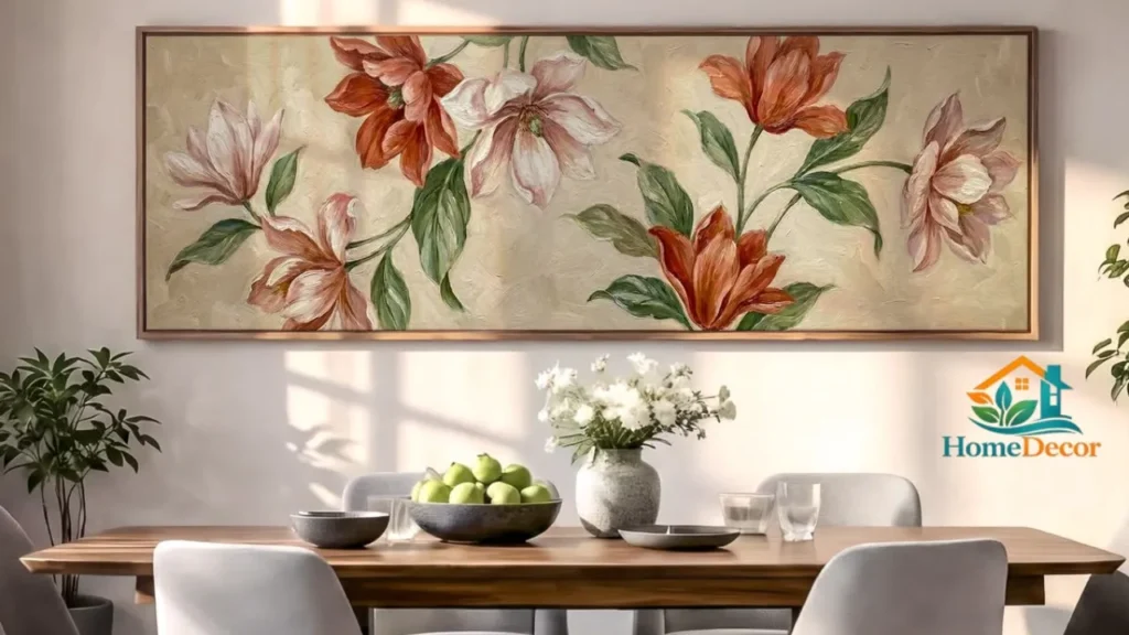
3) Botanical and Floral Art
Botanical paintings add freshness and a natural feel. They pair well with wood tables, linen chairs, rattan accents, and warm neutral walls. The broader 2026 trend toward natural materials and biophilic interiors supports this direction.
4) Textured Canvas Art
Textured paintings are one of the strongest 2026 directions because luxury interiors are moving toward tactile finishes, layered surfaces, and handcrafted detail. This kind of art adds depth even when the color palette is quiet.
5) Food, Wine, and Vineyard Themes
These are more literal, but they still work when done with restraint. A sophisticated wine study, a vineyard landscape, or a subtle culinary still life can feel elegant rather than themed.
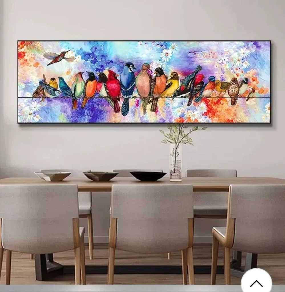
6) Gallery Walls
Gallery walls work best in long or awkward dining rooms that need visual balance. The Spruce shows many dining spaces using grouped framed pieces to make the wall feel alive and intentional.
Mini summary: The safest high-performing choices in 2026 are abstract, textured, botanical, Landscape, and gallery-style compositions.
Best Dining Room Painting Styles by Interior Style
| Dining Room Style | Best Painting Choice | Why It Works |
| Modern | Large abstract, monochrome, geometric art | Clean lines and simple composition support a modern room. |
| Contemporary | Bold color field, textured canvas, mixed media | Adds personality without clutter. |
| Farmhouse | Soft landscape, botanical print, muted still life | Complements wood, linen, and rustic finishes. |
| Luxury | Oversized textured art, gilded frame, sculptural piece | Matches richer materials and more dramatic rooms. |
| Minimalist | One large quiet artwork | Keeps the room calm and uncluttered. |
| Traditional | Classic still life, landscape, framed art pair | Feels timeless and balanced. |
| Coastal | Seascape, neutral abstract, light blue palette | Reinforces an airy, relaxed mood. |
| Transitional | Soft abstract, balanced landscape, neutral gallery wall | Bridges old and new elements easily. |
Use this table as a starting point, not a rulebook. The strongest rooms usually repeat one idea in several places: color, shape, texture, or mood.
How to Choose the Right Size for Dining Room Paintings
Size is where many dining rooms go wrong. A beautiful painting can still look weak if it is too small for the wall or table. A common design rule of thumb is to choose art that feels proportionate to the furniture beneath it, often around two-thirds to three-quarters of the width of the surface. Houzz discussions also repeatedly reflect that proportion-first thinking for artwork above dining furniture.
Practical sizing method
- Measure the wall or furniture piece below the painting.
- Decide whether you want one large statement piece or a grouped set.
- Leave visual breathing room on both sides.
- Mock up the size with paper or tape before buying.
Common scale mistakes
- Choosing art that is too small for a wide wall
- Hanging multiple small pieces too far apart
- Using a large painting in a room with already heavy furniture and too little open wall space
- Forgetting that open-concept rooms need stronger focal pieces
Simple placement rule
BHG recommends hanging art so the center lands about 57 to 60 inches from the floor and 6 to 12 inches above furniture when art is placed over a console or similar piece. That helps the artwork feel connected to the room instead of floating awkwardly.
Mini summary: In dining rooms, scale beats everything. A slightly larger piece usually looks more intentional than a piece that is too safe.
Comparison Table: Best Art Formats for Dining Rooms
| Art Format | Best For | Pros | Cons |
| Oversized canvas | Modern, luxury, open-concept rooms | Strong focal point, easy to style | Can overwhelm very small walls |
| Framed print | Traditional, transitional, budget-friendly rooms | Affordable, versatile, easy to swap | Can feel generic if chosen too quickly |
| Textured painting | Luxury, contemporary, designer looks | Adds depth and richness | Usually higher cost |
| Gallery wall | Long walls, eclectic rooms, family-focused dining areas | Flexible and personal | Needs planning to avoid clutter |
| Triptych / 3-panel art | Wide walls and large tables | Balanced and dramatic | Harder to align perfectly |
| Mural-style wall art | Statement dining rooms | Memorable, immersive, trend-forward | Not ideal for small or busy rooms |
Best Colors for Dining Room Paintings
Dining rooms in 2026 are leaning warmer, richer, and more atmospheric. AD and House Beautiful both point to deeper color, darker woods, and immersive design as major directions, while BHG highlights warm neutrals that make dining rooms feel inviting. Joanna Gaines’ “Gatherings” is a good example of a warm neutral made specifically to support dining-room comfort and hospitality.
High-performing color families
- Terracotta
- Rust
- Olive green
- Deep forest green
- Warm beige
- Taupe
- Soft cream
- Muted gold
- Charcoal
- Inky blue
- Deep teal
Best color pairings by room mood
- Warm and welcoming: beige, taupe, rust, cream
- Elegant and dramatic: inky blue, charcoal, gold
- Organic and calm: olive, forest green, soft brown
- Modern and crisp: black-and-white, muted gray, warm white
What to avoid
Saturated red and yellow can feel too energizing in a dining room, especially if you want long, relaxed meals. BHG notes that warmer neutrals tend to flatter the space more gently than overly intense tones.
Step-by-Step Guide to Choosing the Perfect Dining Room Painting
Decide the mood first
Do you want the room to feel elegant, calm, romantic, lively, or cozy? The mood should come before the artwork.
Study the room’s built-in style
Look at the table shape, chair material, lighting finish, flooring, and wall color. House Beautiful’s 2026 dining-room trend coverage shows how strongly materials and atmosphere now drive design decisions.
Pick one visual leader
That could be color, texture, or subject. Do not try to make the painting do everything.
Match the scale to the wall
A large blank wall usually needs one strong piece or a planned group. A small wall may need compact vertical work or a mini gallery.
Step 5: Check lighting
Dining rooms often use pendant lights or chandeliers, so make sure the painting still reads clearly in both daylight and evening light. The Spruce emphasizes that dining-room styling works best when art, lighting, and table details feel coordinated.
Test the art before buying
Use painter’s tape, paper cutouts, or a digital mockup. This prevents expensive sizing mistakes.
Leave the room calm
Good dining-room art should feel present, not noisy. Balance matters just as much as beauty.
Budget-Friendly Dining Room Painting Ideas
You do not need a luxury budget to make the room feel expensive. The Spruce and BHG both show that framed pieces, gallery walls, DIY art, and carefully styled wall decor can create a strong impact without major spending.
Smart low-cost options
- One large poster in a quality frame
- DIY abstract canvas in room colors
- Thrifted art with upgraded framing
- Two or three coordinated prints
- Downloadable art printed on matte paper
- Gallery wall using mixed sizes of affordable frames
Budget-friendly wins
A simple, oversized print often looks better than several tiny, expensive pieces. Scale is usually more important than the price tag.
Premium and Luxury Dining Room Painting Ideas
Luxury dining rooms are moving toward richer, more personalized, and more tactile design. AD’s 2026 forecast emphasizes opulence, self-expression, artisan craft, and sculptural wall treatments, while House Beautiful highlights murals, reflective ceilings, stone tables, and bold art as key dining-room moves.
Premium directions
- Large original abstract painting
- Hand-textured canvas
- Custom mural or hand-painted wall feature
- Framed artwork with metallic or wood finishes
- Sculptural mixed-media piece
- Art paired with custom paneling or wainscoting
Why luxury artworks
Luxury paintings do not just decorate. They change the room’s emotional temperature. They make the dining room feel curated, collected, and more architectural.
Best Materials and Finishes for Dining Room Wall Art
| Material / Finish | Best Use | Design Effect |
| Canvas | Modern and transitional rooms | Soft, versatile, easy to scale |
| Framed paper print | Budget and classic styles | Crisp and easy to refresh |
| Textured plaster look | Luxury and designer spaces | Rich, tactile, editorial |
| Metal accents | Glam, modern, Neo Deco looks | Adds shine and contrast |
| Wood frame | Farmhouse, traditional, warm interiors | Grounds the art visually |
| Mixed media | Contemporary statement rooms | Feels artistic and layered |
The 2026 trend toward tactile craftsmanship and sculptural detail makes material choice more important than ever. A flat image can still work, but texture now has a stronger chance of standing out.
Smart Styling Tips for Different Room Sizes
Small dining rooms
Choose one piece with clear visual focus. Small rooms usually look better with fewer, stronger elements. The Spruce’s small-space dining examples also show that wall art can help define a dining zone without crowding it.
Medium dining rooms
Use one oversized piece or a balanced pair. Keep the wall clear enough so the painting can breathe.
Large dining rooms
Go bigger than you think. Large dining rooms can handle mural-style art, triptychs, or a Gallery Wall. Houzz and House Beautiful both reflect the growing preference for more purposeful, room-defining design.
Open-concept dining rooms
Use paintings to create separation. In open plans, wall art helps the dining area feel distinct from the kitchen or living room. That is part of the larger 2026 push toward intentional room boundaries.
Common Mistakes to Avoid
1) Hanging art too high
This makes the painting feel disconnected from the dining furniture. BHG’s eye-level guidance helps avoid that.
2) Choosing art that is too small
Small art gets visually lost on a wide dining wall, especially in open-concept homes.
3) Ignoring lighting
If the painting looks dull under your chandelier or pendant, it will not perform at dinner time.
4) Picking art that fights the room
A painting should support the room’s palette and shape, not compete with it.
5) Overcrowding the wall
Too many pieces can make the room feel busy instead of elegant. The Spruce’s dining-room examples work because they keep the arrangement deliberate.
Expert Tips Most People Ignore
- Let the painting echo one element in the room: table wood, chair fabric, rug tone, or light fixture finish.
- Use the artwork to soften hard lines in a room with lots of square furniture.
- In darker dining rooms, choose art with visible contrast so it does not disappear.
- In very warm rooms, add one cool accent in the painting to keep the palette fresh.
- If the room already has strong architecture, keep the art simpler.
- If the room is plain, let the painting do more of the visual work.
These details matter because 2026 dining-room design is less about “filling walls” and more about building atmosphere.
Maintenance, Care, and Long-Term Value
A good dining room painting should hold up visually for years, not just look nice for one season. Keep it away from excessive humidity, direct heat, and splashes from serving areas. If you choose a canvas or framed print, dust it gently and check that the hanging hardware is secure.
For long-term value, prioritize:
- Timeless palette over ultra-trendy subject matter
- Quality frame or stretch
- Durable surface or finish
- A size that works with the room, even if furniture changes later
This matters because the strongest 2026 direction is not disposable decor. It is longevity, quality, and craft.
Best Dining Room Paintings for Different Types of People
Choose this style if you:
- Want a room that feels warm and welcoming
- Host often
- Like a focal point
- Enjoy collected, curated interiors
- Want a fast visual upgrade without remodeling
Avoid this style if you:
- Prefer completely blank walls
- Dislike visual focal points
- Already have very busy furniture, wallpaper, and lighting
- Want the room to stay extremely minimal
People Also Ask
Oversized abstracts, landscapes, botanicals, and textured canvases usually work best because they create mood without overwhelming the room. They also fit well with current 2026 dining-room trends toward warmth, texture, and self-expression.
A widely used guideline is to place the center of the artwork around eye level, roughly 57 to 60 inches from the floor. If it sits above furniture, leave a comfortable gap so it feels connected to the piece below.
They should complement the table, not copy it. A wooden table can pair beautifully with a warm abstract, a botanical print, or a darker-framed piece that brings contrast.
Yes, especially in long walls, awkward spaces, or rooms that need a personal touch. Just keep the spacing intentional so the wall feels curated rather than crowded.
Warm neutrals, earthy greens, terracotta, charcoal, deep blue, and muted gold are strong options because they support a welcoming, dining-friendly mood.
Conclusion
The best dining room paintings do more than decorate a wall. They make the room feel intentional, welcoming, and complete. In 2026, the strongest choices are the ones that combine good scale, strong mood, and a clear connection to the room’s materials and color story. That is why oversized abstract art, textured canvases, landscapes, botanicals, and mural-style pieces are so effective right now. They match the broader shift toward warmer, richer, more expressive dining rooms.
For TheRoomsArt.com, this topic is a strong pillar opportunity because it naturally connects to wall art, room styling, small-space design, luxury decor, and modern home inspiration. Readers who want to improve their dining room will also benefit from related guides on wall art scale, gallery walls, room color pairing, and modern styling. Bookmark this topic, explore the supporting articles, and build from there.
Legal disclaimer: Prices, materials, trends, and product availability may change over time depending on region, suppliers, and brands. Always verify dimensions, materials, and compatibility before purchase or renovation.