

Color Suggestions for Living Room
Choosing the right living room color can completely change how your home feels. The perfect shade can make a small room look larger, help a dark space feel brighter, create a cozy atmosphere for relaxing evenings, or give your home a polished designer look. But with so many paint colors, undertones, and trend cycles to think about, finding the best Color Suggestions For Living Room spaces can feel overwhelming fast.
That’s exactly why this guide goes beyond a simple list of pretty paint shades.
Instead of throwing random living room colors at you, we’ll walk through the best living room color ideas by mood, style, room size, lighting conditions, and furniture pairings—so you can choose a shade that actually works in your home. Whether you want a calm, warm-neutral backdrop, a modern greige palette, a cozy sage green room, or a dramatic navy sitting space, this guide will help you narrow down the right direction with confidence.
You’ll also find practical advice on undertones, small-room color tricks, dark-room fixes, trend-safe shades for 2026, and real-world styling tips that make the color feel intentional rather than random.
If you want your living room to feel brighter, cozier, more stylish, or simply more “you,” start here.
Quick Answer: What Are the Best Living Room Colors Right Now?
If you want the short version, the best living room colors right now are:
- Warm white for a bright, timeless backdrop
- Cream for softness and warmth
- Greige for a modern but livable neutral
- Taupe for elegant coziness
- Sage green for calm, organic warmth
- Olive green for a richer, earthy look
- Pale blue for a fresh, airy atmosphere
- Terracotta for warmth and personality
- Deep navy for classic drama
- Chocolate brown for a luxurious, cocooning feel
The best choice depends on your natural light, room size, furniture, flooring, and the mood you want to create.
How to Choose the Best Color for Your Living Room
Before you fall in love with a paint swatch on Pinterest, take a step back and think about how your living room actually works. A color that looks amazing in a professionally styled photo may look flat, cold, or overwhelming in your own home if the lighting and furniture are completely different.
Here’s the smartest way to narrow down your options.
1. Start With Natural Light
Natural light changes paint more than most homeowners expect.
North-facing living rooms
These rooms often pull colors cooler and flatter. That means icy gray or stark white can feel dull very quickly. Better options include:
- warm white
- cream
- beige
- mushroom
- taupe
- soft sage
South-facing living rooms
These rooms usually get warmer, brighter light, which means they can handle:
- cooler grays
- blue-gray
- navy
- muted teal
- olive
- deeper greens
Dark living rooms
If your living room gets limited daylight, avoid cold whites and steely grays. Instead, lean into:
- creamy off-whites
- soft beige
- warm greige
- light taupe
- pale sage
2. Think About Room Size and Ceiling Height
A small living room doesn’t have to be plain white. The goal is to choose a color that keeps the room open without making it feel cold or flat.
Best colors for small living rooms
- warm white
- cream
- pale greige
- soft beige
- light taupe
- pale blue-gray
- muted sage
Best colors for larger living rooms
Bigger rooms can usually handle more depth and drama, especially if they get good light. Consider:
- navy
- forest green
- charcoal
- chocolate brown
- terracotta
- olive
Low ceilings?
Use a light-to-mid-tone color and keep contrast gentle between walls, trim, and ceiling. This creates a smoother visual flow.
3. Match the Color to Your Sofa, Flooring, and Wood Tones
A wall color doesn’t exist in isolation. It needs to support the room’s biggest visual elements.
If you have a gray sofa
Try:
- sage green
- warm white
- greige
- mushroom
- taupe
- dusty blue
If you have brown furniture
Try:
- cream
- soft beige
- olive
- sage
- taupe
- warm white
If you have a beige or linen sofa
Try:
- navy
- terracotta
- sage
- mushroom
- charcoal
- dusty rose
If you have black furniture
Try:
- warm white
- camel beige
- mushroom
- olive
- greige
- soft taupe
4. Decide on the Mood First
Color becomes much easier to choose when you focus on the feeling you want.
| Mood you want | Best living room colors |
| Calm and airy | warm white, pale blue, soft sage, eucalyptus, blue-gray |
| Warm and cozy | cream, taupe, camel, terracotta, olive, caramel brown |
| Elegant and dramatic | navy, charcoal, forest green, chocolate brown, blackened green |
| Timeless and flexible | greige, warm beige, mushroom, off-white, taupe |
| Fresh and modern | warm white, greige, olive, muted teal, stone beige |
5. Learn the Undertones Before You Commit
This is where many living room paint decisions go wrong.
A beige might lean:
- pink
- yellow
- gray
- green
A gray might turn:
- blue
- violet
- green
A white might feel:
- creamy
- stark
- Slightly Yellow
- slightly gray
Always compare paint against:
- your flooring
- sofa fabric
- wood trim
- curtains
- daylight
- evening lighting
If the undertone fights with your fixed finishes, the room will feel “off” even if the color looked beautiful online.
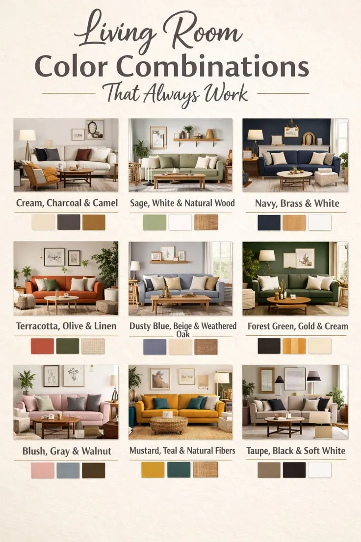
25 Best Color Suggestions for Living Room Spaces
Below are the best living room color ideas grouped by mood and style, so it’s easier to find a direction that fits your home.
Best Neutral Living Room Colors
1. Warm White
Warm white is one of the safest and most versatile living room colors because it brightens a room without feeling sterile. It works beautifully in modern, farmhouse, coastal, transitional, and minimalist spaces.
Best for: small living rooms, dark rooms, open-concept spaces, resale-friendly homes
Pairs well with: oak wood, beige sofas, black accents, linen curtains, brass lighting
2. Cream
Cream creates a softer, more welcoming look than bright white. It instantly adds warmth and works especially well in cozy family rooms, farmhouse interiors, and traditional homes.
Best for: low-light rooms, homes with warm wood flooring, relaxed family spaces
Pairs well with: brown leather, olive accents, rust tones, warm wood, woven textures
3. Greige
Greige blends gray and beige, which is why it remains one of the most useful living room paint colors. It feels current without the coldness that can make gray hard to live with.
Best for: modern homes, open layouts, mixed warm/cool finishes
Pairs well with: navy, cream, black metal, walnut, charcoal, soft white
4. Soft Beige
Soft beige is timeless, approachable, and easy to decorate around. It’s one of the best options if you want warmth without going obviously yellow.
Best for: classic interiors, family homes, layered neutral palettes
Pairs well with: ivory, tan, cognac leather, dark wood, woven baskets
5. Taupe
Taupe has a grounded elegance that makes a living room feel polished without losing comfort. Depending on the undertone, it can feel warm, earthy, or quietly dramatic.
Best for: upscale neutral interiors, transitional homes, living rooms with brown furniture
Pairs well with: cream, olive, rust, walnut, charcoal, brass
6. Mushroom
Mushroom sits somewhere between beige, taupe, and gray. It’s soft, earthy, and refined—perfect if you want a quiet luxury look without following obvious trends.
Best for: minimalist interiors, earthy palettes, modern organic homes
Pairs well with: linen upholstery, pale wood, muted blush, black accents
7. Warm Gray
If you like gray but don’t want a cold room, choose a warm gray with beige or taupe undertones rather than a blue-gray.
Best for: apartments, contemporary living rooms, simple neutral schemes
Pairs well with: white trim, black furniture, pale wood, olive, muted blue
Mini Summary: Best Neutral Picks
If you want the safest all-around choices, start with:
- warm white for brightness
- greige for flexibility
- taupe for elegance
- mushroom for a softer designer look
- cream for cozy warmth
Best Cozy and Warm Living Room Colors
8. Sage Green
Sage green is one of the most flexible living room colors because it feels calm, natural, and timeless all at once. It works in farmhouse, cottage, modern organic, and traditional spaces.
Best for: cozy homes, wood-heavy interiors, calm family rooms
Pairs well with: cream, oak, brass, terracotta, beige, linen
9. Olive Green
Olive is deeper and moodier than sage, which makes it ideal for a warm, cocooning living room. It adds richness without feeling as formal as dark emerald.
Best for: earthy modern spaces, moody living rooms, vintage-inspired homes
Pairs well with: camel, ivory, walnut, rust, black, leather
10. Terracotta
Terracotta brings warmth, personality, and a slightly Mediterranean feel. It’s a great choice if you want a living room that feels layered and welcoming rather than flat.
Best for: boho, rustic, Spanish, Mediterranean, earthy modern interiors
Pairs well with: cream, sand, olive, dark wood, jute, clay tones
11. Dusty Rose or Plaster Pink
A muted pink can behave almost like a neutral when it’s earthy rather than sugary. It adds warmth and softness while still feeling sophisticated.
Best for: eclectic rooms, vintage-inspired spaces, soft modern interiors
Pairs well with: taupe, green, walnut, cream, brass
12. Camel Beige
Camel sits between beige, tan, and caramel. It adds depth without making the room dark and works beautifully with leather and natural materials.
Best for: cozy modern living rooms, earthy transitional spaces
Pairs well with: olive, cream, rust, warm wood, black accents
13. Warm Caramel Brown
If you want a richer, more enveloping living room, warm caramel brown can feel incredibly elevated. It’s especially beautiful in den-like spaces and rooms with layered lighting.
Best for: dramatic cozy rooms, luxury earthy interiors, media-style living spaces
Pairs well with: ivory, camel, walnut, cognac leather, brass
14. Muted Mustard
Muted mustard adds personality and warmth without the sharpness of bright yellow. It’s best for homeowners who want a room with more energy and individuality.
Best for: boho, eclectic, vintage, retro-inspired living rooms
Pairs well with: charcoal, cream, olive, dark wood, navy accents
Best Cool and Calming Living Room Colors
15. Pale Blue
Pale blue makes a living room feel fresh, relaxed, and open. It’s perfect if you want more personality than white but still want an airy effect.
Best for: coastal, classic, transitional, bright living rooms
Pairs well with: crisp white, driftwood tones, beige linen, navy, soft gray
16. Blue-Gray
Blue-Gray works well when you want a refined, subtle look that doesn’t feel too colorful. It’s soothing, elegant, and especially nice in rooms with white trim.
Best for: calm transitional spaces, small sophisticated living rooms
Pairs well with: cream, warm wood, charcoal, silver, black accents
17. Soft Teal
Soft teal gives a living room personality without becoming loud. Depending on the undertone, it can feel coastal, moody, modern, or slightly vintage.
Best for: statement living rooms, creative spaces, jewel-toned interiors
Pairs well with: warm white, tan leather, walnut, brass, cream
18. Eucalyptus Green
Eucalyptus is cooler and slightly grayer than sage. It creates a soft spa-like atmosphere and works especially well in homes with lots of daylight.
Best for: serene living rooms, minimalist spaces, modern organic interiors
Pairs well with: pale wood, soft white, beige upholstery, gray textiles
19. Lavender Gray
Lavender gray is subtle and unexpected. Used carefully, it can make a living room feel soft, elegant, and quietly upscale.
Best for: refined eclectic spaces, quiet luxury palettes, soft contemporary rooms
Pairs well with: mushroom, cream, warm wood, brass, charcoal
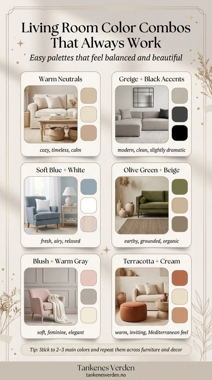
Best Bold and Dramatic Living Room Colors
20. Deep Navy
Navy is one of the best dramatic living room colors because it feels classic, rich, and versatile. It works in coastal, traditional, masculine, and modern interiors.
Best for: bright rooms, statement walls, elegant living spaces, larger rooms
Pairs well with: crisp white, walnut, brass, ivory, marble, tan leather
21. Forest Green
Forest green creates a rich, cocooning atmosphere and looks especially beautiful with wood tones, leather, brass, and layered textures.
Best for: moody living rooms, traditional homes, cozy library-like spaces
Pairs well with: cream, camel, black, walnut, vintage rugs, brass
22. Charcoal
Charcoal adds drama and modern sophistication. It’s best in rooms with decent natural light and enough warmth in the furnishings to keep the room from feeling flat.
Best for: modern interiors, industrial spaces, bold minimalist rooms
Pairs well with: ivory, cognac, warm wood, matte metals, black accents
23. Chocolate Brown
Chocolate brown is one of the most interesting living room color directions in 2026. Warm browns are becoming more popular as homeowners move away from cold gray and want spaces that feel grounded and luxurious. Current trend coverage also points to warm neutrals, earthy greens, terracotta, muted teals, airy blues, and rich browns as standout directions for 2026 interiors.
Best for: elegant, moody interiors, upscale, cozy rooms, trend-forward homes
Pairs well with: ivory, beige, brass, walnut, olive, rust
24. Aubergine or Plum
A muted plum can add drama and individuality without looking childish or loud. It’s best for homes that already lean eclectic, traditional, or richly layered.
Best for: jewel-toned interiors, vintage-inspired spaces, bold traditional rooms
Pairs well with: blush, cream, charcoal, dark wood, brass
25. Blackened Green
Blackened green reads almost neutral from a distance but has much more personality than charcoal. It feels dramatic, grounded, and designer-led.
Best for: statement living rooms, darker, cozy spaces, upscale traditional or modern homes
Pairs well with: warm white, camel, linen, walnut, stone, brass
Best Living Room Colors for Small Spaces
Small living rooms need colors that create softness and continuity without making the room feel boxed in. That doesn’t mean you’re limited to plain white.
Best color suggestions for a small living room
- warm white
- cream
- pale greige
- soft beige
- muted sage
- pale blue-gray
- mushroom
Design tricks that make a small room feel bigger
- Paint walls and trim in similar tones for a smoother visual flow
- Use one main wall color instead of lots of contrast
- Choose lighter upholstery if the room already lacks light
- Use large rugs instead of tiny ones to unify the room
- Layer lighting rather than relying on one overhead fixture
Design advice for small living rooms increasingly favors monochrome or close-tone palettes, layered lighting, and avoiding oversized furniture, which helps the room feel more open and cohesive.
Best Living Room Colors for Dark Rooms
Dark living rooms need shades that brighten the space without turning cold. Stark white often looks harsh in low light, so warmer tones usually work better.
Best colors for dark living rooms
- creamy white
- soft beige
- pale greige
- mushroom
- warm taupe
- light sage
What to avoid in a dark room
- blue-based gray
- bright icy white
- high-contrast black-and-white palettes
- paint colors that look flat without layered lighting
Best Living Room Colors for Bright Rooms
If your living room gets a lot of natural sunlight, you have more freedom to go deeper and moodier.
Great colors for bright living rooms
- deep navy
- forest green
- olive
- charcoal
- terracotta
- chocolate brown
- dusty blue
Bright rooms can support more color depth because sunlight prevents the walls from feeling too heavy.
Best Living Room Color Suggestions by Style
Modern Living Room Colors
If you want a clean, current look, focus on warm neutrals and earthy, moody shades rather than cold gray.
Best modern living room colors
- greige
- mushroom
- warm white
- olive green
- charcoal
- taupe
Farmhouse Living Room Colors
Farmhouse living rooms look best with soft, natural shades that feel welcoming and easy to layer.
Best farmhouse colors
- creamy white
- sage green
- dusty blue
- warm beige
- soft taupe
- light greige
Minimalist Living Room Colors
Minimalist rooms benefit from quiet colors with depth instead of flat white everywhere.
Best minimalist living room colors
- off-white
- mushroom
- stone beige
- pale gray-green
- warm greige
- soft taupe
Boho Living Room Colors
Boho spaces are perfect for warm, earthy shades and a layered personality.
Best boho colors
- terracotta
- sand
- olive
- camel
- dusty blush
- muted mustard
Luxury Living Room Colors
If you want a more expensive-looking living room, choose colors with richness and depth.
Best luxury living room colors
- navy
- forest green
- chocolate brown
- charcoal
- taupe
- blackened green
Best Living Room Colors Based on Furniture
Matching paint to your furniture is one of the easiest ways to make a room feel intentional.
If You Have a Gray Sofa
Try:
- sage green
- greige
- warm white
- mushroom
- taupe
- dusty blue
If You Have Brown Furniture
Try:
- cream
- soft beige
- olive green
- sage
- warm white
- taupe
If You Have a Beige Sofa
Try:
- navy
- terracotta
- sage
- mushroom
- dusty rose
- charcoal
If You Have White Furniture
Try:
- blue-gray
- olive
- greige
- forest green
- taupe
- blackened green
If You Have Black Furniture
Try:
- warm white
- mushroom
- camel beige
- soft taupe
- olive
- greige
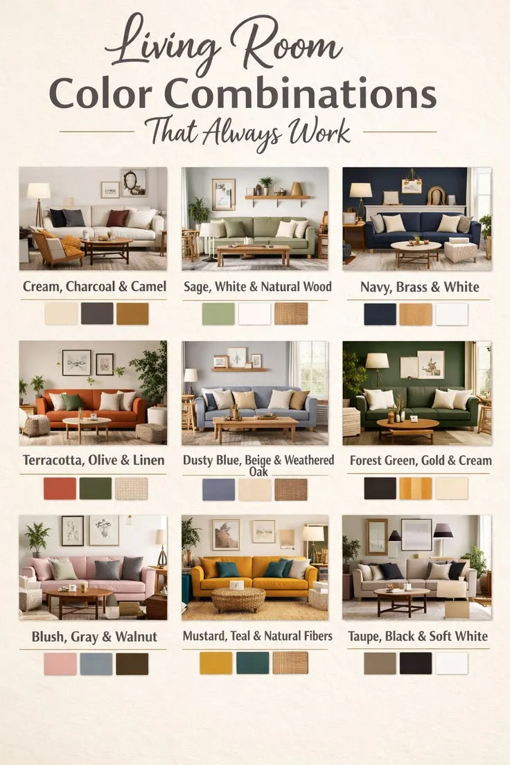
12 Living Room Color Combinations That Always Work
Sometimes it’s easier to choose a palette than a single wall color. Here are combinations that work again and again.
- Warm white + beige + black accents – clean, timeless, modern
- Sage green + cream + light oak – calm, organic, cozy
- Greige + navy + brass – polished and classic
- Taupe + rust + walnut – warm and sophisticated
- Pale blue + white + natural linen – airy and fresh
- Olive + camel + ivory – grounded and cocooning
- Mushroom + charcoal + blush – soft but elevated
- Terracotta + sand + dark wood – rich and bohemian
- Forest green + warm white + cognac leather – dramatic and timeless
- Dusty rose + taupe + gold – stylish and soft
- Blue-gray + cream + weathered wood – calming and refined
- Chocolate brown + ivory + brass – moody and luxurious
Comparison Table: Which Living Room Color Fits Your Goal?
| If your goal is… | Best colors to try | Why they work |
| Make a small room feel bigger | warm white, cream, pale greige, soft beige | They reflect light and keep visual edges soft |
| Make a dark room feel brighter | cream, mushroom, warm taupe, soft beige | They warm up low light instead of turning cold |
| Create a cozy room | sage, olive, taupe, terracotta, camel | They add warmth and depth |
| Make the room feel luxurious | navy, chocolate brown, forest green, charcoal | They create richness and contrast |
| Keep it resale-friendly | warm white, greige, beige, taupe, cream | These shades appeal to a wide range of buyers |
| Add personality without going too bold | sage, dusty rose, pale blue, eucalyptus, soft teal | They feel distinct but still livable |
Warm vs Cool Living Room Colors: Which Is Better?
There’s no universal winner. It depends on your room and the feeling you want.
Choose Warm Colors If You Want:
- a cozy, welcoming living room
- a softer atmosphere
- better balance in a north-facing or dark room
- an earthy, layered look
Great warm options: terracotta, taupe, cream, camel, olive, warm beige, caramel brown
Choose Cool Colors If You Want:
- a calm and airy room
- a lighter, fresher feel
- a subtle coastal or contemporary mood
- a soothing backdrop in a bright room
Great cool options: pale blue, blue-gray, eucalyptus, soft teal, cooler sage tones
Quick rule of thumb
- Dark room? Start warmer.
- Very sunny room? You can go cooler or darker.
- Want cozy? Warm wins.
- Want airy? Cool usually works better.
2026 Living Room Color Trends That Actually Feel Livable
Interior color coverage in 2026 is clearly moving away from icy grays and toward warm neutrals, muddy greens, terracotta/clay tones, muted teals, airy blues, and rich browns. Design publications and trend roundups are repeatedly highlighting earthy warmth, layered color, and more personalized rooms over sterile minimalism.
The 2026 shades worth paying attention to
1. Warm whites and creamy neutrals
These feel softer and more livable than stark gallery white.
2. Olive and muddy greens
They add depth while still reading close to neutral in many homes.
3. Terracotta and clay-based shades
These bring warmth, especially in modern boho, Mediterranean, and earthy spaces.
4. Chocolate and mocha browns
Browns are returning in a much richer, more elevated way than the heavy brown interiors of the past.
5. Muted teal and airy blue
These are ideal for homeowners who want color without overwhelming the room.
The key takeaway
The trend isn’t just “pick a trendy shade.” It’s a choice of a warmer, more personal palette that still feels easy to live with.
How to Choose the Right Living Room Color Without Regret
If you’re stuck between 5 different paint swatches, use this process.
Identify the room problem
Ask:
- Is the room too dark?
- Too cold?
- Too plain?
- Too small?
- Too busy?
- Lacking contrast?
The best paint color should solve a problem, not just look pretty.
List your fixed finishes
Write down what isn’t changing:
- flooring
- sofa
- fireplace stone
- Wood Trim
- curtains
- rugs
- built-ins
Your paint needs to support those pieces.
Pick your mood
Choose one:
- calm and airy
- warm and cozy
- polished and timeless
- dramatic and moody
- earthy and organic
Narrow to 3 color families
Example:
- warm white
- sage green
- greige
Not 20 swatches. Just 3 directions.
Test large samples
Paint sample boards or large wall swatches. Tiny paint chips are not enough.
Check them:
- in morning light
- in afternoon light
- at night with lamps on
- next to your sofa and rug
- against your trim and flooring
Look for undertone conflict
If the beige suddenly looks pink or the gray turns blue, don’t force it.
Consider the whole house
The living room doesn’t stand alone. Make sure the color flows with nearby hallways, kitchens, and dining spaces.
Living Room Paint Mistakes to Avoid
Even beautiful colors can disappoint when they’re used in the wrong way.
1. Choosing paint from a tiny swatch
Paint looks completely different on a full wall than it does on a card.
2. Ignoring undertones
A neutral can lean pink, yellow, green, or blue. That undertone matters.
3. Using a cold gray in a dark room
This is one of the easiest ways to make a living room feel dull and lifeless.
4. Forgetting adjacent rooms
The living room should connect visually to the rest of the home.
5. Going dark without enough lighting
Dark colors can be gorgeous, but they need support from:
- table lamps
- floor lamps
- warm bulbs
- texture
- contrast
- Layered Decor
6. Copying a trend without checking if it suits your room
A trend should support your architecture, furniture, and lifestyle—not fight them.
Expert Tips Most People Ignore
Use the ceiling strategically
If your walls are light, a slightly softer ceiling color can make the room feel more custom and less builder-basic.
Don’t automatically paint trim bright white
Sometimes a softer white or matching trim tone creates a much more elevated look.
Brown wood is not the enemy
In 2026, warm wood and brown-based palettes feel more current than cold gray-on-gray rooms.
Test paint beside upholstery, not just flooring
Sofas take up so much visual space that they can completely change how the wall color reads.
Use lighting to finish the color story
Paint alone won’t make a room feel cozy if the lighting is harsh.
Budget-Friendly Living Room Color Ideas
You don’t need a full luxury makeover to make color work beautifully.
Smart low-cost ways to refresh a living room with color
- Paint just the walls and leave major furniture as-is
- Add color through pillows, throws, and curtains before committing to bold walls
- Use one richer accent wall instead of repainting the whole room
- Refresh a neutral room with olive, rust, navy, or blush decor
- Swap cold bulbs for warmer lighting to make beige, taupe, and cream look better
Best budget-friendly wall colors
- warm white
- greige
- cream
- sage
- soft beige
These are easy to decorate around, which means you won’t have to replace everything else in the room.
Premium / Luxury Living Room Color Directions
If you want a living room that feels high-end, focus on depth, restraint, and layering rather than simply choosing the darkest color.
Luxury-friendly living room colors
- taupe
- mushroom
- forest green
- navy
- chocolate brown
- blackened green
What makes them feel expensive?
- warm metals like aged brass
- heavy linen or velvet
- walnut or oak wood
- oversized art
- layered lighting
- tone-on-tone styling
- fewer, better pieces instead of clutter
Best Decor and Material Pairings for Popular Living Room Colors
| Wall color | Best materials & decor pairings |
| Warm white | oak, linen, black metal, jute, brass |
| Cream | warm wood, rust accents, woven baskets, leather |
| Greige | walnut, black accents, marble, soft ivory textiles |
| Sage green | oak, brass, linen, terracotta, natural fiber rugs |
| Olive green | camel leather, walnut, antique brass, cream upholstery |
| Pale blue | white trim, driftwood, soft beige fabrics, glass |
| Navy | marble, brass, walnut, ivory, cognac leather |
| Chocolate brown | boucle, brass, warm ivory, travertine, walnut |
Space-Saving & Functional Color Tips
Color alone won’t fix a poorly functioning room, but it can support a smarter layout.
For apartment living rooms or small layouts
- Keep walls, trim, and large storage pieces in a close tonal family
- Use mirrors to bounce light
- Choose colors that reduce visual clutter rather than increase it
- Avoid too many accent colors in one small room
- Use shelving and vertical decor to pull the eye upward
Design guidance for small spaces increasingly emphasizes visual continuity, layered light, and avoiding bulky furniture choices that overwhelm the room.
Who Should Choose Warm Living Room Colors?
Warm living room colors are ideal if you:
- have a dark or north-facing room
- want the room to feel cozy and welcoming
- have brown furniture or warm wood floors
- love earthy, organic, farmhouse, or Mediterranean interiors
- want a softer backdrop than stark white or cold gray
Who Should Choose Cool Living Room Colors?
Cool living room colors are a better fit if you:
- have a bright sun-filled room
- want an airy or coastal feel
- like blue-gray, pale blue, eucalyptus, or more serene palettes
- prefer a slightly crisper modern look
- want a calmer visual backdrop
Who Should Avoid Very Dark Living Room Colors?
Very dark wall colors may not be the best fit if:
- The room gets very little natural light
- You don’t have enough lamps or layered lighting
- Your furniture is already visually heavy
- You want the room to feel larger rather than more intimate
- You don’t enjoy moody interiors
That doesn’t mean dark colors are “wrong”—they just need the right room conditions.
Maintenance, Longevity, and Long-Term Value
The best living room color isn’t just the prettiest one on day one. It should also age well with your furniture, style changes, and daily life.
Colors that usually have the best long-term flexibility
- warm white
- cream
- greige
- taupe
- mushroom
- sage green
These shades are easy to refresh with:
- new throw pillows
- updated art
- different rug colors
- seasonal styling
- changing hardware and lighting finishes
If resale matters
Neutral and broadly appealing tones are still the safest route. Zillow’s recent color analysis found that paint choices can affect buyer perception and even offer prices, with sage and pale blue performing well in some rooms while certain harsher yellows and reds performed poorly.
That doesn’t mean you can’t use color—it just means the most resale-friendly choices tend to be soft, balanced, and widely livable.
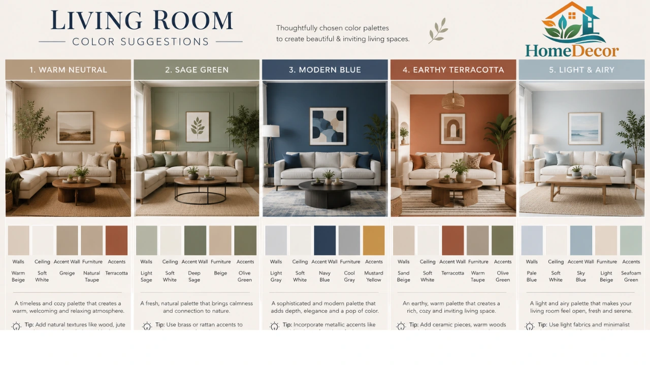
People Also Ask
There isn’t one perfect answer for every home, but warm white, greige, cream, taupe, and sage green are among the most versatile choices. They work across many styles and are easier to pair with furniture and flooring.
Colors that keep contrast soft usually work best. Try warm white, pale greige, soft beige, muted sage, or pale blue-gray if you want a living room to feel more open and airy.
Not at all—dark living room colors can look stunning. They just work best in rooms with good lighting, enough contrast, and furnishings that add warmth and texture.
Brown furniture pairs beautifully with cream, soft beige, warm white, sage green, taupe, and olive. These shades complement the warmth of the wood or leather instead of fighting it.
White can be a great choice if you want a flexible backdrop, but in many homes, a warm white or creamy off-white feels much more inviting than a stark, bright white.
Final Thoughts
The best living room color is the one that works with your light, furniture, layout, and lifestyle, not just the one that looks nice in someone else’s home. If you want a timeless and flexible backdrop, start with warm white, cream, greige, taupe, or mushroom. If you want a cozier room with more character, look at sage, olive, terracotta, camel, or dusty rose. And if you’re ready for drama, navy, forest green, charcoal, or Chocolate Brown can create a living room that feels unforgettable.
