
Introduction
The Best Color for Living Room Walls is not one universal shade. It is the color that works with your light, your furniture, your room size, and the feeling you want the room to create. That is why one living room can look perfect in warm white while another looks far better in greige, olive green, or a soft blue-gray. Designers and paint brands keep repeating the same truth: light changes color, undertones matter, and the wrong finish can ruin even a beautiful shade.
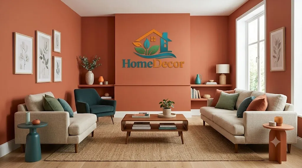
In 2026, the strongest living room color direction is moving away from cold, flat gray and toward warmer, richer, more natural tones. Warm whites still lead as a safe all-around choice, but earthy greens, mushroom, sand-washed beige, soft clay, and muted blue tones are gaining ground because they feel calmer, more personal, and easier to live with.
If you are trying to pick a wall color and feel stuck, this guide gives you a clear path. You will see which colors work best for bright rooms, small rooms, north-facing rooms, cozy rooms, and modern interiors. You will also learn how to test samples the right way so the color you choose in the store is the color you actually love at home.
What Is the Best Color for Living Room Walls?
The best living room wall color is the shade that supports the room’s purpose instead of fighting it. Living rooms usually need to do several jobs at once: relaxing, entertaining, reading, watching TV, hosting guests, and sometimes serving as a pass-through space. That is why flexible colors keep winning. White and warm neutral tones remain popular because they create a calm backdrop and let furniture, art, and textiles do the visual work.
At the same time, modern design is becoming less afraid of color. Trend coverage for 2026 points toward olive green, soft clay, mushroom, sand-washed beige, midnight blue, burgundy, and other earthy shades that add warmth without feeling loud. Those shades are especially useful when you want the room to feel more layered and less generic.
Why Living Room Wall Color Matters in 2026
Paint is one of the cheapest ways to change how a room feels, but it also has one of the biggest effects on comfort and perceived value. Recent design coverage warns that lighting, undertones, finish choice, and overly saturated combinations can quickly make a room feel less polished or even less valuable. Designers also note that not all whites behave the same, which is why “just pick white” is not a real strategy.
In 2026, homeowners are leaning toward warmer, more natural, more human interiors. That means less sterile white, less icy gray, and more shades that feel grounded and livable. Pantone’s 2026 Color of the Year coverage reflects a move toward calm neutrals, while trend coverage from major design outlets highlights earthy umber, pistachio-chartreuse, desaturated sky blue, ochre, and warm green tones.
Mini summary:
The wall color you choose now affects more than style. It affects how big the room feels, how warm it feels, how your furniture reads, and how timeless the space will look over time.
Best Living Room Wall Colors by Goal
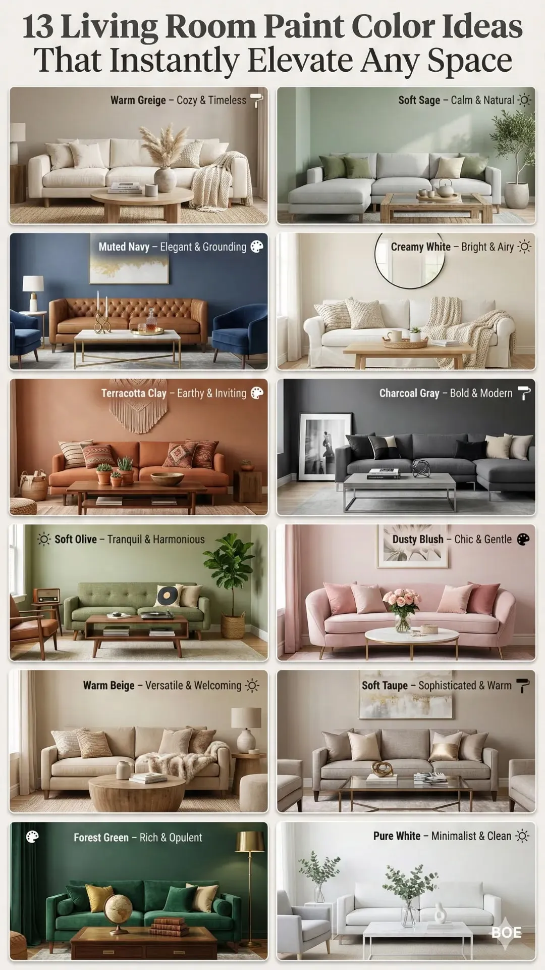
| Goal | Best colors | Why they work |
| Bright and airy | Warm white, ivory, creamy off-white, soft pearl | Reflect light and keep the room open. |
| Cozy and inviting | Beige, greige, mushroom, taupe, soft clay | Add warmth without making the room feel heavy. |
| Modern and Dramatic | Navy, charcoal, forest green, burgundy | Create depth and a more cocooning atmosphere. |
| Timeless and easy to decorate | Warm white, greige, soft beige, balanced gray-beige | Work with many furniture styles and art palettes. |
Best color for a bright and airy living room
Choose warm white, soft ivory, or creamy off-white if your main goal is light and openness. These colors reflect daylight well and usually make the room feel cleaner and larger. Designers still favor warm whites because they are flexible and let your sofa, rug, and art become the visual focus.
Best color for a cozy and inviting living room
Choose greige, beige, mushroom, taupe, or soft clay if you want a softer, warmer space. These shades are especially good when you want the living room to feel welcoming at night and calm during the day. They are also easier to live with than ultra-cool grays because they do not fight warm wood, brass, or textured fabrics.
Best color for a modern and dramatic living room
Choose navy, charcoal, forest green, or burgundy if you want a richer room with personality. These colors work well when the room has good natural light, strong trim, or enough square footage to handle deeper tones. House Beautiful’s current living-room coverage also points to jewel tones and moody colors as effective ways to create a cocooning mood.
Best color for a timeless and easy-to-decorate living room
Choose warm white, greige, or soft beige if you want a room that stays flexible through furniture changes and seasonal decor updates. This is the safest path for homeowners who do not want to repaint often. Designers and paint experts continue to treat warm neutrals as the most adaptable foundation for art, textiles, and accent furniture.
Best Living Room Colors by Natural Light
Lighting is one of the biggest reasons paint succeeds or fails. Benjamin Moore notes that low light can make cooler undertones look dull, and Sherwin-Williams and other paint authorities stress using samples in the actual room before choosing a color. North-facing light is usually cooler; south-facing light is brighter and warmer; east light changes through the morning; west light becomes warmer later in the day.
| Room condition | Better color choices | Why |
| North-facing living room | Warm white, cream, beige, warm greige, soft clay | Counteracts cool light and keeps the room from feeling dull. |
| South-Facing Living Room | Crisp warm white, balanced greige, muted green, soft blue-gray | Handles stronger light without looking washed out. |
| East-facing living room | Soft neutrals, mushroom, sage, warm beige | Morning light can be gentle, so flexible mid-tone shades work well. |
| West-facing living room | Beige, greige, olive, muted blue, warm off-white | Evening warmth can intensify color, so balanced undertones matter. |
A practical rule works well here: cooler light usually needs warmer paint, and stronger light usually needs more balanced undertones. That is why some whites look perfect in one home and harsh in another.
Mini summary:
Do not choose a living room color by the name alone. Always judge it by light direction, undertone, and how it reacts to your own windows.
Best Living Room Wall Colors by Room Size
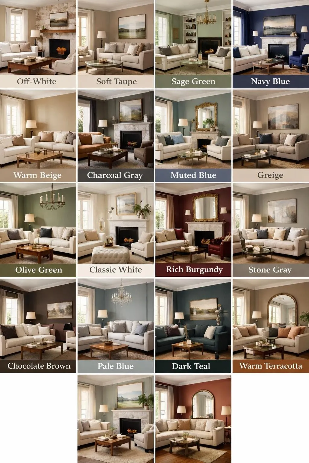
Small rooms usually benefit from lighter colors because they reflect more light and keep the space visually open. Bigger rooms can support deeper, moodier shades without feeling closed in. That is why so many small-space guides still favor warm white, cream, light beige, and pale greige, while larger rooms can confidently use olive green, navy, charcoal, or burgundy.
Best colors for small living rooms
- Warm white
- Soft ivory
- Light beige
- Pale greige
- Muted pale blue-gray
Colors for large living rooms
- Olive green
- Navy
- Forest green
- Charcoal
- Deep mushroom or clay-based neutrals
Colors for open-plan living rooms
Use a calm neutral base like warm white, greige, or beige, then layer stronger colors in art, cushions, and rugs. That keeps the entire space cohesive without making one area overpower another.
Best Living Room Colors by Style
| Style | Best colors | Design effect |
| Modern minimal | Warm white, soft gray, greige | Clean, calm, uncluttered. |
| Classic traditional | Ivory, beige, creamy off-white | Warm and timeless. |
| Organic modern | Mushroom, sage, olive, clay | Natural and layered. |
| Luxury moody | Navy, forest green, charcoal, burgundy | Rich, dramatic, intimate. |
| Coastal | Light blue-gray, soft sand, warm white | Breezy and relaxed. |
Designers are increasingly embracing warmer, more tactile interiors, which is why earthy greens and grounded neutrals are showing up more often in trend coverage for 2026.
How to Choose the Right Living Room Paint Color Step by Step
Step 1: Decide the room’s main job
Is the room for relaxing, hosting, reading, watching TV, or all of the above? A formal living room can handle a richer, moodier shade. A family room usually benefits from a more forgiving neutral.
Step 2: Study the natural light
Look at the room in the morning, afternoon, and evening. North light often needs warmth. Bright south light can handle stronger contrast. West-facing rooms often need balanced undertones to stay calm later in the day.
Step 3: Check your fixed finishes
Flooring, stone, tile, trim, fireplace surrounds, and wood tones all affect the final result. Design guidance repeatedly warns that undertone clashes are one of the most common paint mistakes.
Step 4: Choose a color family, not a random swatch
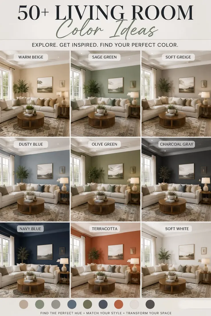
Start by choosing a family: warm white, beige, greige, green, blue-gray, or moody dark. Then narrow it down to one or two shades. That is far easier than testing ten unrelated colors.
Step 5: Test large samples on your own wall
Do not trust tiny chips. Paint large swatches, view them in daylight and lamplight, and compare them with your sofa, rug, curtains, and trim. Paint companies explicitly recommend sampling before committing.
Step 6: Pick the right finish
For most living rooms, eggshell or satin is the most practical choice because it gives a soft look while still being durable enough for everyday life. Sherwin-Williams specifically recommends eggshell or satin for living rooms.
Step 7: Use the room’s existing style as your guide
If your furniture is warm wood and soft fabric, warm neutrals or muted greens usually look best. If your room has crisp lines and a more modern feel, warm white or balanced greige can be ideal.
Mini summary:
The best paint decision is not made in a store. It is made in your room, with your light, your furniture, and your finish choices.
Comparison: Which Color Family Should You Choose?
| Color family | Best for | Strengths | Watch out for |
| Warm white | Bright, small, or flexible rooms | Open, clean, timeless | It can look stark if the undertone is wrong. |
| Greige | Most living rooms | Balanced, versatile, easy to decorate | Some greiges read cooler than expected. |
| Beige / mushroom | Cozy spaces | Warm, inviting, soft | Can feel flat if lighting is too dim. |
| Sage / olive green | Trend-forward rooms | Natural, grounded, stylish | Can look muddy if undertone clashes. |
| Blue-gray | Calm and airy rooms | Cool, balanced, elegant | Can turn icy in the wrong light. |
| Navy / charcoal / burgundy | Large or dramatic rooms | Rich, luxurious, intimate | Needs enough light and contrast. |
Budget-Friendly Options
Budget-friendly living room colors are usually the ones that are easiest to live with and hardest to regret. Warm white, soft beige, greige, and gentle sage are smart because they stay flexible if you change your sofa, rug, or curtains later. Benjamin Moore and Sherwin-Williams both emphasize sample testing and curated color tools, which can help avoid expensive repaints.
Best budget-friendly picks
- Warm white
- Light greige
- Soft beige
- Pale blue-gray
- Muted sage
Why they save money:
These shades are easier to decorate around, easier to sell later, and less likely to clash with future furniture purchases.
Premium / Luxury Options
Luxury living rooms usually feel special because of contrast, texture, and depth rather than bright color alone. Deep green, navy, charcoal, and burgundy create that richer mood, especially when paired with brass, walnut, velvet, linen, or stone. House Beautiful’s current coverage also supports dramatic jewel tones as a strong mood-setting move.
Best luxury-looking colors
- Forest green
- Navy blue
- Charcoal
- Burgundy
- Dark olive or moss
Luxury styling pairings
- Brass or aged gold lighting
- Walnut or dark oak furniture
- Linen curtains
- Textured rugs
- Matte or softly reflective finishes
Smart and Modern Design Trends for 2026
The strongest 2026 color story is warm and grounded. Design coverage points toward earthy greens, soft clay, mushroom, sand-washed beige, desaturated sky blue, ochre, and richer browns as the most current-feeling choices. Even white is shifting toward warmer, calmer tones in some trend reporting.
What is trending now
- Warm whites instead of icy whites
- Earthy greens like olive and moss
- Soft clay and terracotta-adjacent tones
- Mushroom and sand-washed beige
- Broad blue and burgundy accents
What is fading
- Flat, cool gray-heavy rooms
- Overly sterile whites
- Very bright, harsh, saturated walls without balance
Common Mistakes to Avoid
Recent designer guidance points to several paint mistakes that can quietly hurt a room’s look and value: assuming all whites are the same, ignoring lighting, ignoring undertones, choosing the wrong finish, and using clashing or overly saturated combinations without a plan.
Avoid these errors
- Picking paint from a tiny chip only
- Ignoring morning vs evening light
- Forgetting undertones in flooring and trim
- Using a finish that is too shiny or too flat
- Choosing a trendy color without checking the room context
One simple rule
If the wall color looks beautiful but makes the sofa, floor, or trim look wrong, the color is not right for that room.
Expert Tips Most People Ignore
Paint experts often say the same thing in different ways: the wall color is only part of the result. The room’s success depends on undertones, sheen, and how the color behaves in changing light. Sherwin-Williams also notes that eggshell or satin is generally a smart living room finish, which means the sheen should support the color rather than distract from it.
Tips that make a real difference
- Test at least two different whites, even if you think you already know your favorite.
- Put samples beside trim and flooring, not just on a blank wall.
- View the room with lights on and off.
- Use warmer shades in cool rooms.
- Use more balanced shades in bright rooms.
Best Living Room Color Combinations
| Main wall color | Best companion colors |
| Warm white | Taupe, walnut, black accents, soft beige |
| Greige | Brass, camel, cream, muted green |
| Olive green | Linen, tan, oak, warm white trim |
| Navy | Crisp white, walnut, brass, camel |
| Burgundy | Beige, dark wood, bronze, soft ivory |

Best Materials and Decor Choices That Support Your Wall Color
The wall color looks stronger when it is paired with the right materials. Warm neutrals often look best with wood, linen, wool, cane, stone, and brass. Darker colors look especially polished with velvet, leather, lacquer, matte black, and textured fabrics. Trend coverage across 2026 also shows a stronger preference for layered, tactile interiors rather than flat, one-note rooms.
Easy pairings
- Warm white → oak, boucle, black accents
- Greige → walnut, beige textiles, brushed brass
- Sage/olive → cane, linen, terracotta, aged wood
- Navy/charcoal → velvet, leather, polished metal
- Clay/burgundy → cream, bronze, natural fibers
Maintenance, Care, and Long-Term Value
Living room paint should still look good after daily life happens. That is why finish matters. Sherwin-Williams recommends eggshell or satin for living rooms because those sheens balance appearance and practicality. Paint experts also warn that poor paint choices can hurt perceived value, especially when lighting, undertones, and finish are ignored.
For long-term value, the safest colors remain warm neutrals and muted earthy shades. They age more gracefully than highly saturated or heavily trend-driven colors, especially if your decor changes over time.
Who Should Choose Which Color?
Best for you if you want a warm white
You like bright, calm, flexible rooms and change your decor often.
Best for you if you want greige or beige
You want a balanced room that feels safe, comfortable, and easy to style.
Best for you if you want sage or olive
You like natural, current, and slightly designer-forward spaces.
Best for you if you want navy, charcoal, or burgundy
You want a more dramatic, cozy, and high-end look.
Who should avoid ultra-dark colors?
People with very low light, very small rooms, or lots of mismatched undertones may find deep shades harder to control.
People Also Ask
Warm white and soft neutral shades are still the most flexible and widely recommended, but 2026 trend coverage shows stronger interest in olive green, clay, mushroom, and muted blue tones.
Light colors usually make a room feel larger because they reflect more light. Warm white, cream, pale beige, and light greige are the safest choices.
Yes. Greige remains one of the most useful living room colors because it bridges warm and cool spaces and works with many furniture styles.
Warmer colors usually work best in north-facing rooms because cooler light can make gray or blue undertones look dull. Beige, warm white, cream, and warm greige are strong options.
Paint large samples on the wall, check them in daylight and at night, and compare them with your flooring, trim, and furniture before buying full gallons.
Conclusion
The best living room Wall Color is the one that fits your room, not the one that looks best on a tiny paint chip. If you want the safest all-purpose choice, go with a warm white, soft beige, or balanced greige. If you want a more design-forward room, olive green, soft clay, blue-gray, navy, or burgundy can create far more depth and personality. The smartest choice is always the one that respects your light, your undertones, and the finish you use.
For TheRoomsArt.com, this topic is perfect for a pillar article because it can anchor multiple related posts on paint colors, living room styling, wall art, and room makeovers. That is the kind of content that builds trust, keeps readers on the page longer, and creates a strong topical cluster around modern home decor.
Legal disclaimer: Prices, materials, trends, and product availability may change over time depending on region, suppliers, and brands. Always verify dimensions, materials, and compatibility before purchase or renovation.
