
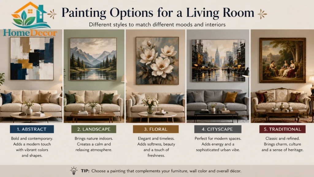
Introduction
Choosing the right Painting Options for a Living Room can completely change how your home feels. The same room can look calm, warm, elegant, modern, or dramatic depending on the color, finish, and lighting you choose. That is why this decision matters so much. A living room is not just a wall color project; it is a mood project, a style project, and often the first impression your home gives. Current design trends are moving toward warmer neutrals, earthy tones, and richer, more layered color stories, while official 2026 paint forecasts from major brands continue to highlight cozy, versatile shades that work in real homes.
This guide breaks everything down in a simple way. You will learn how to choose a paint color based on room size, light, mood, furniture, and finish. You will also see the best living room color families for 2026, budget-friendly ideas, premium looks, common mistakes, and practical steps that make the final result feel polished instead of random. The goal is simple: help you choose a living room paint color once, and choose it well.
What Are the Best Painting Options for a Living Room?
The best painting options for a living room are colors and finishes that support the room’s main job: relaxing, hosting, reading, watching TV, and spending time with family. In practice, that usually means a balance of comfort, durability, and visual harmony. Living rooms can handle more personality than bedrooms because they are social spaces, but they still need to feel welcoming enough for daily use. Design sources consistently point to light conditions, mood, and room function as the starting point.
The easiest way to think about it
A good living room paint choice should do three things:
- Make the room feel right.
- Work with the light you already have.
- Match the furniture and decor you are keeping.
That sounds simple, but it is exactly where many people go wrong. They choose a color they love in isolation, then discover it clashes with the sofa, looks too cold at night, or makes the room feel smaller than it is. The better approach is to design the wall color around the whole room, not just the paint chip.
Mini summary:
The best living room paint is not just “pretty.” It is the color that supports the room’s light, size, purpose, and style all at once.
Why Living Room Paint Matters More in 2026
In 2026, interiors are leaning away from flat, purely safe neutrals and toward warmer, more personal spaces. Official brand forecasts show a clear move toward versatile beige-browns, grounded earth tones, and deeper expressive shades. Sherwin-Williams’ 2026 Color of the Year is Universal Khaki, a warmer neutral, while Benjamin Moore’s 2026 Color of the Year is Silhouette AF-655, a rich espresso-charcoal tone. That tells us something important: 2026 living rooms are about warmth, depth, and livability rather than sterile perfection.
Broader design coverage also shows a continued interest in earthy palettes such as sage, olive, terracotta, camel, and moss, especially for rooms that should feel cozy and relaxing. At the same time, trend reporting continues to show growing interest in color blocking, color drenching, and bolder feature walls. The result is a living-room palette landscape that is more flexible than before: you can go soft, grounded, moody, or expressive as long as the whole room feels intentional.
Why does that matter for your article?
A strong pillar page should help readers navigate this shift. It should show:
- timeless choices that still look current,
- trend-led ideas that do not age fast,
- and practical rules for using color in real rooms.
How to Choose the Best Paint for Your Living Room
1. Start with mood
Before thinking about color families, decide how you want the room to feel. Color psychology is not magic, but it does influence the atmosphere. Cooler tones tend to feel calmer, while warmer tones feel more inviting and active. Better Homes & Gardens recently highlighted how color can influence stress, energy, and comfort, and design guidance from Architectural Digest also ties room color to mood and function.
Ask yourself:
- Do I want cozy and intimate?
- Do I want bright and airy?
- Do I want moody and elegant?
- Do I want a calm and flexible family life?
2. Check the light
Light changes paint more than most people expect. Natural light, artificial light, window direction, and even the time of day can shift how a color looks. Architectural Digest advises testing colors at different times because the same shade can look different depending on lighting conditions.
Simple rule of thumb:
- North-facing rooms usually need warmer paint.
- South-facing rooms can handle cooler or deeper shades.
- Dark rooms benefit from lighter or reflective tones.
- Bright rooms can support richer, more saturated colors.
3. Coordinate with furniture and flooring
Your paint color should support the sofa, rug, wood tone, curtain fabric, and wall art you already have. Experts recommend starting with an anchor object in the room, like a rug or artwork, and pulling the palette from that element so the space feels cohesive rather than forced.
Mini summary:
The easiest winning formula is mood + light + furniture harmony. When those three align, the color usually works.
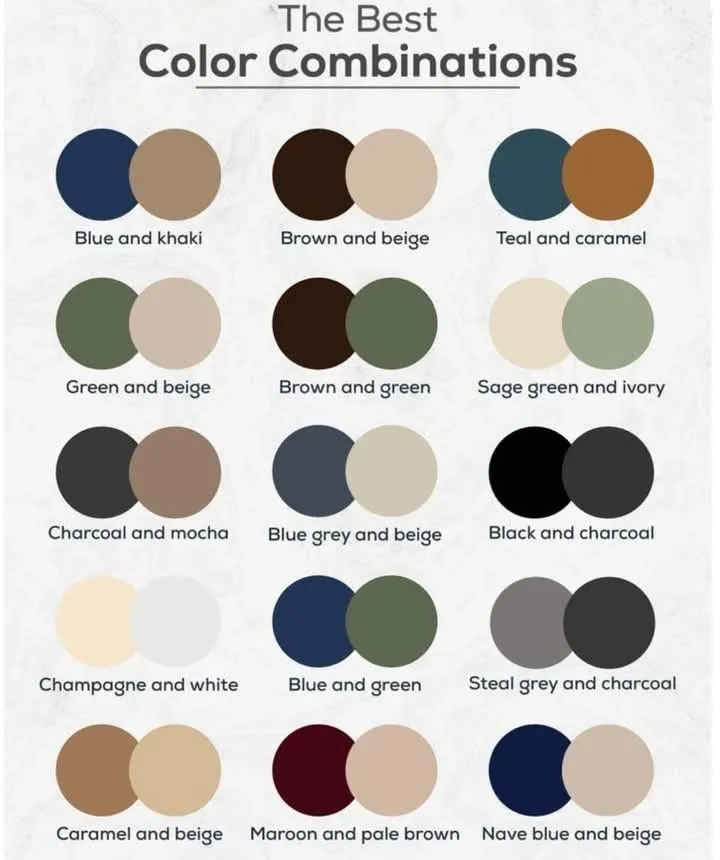
Best Painting Options for a Living Room by Style
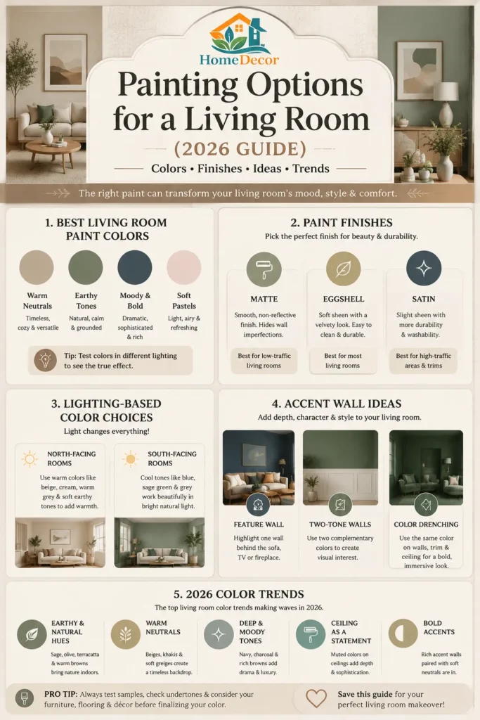
Warm neutrals
Warm neutrals are still one of the safest and smartest choices for living rooms in 2026. Think beige, greige, sand, oat, cream, mushroom, and soft khaki. These shades work with modern, transitional, traditional, and minimalist spaces. They also pair beautifully with wood, linen, leather, rattan, and warm metals. Official 2026 color direction from Sherwin-Williams and Benjamin Moore supports this warmer-neutral shift.
Best for:
- open-plan homes,
- rental-friendly updates,
- small living rooms,
- and people who want a timeless backdrop.
Earthy and nature-inspired tones
Sage, olive, clay, terracotta, moss, and muted brown-greens are extremely strong options right now. These colors feel grounded and are especially appealing in rooms designed for calm and comfort. Earthy palettes are also widely being used to create warmer, more human interiors.
Best for:
- cozy family rooms,
- homes with lots of natural texture,
- and rooms with plants, wood accents, or stone details.
Moody and bold colors
Deep navy, charcoal, forest green, espresso brown, and ink blue can make a living room feel dramatic and sophisticated. These colors work best when the room has enough light or when you want a cozy, enveloping effect. Benjamin Moore’s 2026 Silhouette trend shows how deep brown-charcoal shades are becoming more desirable in interiors.
Best for:
- larger living rooms,
- formal sitting areas,
- reading-room vibes,
- and accent walls.
Soft pastels
Soft blush, powder blue, muted lavender, and pale sage can bring lightness without feeling childish. The key is to keep the undertone soft and mature. Pastels work best when balanced with wood, Black Accents, stone, or neutral textiles.
Best for:
- airy apartments,
- feminine or romantic design styles,
- and rooms that need a gentle lift.
Best Living Room Paint Choices by Room Type
| Room Condition | Best Color Direction | Why It Works |
| Small room | Warm white, soft greige, pale beige | Keeps the room open and bright |
| Dark room | Warm cream, light khaki, soft sage | Adds warmth without feeling heavy |
| Large room | Olive, navy, espresso, deep brown | Creates intimacy and structure |
| Open-plan space | Greige, mushroom, khaki, muted taupe | Connects areas without visual chaos |
| Formal living room | Navy, charcoal, deep green | Feels polished and elegant |
| Rental/quick refresh | Warm neutral, off-white, muted gray-beige | Safe, flexible, easy to decorate around |
Practical guidance based on current paint and design recommendations. Light, function, and room size remain the key variables.
Accent Walls & Advanced Techniques That Actually Work
Feature walls
A feature wall can work well behind a sofa, fireplace, TV, or reading corner. The trick is to make the wall look intentional, not random. A darker wall can create depth, but it should connect to something else in the room, such as artwork, upholstery, or a rug. Some designers now prefer texture changes over color changes, but a painted feature wall still works when used thoughtfully.
Two-tone walls
Two-tone walls can help break up a tall or awkward room. A darker lower section adds weight, while a lighter upper section keeps the room feeling airy. This technique is useful in homes with wainscoting, paneling, or a clear architectural break.
Color drenching
Color drenching means painting the walls, trim, and sometimes the ceiling in the same shade. This trend creates a cohesive, immersive feel and is especially effective in moody living rooms, reading nooks, and spaces with strong character. Current trend coverage shows that color drenching remains part of the conversation for people who want more personality at home.
Mini summary:
Use accent techniques when they solve a design problem: add depth, create focus, or make a room feel more cohesive.
Paint Finishes That Elevate a Living Room
The finish matters almost as much as the color. Behr’s current interior sheen guide says eggshell is a strong choice for living rooms, while matte is also suitable for living room walls and gives a softer, low-luster look. Sherwin-Williams similarly notes that higher sheen reflects more light and draws attention to flaws, while lower sheen hides them better.
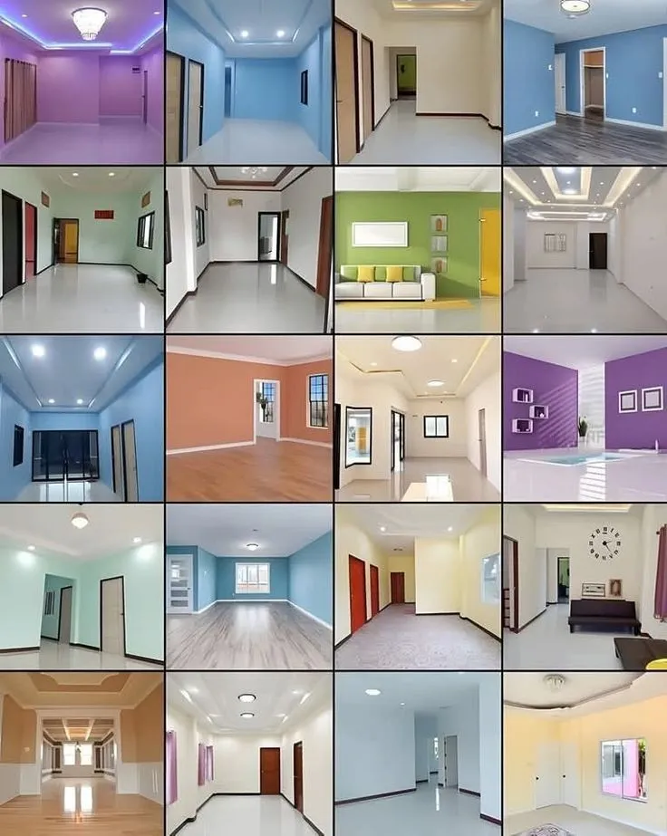
Living Room Paint Finish Comparison
| Finish | Look | Best Use | Pros | Cons |
| Matte | Soft, low reflection | Calm, modern walls | Hides imperfections, looks elegant | Less wipeable than shinier finishes |
| Eggshell | Slight soft sheen | Most living rooms | Balanced, versatile, popular choice | Still shows wear if the walls are rough |
| Satin | Noticeable soft shine | Family rooms, high-use walls | Easier to clean | Can show wall flaws more |
| Semi-gloss | Brighter reflection | Trim, doors, moldings | Durable and washable | Too shiny for most main walls |
| High-gloss | Very reflective | Special accents only | Dramatic and bold | Exposes every imperfection |
Behr specifically lists eggshell enamel as a good choice for moderate-traffic areas such as living rooms, while matte is also positioned for living rooms and other interior walls. That makes eggshell the safest default recommendation for most homes, with matte as the best option when you want a softer, more design-led look.
Best practical advice:
- Choose eggshell for most living rooms.
- Choose matte if the walls are smooth and you want a more refined look.
- Use semi-gloss for trim, doors, and built-ins.
Living Room Paint Ideas by Room Size and Light
Small living rooms
Small living rooms usually benefit from lighter colors because light shades bounce more light and keep the space from feeling boxed in. Warm whites, pale beige, soft greige, and muted pastels are all strong choices. Pair them with mirrors, slim furniture, and layered lighting for a more open effect.
Dark living rooms
If your living room lacks natural light, avoid icy white unless you want a very crisp modern effect. Warmer off-whites, cream, sand, and soft khaki usually perform better because they counter the coolness of a dim room. Stronger lamp lighting and warm bulbs also help the color feel richer.
Large living rooms
Large spaces can handle deeper color because they need visual weight. Navy, forest green, dark brown, or charcoal can make a big living room feel more inviting and less empty. The room should still have contrast through trim, artwork, textiles, or wood tone.
Low-ceiling rooms
To make a low ceiling feel taller, keep the walls lighter than the ceiling or use a tone-on-tone palette. A very dark ceiling can be dramatic in the right room, but it should be intentional and supported by the rest of the design. Painted ceilings are again part of current design conversations, especially when used to create atmosphere or continuity.
Guide to Choosing a Living Room Paint Color
- Identify the mood first.
Decide whether you want calm, cozy, elegant, airy, or dramatic. - Study the light.
Look at the room in the morning, afternoon, and evening. - Check your fixed elements.
Floor, sofa, rug, fireplace, curtains, and built-ins should guide the color. - Shortlist 3–5 shades.
Do not compare 20 colors at once. That creates confusion. - Test samples on multiple walls.
Place samples where light hits differently. - Watch them for at least one full day.
Many colors change after sunset. - Choose the right sheen.
Eggshell or matte usually works best for walls. - Paint trim and ceiling with intention.
A matching or contrasting trim color can change the whole room.
This decision process reflects the same practical advice repeated across authoritative color guidance: inspiration should come from the room itself, and lighting should always be tested before committing.
Comparison Section: Budget-Friendly vs Premium Living Room Paint Looks
Budget-friendly options
Budget-friendly does not mean boring. The smartest budget approach is to use one strong wall color, keep the finish simple, and build style through accessories. Warm neutrals, soft gray-beige, and pale sage can look expensive when paired with good lighting and clean trim. Houzz’s large gallery approach shows just how many styles can work from the same basic color families, which is why versatile paint is often the best value.
Premium/luxury options
Premium living room looks usually come from deeper colors, richer layering, and more deliberate finish choices. Think matte walls, sharp trim, color-drenching, tonal fabrics, and high-contrast art. Benjamin Moore’s 2026 palette is a strong example of this direction because it mixes rich depth with soft, layered supporting tones.
Premium look formula:
Deep or nuanced paint + matte finish + quality trim color + layered materials + restrained decor.
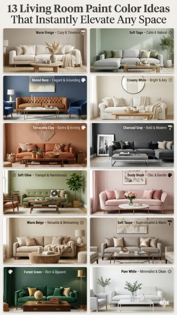
Best Color Combinations for a Living Room
Here are combinations that tend to work well:
- Warm khaki + ivory trim + oak furniture
- Sage green + cream sofa + brass accents
- Deep navy + White Trim + walnut wood
- Olive + linen curtains + black metal lamps
- Espresso brown + warm beige rug + textured artwork
- Soft blush + greige + natural wood
These combinations are effective because they create https://captrilo.com/category/captions/contrast without visual noise. They also reflect the broader 2026 move toward warmer neutrals and grounded natural colors.
Best Materials and Decor Choices to Pair with Wall Color
Paint always looks better when the room has the right supporting materials. In living rooms, the strongest pairings are usually:
- natural wood,
- linen and cotton,
- wool rugs,
- matte ceramics,
- metal accents,
- and framed wall art.
This is also where TheRoomsArt.com can build topical authority. Paint is only one layer of the room story. The wall color should connect to the sofa fabric, artwork, lighting, and even the books on the shelf. Industry guidance on choosing color cues from existing objects is especially useful here, as it makes the room feel designed rather than decorated randomly.
Smart and Modern Design Trends for 2026
The most relevant 2026 living room paint trends are not extreme. They are practical, emotional, and versatile.
1. Warm neutrals are back
Universal khaki, warm beige, and soft brown neutrals are strong choices for anyone seeking a safe yet modern base.
2. Earthy colors keep rising
Sage, terracotta, olive, moss, camel, and muted rust feel current because they connect to nature and comfort.
3. Deep tones feel more luxurious
Silhouette-style browns, charcoal, and dark green-blue shades are becoming more acceptable in everyday homes, not just high-end ones.
4. Color drenching and ceiling color stay relevant
These techniques remain strong when the goal is depth, mood, and a more architectural finish.
5. Monochrome layering is growing
Using shades, tints, and tones from one color family creates calm and sophistication, especially when texture varies.
Common Mistakes to Avoid
- Choosing a color only from a tiny paint chip.
- Ignoring undertones.
- Testing only one wall.
- Using too much cool gray in a dark room.
- Picking a finish that shows too many flaws.
- Forgetting about the sofa, rug, and trim.
- Following a trend without checking whether it fits the room.
The biggest mistake is treating paint like the last step instead of part of the whole design. Good interiors usually start with coordination, not guesswork.
Expert Tips Most People Ignore
Use the room’s “anchor object.”
Choose a rug, Art Piece, or a fabric swatch first, then build the paint color from that. This makes the whole room feel coherent.
Look at the ceiling, too
A ceiling color can subtly change the room’s proportions and mood. A soft tint can make the room feel more finished and custom.
Do not overuse pure white
Many living rooms need warmth, not just brightness. A soft off-white often looks more livable than a stark, cold white.
Use trim as a design tool
Trim can stay crisp and light, or it can match the wall for a more seamless look. Semi-gloss is often used for trim because it is more durable and visually distinct.
Maintenance, Care, and Long-Term Value
A good living room paint color should still look good two years later. That means choosing a color you can live with, not just one that looks good on a trend board. It also means choosing a finish that cleans easily enough for your lifestyle. Behr and Sherwin-Williams both emphasize that sheen affects durability and how much surface imperfections show, which is important in a room that gets regular use.
For long-term value:
- use durable finishes on high-touch areas,
- Choose flexible colors for large wall surfaces,
- and reserve bold choices for places that are easy to refresh later.
Who Should Choose This Style
This kind of thoughtful living room paint approach is best for:
- homeowners who want a polished, lasting result,
- renters making careful style upgrades,
- families who need a comfortable but durable room,
- and design lovers who want their living room to feel intentional.
Who Should Avoid This Style
A highly curated, color-driven living room may not suit:
- people who want zero maintenance,
- Anyone unwilling to test samples,
- Or those who change decor every few months and need a very neutral base.
In those cases, a soft, warm neutral is usually the safest choice.
People Also Ask
The best color is the one that fits your light, furniture, and mood. In many homes, warm neutrals, soft khaki, greige, and muted earth tones are the safest and most flexible choices.
Eggshell is the most versatile default for most living rooms because it adds a soft finish and good durability. Matte works beautifully, too, if you want a softer, more designer look and your walls are in good condition.
Yes, especially in larger rooms or rooms you want to feel cozy and elegant. Deep blues, greens, and brown-charcoal shades can make a space feel more intimate when balanced with the right lighting and decor.
Warm neutrals, earthy greens, brown-based neutrals, and deeper moodier tones are all strong directions for 2026. Brand forecasts and trend reporting point to a more grounded, layered color palette.
Choose warmer tones rather than icy cool ones, and test samples in both daylight and evening light. Warm off-whites, khaki, cream, and soft beige often work better in darker rooms.
Conclusion
The smartest living room Paint Choice is the one that fits the room, the light, and the way you actually live. For most homes, warm neutrals and earthy tones are the safest long-term choice in 2026, while deeper, moody colors can create a richer, more dramatic look in larger or brighter spaces. Eggshell remains the most practical finish for many living rooms, with matte as a stylish alternative when the walls are smooth, and the goal is a softer look.
If you are writing for TheRoomsArt.com, this topic is ideal for homeowners, renters, and decor lovers who want a room that feels current without becoming dated too quickly. Build the article around useful choices, not just pretty pictures, and it will naturally feel more trustworthy, more helpful, and more rank-worthy. Explore more room inspiration articles on TheRoomsArt.com, and use this guide as the starting point for your own living room transformation.
Legal disclaimer: Prices, materials, trends, and product availability may change over time depending on region, suppliers, and brands. Always verify dimensions, materials, and compatibility before purchase or renovation.
