Introduction
Choosing the right Living Room Wall Colors can transform a home faster than almost any other design decision. A single coat of paint does more than cover plaster. Light shifts its mood – morning sun softens cool tones, while dim corners deepen warmth. Size tricks happen quietly; pale hues stretch walls outward, darker ones pull them inward. Furniture talks back to walls, demanding harmony. Floors anchor everything, their grain or sheen clashing or calming nearby colors. What feels cozy in a loft might feel dull in a basement. Balance matters most – not just what you like, but how pieces respond under real daylight, at night, when guests arrive.
Picture walking into a space that just feels right. Picking a color becomes clearer when you see how light shifts through your windows. Most overlook how gray changes at dusk – suddenly, walls feel cold. A hue might look fresh now, but fade against next year’s trends. Think about texture under morning sun instead of chasing what magazines show. Mistakes happen when eyes ignore the base tones hiding beneath glossy swatches. Balance keeps things from feeling outdated fast. Lasting choices grow from watching how warmth spreads across floors by noon.
Living Room Wall Colors: The Ultimate 2026 Guide to Stylish, Balanced, and Timeless Interiors
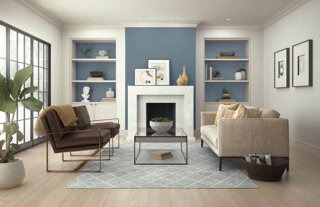
Fresh off the design radar, 2026 leans hard into warmth without shouting about it. Instead of sharp contrasts, think cozy undertones – mushroom grays whisper through walls, while reds pull from soil rather than fruit. Browns aren’t flat – they carry depth, almost like wet bark under morning light. Blues show up quietly, more sky at dusk than midday. Greens stay close to the ground, nothing too leafy or loud. Even khakis lose their stiffness, going softer, like fabric worn smooth over time. Leading the charge, Benjamin Moore drops Silhouette AF-655 – a deep blend of espresso and charcoal that feels heavy in a good way. Meanwhile, Sherwin-Williams builds around Universal Khaki, not too yellow, not too pink, just steady. Over at BEHR, they’re watching mushroom shades spread quietly, paired with smoky jade creeping in like fog across stone.
A fresh look at color choices starts here, peeling back generic tips to reveal something more practical. Instead of just mood boards and trends, there’s a clear way to decide. Step by step, light levels guide one choice, while furniture textures shape another. Room dimensions play a role, too, setting boundaries for boldness or softness. Each factor ties into the next, building confidence before any paint gets bought.
Why Living Room Wall Colors Matter So Much
Out in the open, the living room usually sees the most action at home. People settle here to unwind, chat, flip through books, catch shows, host others, or just sit still. So the shade on the walls isn’t only about looks – it quietly shapes how the place feels: relaxed, tight, bright, snug, serious, or lively. Sometimes it even shifts the mood without anyone noticing.
Brighter hues tend to open up a space, bouncing light around so the walls seem farther apart. Because they let the eye wander freely, ceilings appear higher than they really are. On the flip side, deeper pigments pull everything inward – drawn close like embers in a fireplace. Think forest floor, aged leather, or storm clouds held just before rain. These choices anchor a room instead of letting it float away on brightness alone. Warmth hides in their shadows, not despite but because of the lack of glare. They carry weight without shouting, present but never overwhelming. Mood builds slowly here, layer by quiet layer.
Most folks pick a hue using just a small swatch or their device display – then think they’re set. Yet once lit by morning sun, soft bulbs, or surrounded by grainy oak, cool tile, woven cloth, or brushed steel, the same tint shifts completely. What seemed smooth and warm at noon might expose hints of rose, moss, butter, or fog later. So, trying it straight onto drywall makes sense. Because walls change everything.
The color on the living room walls shapes how the room feels overall. When it misses the mark, high-end pieces might seem off despite their cost. Get it right, though, and basic furnishings gain a sense of purpose. Even minimal decor finds balance without trying too hard.
What Shapes the Best Living Room Wall Colors in 2026
Out of nowhere, soft, earthy tones began taking center stage by 2026. Cold grays, once everywhere, started fading like old photographs in sunlight. Warmth matters more now – colors breathe easier alongside furniture, walls, mornings. Paint companies aren’t chasing bold statements anymore; they’re leaning into hues that age quietly. Long-lasting isn’t just for materials – it’s become a shade, a mood, a choice. Balance shows up not in symmetry, but in how light rests on a surface mid-afternoon.
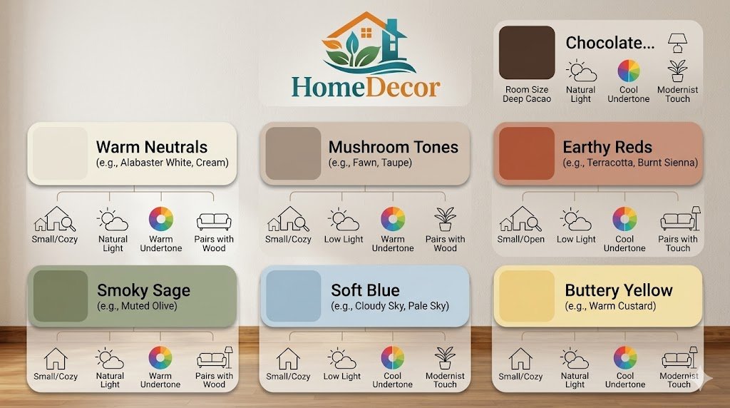
Earthy reds and terracotta-inspired tones
Red isn’t shouting here. By 2026, it leans quite more toward earth than flame. Picture old bricks kissed by sun, soil after rain, spices left in shadow. Such tones wrap a space like afternoon light, never crowding the corners. Wood with golden veins finds its match nearby. So do off-white fabrics that breathe easily, rough-woven baskets, soft metal glints. A room can hold both strength and hush at once.
Brown-chocolate and charcoal-brown shades
Brown shades dive deep into quiet elegance. This shift shows up clearly in Benjamin Moore’s Silhouette AF-655, where dark meets depth without losing warmth. Instead of standing out, it settles in – like something familiar yet refined. Warmth returns through choices like Sherwin-Williams’ Universal Khaki, which ages well instead of fading fast. Not loud, never flashy, these colors grow stronger the longer they stay.
Mushroom neutrals and modern khaki
Starting with soft earth tones, BEHR’s 2026 collection leans into mushroom-like hues touched lightly by greige. Instead of stark white, these colors bring warmth without shouting as brighter choices might. Matching them to different kinds of furniture feels natural rather than forced. Because they shift well between moods and materials, they suit spaces meant to stay current yet calm.
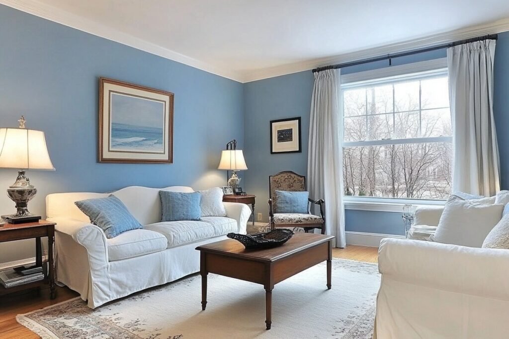
Soft blues and blue-gray tones
Peace settles in when soft blue fills a space, offering quiet depth without emptiness. Pale tones breathe easily, light and open like morning air through a half-open window. Misty blue-gray keeps things fresh but never cold, avoiding that too-tight, unused feeling. Rooms painted this way slow the eye, giving rest between motion and stillness elsewhere in the home.
Soft yellow and buttery warmth
Warm yellow tones can be incredibly effective in rooms that need more sunlight and optimism. Gentle butter shades, pale wheat, or barely-there golden tones can make a room feel cheerful and inviting without becoming overly bright. They work especially well in rooms that need a touch of brightness.
Grounded greens and smoky sage
Muted greens continue to thrive because they sit in the sweet spot between neutral and color. Smoky sage, olive, moss, and muted jade all feel stable, restful, and organic. They connect the room to nature and work especially well with wood, stone, and natural textiles.
Best Living Room Wall Colors by Room Size, Lighting, and Style
The smartest way to choose a wall color is to match it to the room’s actual conditions. A shade that looks beautiful in a large sun-filled living room may feel too heavy in a compact apartment. Likewise, a color that seems understated on a sample card may appear much stronger once it covers all four walls.
| Room condition/style | Best wall color families | Why they work | Best paired with |
| Small living room | Warm white, ivory, pale blue, soft greige | Helps the room feel brighter and more open | Light wood, mirrors, slim furniture |
| Large living room | Chocolate brown, deep green, dusty blue, earthy red | Adds intimacy and definition | Layered lighting, textured rugs, bold art |
| North-facing room | Warm neutrals, cream, beige, taupe | Balances cooler daylight | Walnut, brass, linen |
| South-facing room | Soft blue, sage, khaki, muted terracotta | Softens strong sunlight | White trim, natural fibers |
| Modern minimalist | Warm white, mushroom, khaki, soft gray | Clean but not cold | Matte finishes, black accents |
| Classic/traditional | Deep brown, olive, cream, navy-blue gray | Feels timeless and refined | Wood furniture, molding, framed art |
| Cozy Scandinavian | Off-white, pale sage, dusty blue, soft beige | Keeps the room airy and calm | Light oak, boucle, wool textures |
| Luxury/statement space | Eggplant, charcoal blue, rich brown, earthy red | Adds drama and depth | Velvet, brass, stone, art lighting |
Modern Minimalist Living Room Wall Colors
Minimalist rooms work best when they feel warm and intentional rather than icy or unfinished. A stark white living room can look beautiful in photographs, but in real life, it may feel too flat or too sterile. A softer white, muted mushroom, or light greige usually feels much more approachable and livable.
Good minimalist wall colors include:
- Warm white
- Mushroom beige
- Soft gray with warmth
- Pale khaki
- Light greige
These colors keep the room simple while still giving it personality and depth. They allow furniture, art, and texture to become more visible without creating visual noise.
In minimalist settings, the goal is not to eliminate warmth. It is to reduce clutter while keeping the room emotionally comfortable. That is why warm neutrals are becoming more dominant in the current interior direction.
Classic and Traditional Living Room Wall Colors
Traditional living rooms usually look best with colors that support molding, trim, wood finishes, classic furniture, and symmetrical layouts. Deep brown, olive, cream, and warm beige all work very well in these spaces. These tones lend themselves to timeless elegance rather than temporary trendiness.
Excellent choices for traditional spaces include:
- Chocolate brown
- Creamy ivory
- Deep olive
- Soft taupe
- Muted navy-gray
These shades create a setting that feels composed, balanced, and long-lasting. They also complement framed art, heirloom furniture, and architectural detail.
Traditional spaces benefit from colors that do not compete with the room’s structure. Instead, they support the room’s character and allow the craftsmanship to stand out.
Scandinavian and Cozy Living Room Wall Colors
Scandinavian interiors usually rely on light, soft, natural tones. The purpose is to keep the room airy and bright while still maintaining warmth. This style works especially well when the walls provide a quiet visual foundation that lets natural textures do the rest of the work.
Best shades for this style include:
- Off-white
- Pale sage
- Dusty blue
- Soft beige
- Light greige
These colors look beautiful with light oak, boucle fabric, wool throws, and simple, clean silhouettes. They are ideal for anyone who wants a restful environment that feels calm but not cold.
The Scandinavian approach is less about perfect white walls and more about creating serenity through subtle tonal harmony. A living room in this style should feel easy, breathable, and soft around the edges.
How to Choose the Right Living Room Wall Colors
The simplest way to choose a wall color is to follow a clear process rather than relying on guesswork. This approach reduces costly mistakes and helps you choose a shade that works in your actual home, not just on a sample strip.
Study your light
Look at your living room in the morning, afternoon, and evening. A color can look warm and inviting during the day, but flat or muddy at night. Lighting changes everything.
Observe:
- How much Natural Light does the room get?
- Whether the light is cool or warm
- How the room looks under lamps and ceiling fixtures
- How shadows move across the room during the day
A sample that looks perfect in the morning can feel surprisingly different after sunset. That is why testing under multiple conditions matters so much.
Check the room direction.
The direction your living room faces affects the type of light it receives.
- North-facing rooms often receive cooler daylight, so warmer colors usually help soften the space.
- South-facing rooms generally receive generous daylight, which means both light and deeper shades can work.
- East-facing rooms often have bright but gentle morning light.
- West-facing rooms often gain stronger, warmer light later in the day.
When a room gets strong sunlight, warm gray and greige are often useful because they stay adaptable throughout the day. They are forgiving, elegant, and easy to pair with many finishes.
Watch the undertones
Undertones are where most paint mistakes happen. Beige, cream, white, and gray are not truly neutral in the same way. They may be pink, yellow, green, blue, or taupe. A color that appears soft in the store can reveal a surprising undertone once it is painted on a full wall.
That is why larger paint samples are so valuable. Small chips rarely show the full behavior of a color. A real wall sample gives you a more accurate view of how the shade interacts with your home.
Match the wall color to your furniture and floor
Wall color should support the room, not fight against it.
- Warm wood pairs beautifully with cream, mushroom, sage, taupe, and earthy red.
- Dark wood pairs well with ivory, dusty blue, soft khaki, and warm gray.
- Metal and glass furniture often work best with warm white, pale blue, or greige.
- Bright or colorful décor usually needs quieter walls so the room does not become visually crowded.
A room feels more polished when the wall color and the furnishings share a common temperature or tonal language.
Test before painting the whole room
Paint a large sample on more than one wall. Check it in daylight and artificial light. Look at it beside your sofa, rug, curtains, trim, and floor. A true decision should be made in the environment where the color will actually live.
This step may seem slow, but it prevents repainting later. The more carefully you test, the more likely you are to choose a color that remains satisfying long after the novelty wears off.
Color Combinations That Always Work in Living Rooms
A living room rarely succeeds through wall color alone. The best interiors use color as part of a broader palette that includes furniture, textiles, lighting, artwork, and surface finishes. The most effective rooms feel coordinated rather than overdesigned.
Safe and stylish combinations
- Warm ivory + walnut wood + brass
- Soft greige + sage green + linen
- Dusty blue + white trim + light oak
- Mushroom beige + charcoal accents + black frames
- Earthy red + cream upholstery + warm wood
- Deep brown + off-white ceiling + natural woven textures
These combinations are reliable because they balance warmth, contrast, and material variety.
Best combinations for a small living room
For a small room, keep the wall color light or medium-light. Warm whites, pale blues, and soft greige reflect light and help the room feel more open. They also create a cleaner backdrop for compact layouts.
Small rooms often look best when there is some softness between surfaces. Too much contrast can make a space feel choppy, while a gentle palette helps it flow.
Best combinations for a large living room
Large living rooms can handle deeper colors much better. A deep brown or charcoal-blue wall can create a sense of intimacy and structure, especially when balanced with lighter trim, layered lighting, and textured rugs.
A spacious living room is often improved by richer wall colors because they reduce the feeling of emptiness. Instead of looking bare, the room begins to feel collected, grounded, and deliberate.
Living Room Wall Colors by Budget
Paint is one of the most affordable ways to update a living room, but the smartest budget choice is not necessarily the cheapest or trendiest one. The best value comes from choosing a shade that works with what you already own.
Budget-friendly approach
Choose:
- Warm White
- Greige
- Soft beige
- Pale blue
- Muted sage
These colors are easy to pair with existing furniture and are less likely to feel outdated quickly. They also fit the 2026 preference for practical, enduring neutrals.
Budget-friendly colors are especially useful when you want the room to look fresh without requiring a full furniture replacement.
Premium or luxury approach
Choose:
- Chocolate brown
- Earthy red
- Deep olive
- Charcoal blue
- Aubergine or plum
These richer colors work best when paired with luxury materials such as velvet, boucle, walnut, marble, brass, and layered lighting. A darker paint color becomes more compelling when the finishes around it feel equally thoughtful.
Luxury wall colors do not need to feel loud. In many cases, their strength lies in restraint, depth, and material richness.
Common Mistakes to Avoid When Choosing Living Room Wall Colors
Many paint regrets happen because the color was selected without enough context. A shade can look excellent in one setting and completely off in another. The problems usually come from ignoring the room’s real conditions.
Mistakes that cause paint regret
- Choosing a color from a phone screen only
- Ignoring undertones
- Using a dark color in a weak-light room
- Matching the wall color to only one piece of furniture
- Painting trim, walls, and ceiling the same dark tone without planning contrast
- Following a trend without checking whether it suits the room
The most successful living rooms are not built on impulse. They are built through observation, testing, and proportion.
A color that feels exciting for a moment may become tiring over time if it does not suit the room’s architecture, lighting, or materials.
Pros and Cons of Using Bold Wall Colors in the Living Room
Bold living room colors can look stunning, but they work best when the space has enough light, enough contrast, and enough texture to support them.
Pros
- Creates instant personality
- Can make the room feel more luxurious
- Helps define Focal Walls and key architectural features
- Works beautifully in large or well-lit rooms
- Makes simple furniture look more intentional
Cons
- Can overpower small or dark rooms
- Requires better lighting planning
- Makes undertone issues more visible
- Can be harder to change later
- Needs careful balancing with décor and trim
Deeper wall colors are more appealing in 2026 than they were during the cold-gray era, but they still need warmth and contrast to feel inviting. Without those supporting elements, bold color can become too intense.
The best bold rooms do not feel heavy. They feel layered, tailored, and comfortable.
Maintenance, Care, and Durability Tips
A beautiful wall color should also be practical. Living rooms are high-use spaces, so the finish and upkeep matter as much as the shade itself. Good color should be paired with a finish and maintenance routine that keeps the room looking clean and fresh.
Practical care tips
- Use a finish that can handle cleaning in active homes
- Keep leftover paint for touch-ups
- Clean marks quickly before they set
- Recheck color after changing curtains, rugs, or lamps
- Repaint feature walls sooner if sunlight causes fading
A durable wall color should not only look good on day one. It should continue to perform after daily wear, changing seasons, and shifts in décor.
Durability tip for long-term style
Choose a shade that will still work if your furniture changes later. This is one reason warm neutrals, soft blues, mushroom tones, and grounded greens are so strong in 2026. They are versatile, adaptable, and less dependent on a single trend cycle.
A room that ages well usually begins with a wall color that has range.
Smart, Modern, and Future-Ready Living Room Wall Ideas
Living rooms are becoming more layered, more personalized, and more flexible. Instead of using one flat color everywhere, many homes now combine paint with architecture, texture, and tonal contrast.
Smart ideas to try
Two-tone wall treatment
Use a lighter shade on the upper section and a deeper grounded tone below. This adds visual interest while keeping the room balanced.
Feature wall behind the sofa
Use charcoal blue, earthy red, deep green, or chocolate brown on one wall to create a strong focal point. This works especially well when the rest of the room remains quieter.
Color + texture combination
Pair paint with timber slats, molding, limewash-style texture, or subtle paneling. Texture makes color feel more dimensional and custom.
Lighting-aware design
Choose colors that look attractive in daylight and in warm lamp light. A good living room color should perform well across the full day.
Season-proof palettes
Pick shades that work with summer linens and winter textures. That allows the room to feel relevant all year instead of only in one season.
This approach suits both small apartments and larger homes because it emphasizes balance rather than chasing a temporary trend.
Quick Pro Tips for Better Results
A few simple habits can improve the outcome dramatically.
- Always test a sample on more than one wall.
- Choose the wall color after deciding on the sofa and rug.
- Use warm neutrals if the room feels cold or underlit.
- Use deeper colors only when you have enough light and contrast.
- Treat wall color as part of the whole room, not a separate decision.
Small decisions made in the right order usually lead to a much better result than rushed paint choices.
FAQs About Living Room Wall Colors
Light colors such as warm white, ivory, pale blue, soft beige, and light greige usually make a living room feel larger because they reflect more light and create a more open impression. Benjamin Moore describes light paint colors as bringing brightness, clarity, and airiness.
The strongest 2026 directions are earthy red, mushroom neutrals, warm khaki, smoky green, soft blue, deep brown, and buttery yellow. These shades reflect the broader color direction seen in Benjamin Moore, Sherwin-Williams, and BEHR palettes for the year.
Yes, especially in large rooms, well-lit rooms, or on a feature wall. Dark colors such as charcoal blue, deep green, chocolate brown, and aubergine can feel rich and intimate when balanced with lighter trim and layered lighting. The 2026 palette direction shows that deep colors can be elegant when used thoughtfully.
Warm whites, greige, beige, pale blue, blush, and soft sage are strong choices for darker rooms because they reflect light and keep the space from feeling heavy. Light, airy shades are especially useful when a room needs more brightness.
Test samples in daylight, evening light, and artificial light. Compare them against your flooring, sofa, curtains, and trim. Use larger samples and observe them at different times of day so you can see how the color truly behaves.
Conclusion
Choosing the right Living Room Wall Colors is one of the most effective ways to transform your space without a full renovation. Start with how sunlight moves through the space. Maybe soft grays open things up, while deep greens add quiet depth. Light changes everything – watch how it shifts across walls from morning to night. Furniture colors matter just as much as paint. Think about what hue helps your sofa stand out or makes shelves look balanced. Some rooms need airiness, others thrive on closeness. A dusty blue might stretch tight corners, whereas a rust tint pulls high ceilings down gently. Match the mood you want, not trends. Finish by stepping back, eyes half closed – does it hum quietly, feel settled? That is when it works.
White and beige stay strong. Yet green pulls attention now. Blue slips in quietly beside it. Charcoal makes a bold move without shouting. Options stretch wide, no matter your taste or wallet size. Think through choices before painting walls. Pros suggest matching shades to the room’s purpose. A bedroom calms one way. A kitchen wakes up another. Balance comes from pairing hues with light and furniture. Mistakes fade when planning leads. Feel finds its place when colors reflect who you really are.