Introduction
Choosing the right Sitting Room Wall Colours can completely transform the atmosphere of your home. A single paint swatch tells only part of the story. When held up on its own, it can’t show how shade shifts across large surfaces. Light changes everything – morning versus evening, natural versus artificial. Try brushing some directly onto the wall instead. Different sides of the room reveal new moods in the hue. Furniture nearby alters perception, too. Big brands agree: real results come from seeing colour live. Watch how it interacts before deciding. That moment when sunlight hits it just right? That matters most.
Start by picking three to five tones near your ideal shade. Try these out when the sun rises, at midday, then again as it sets. Hold each next to your couch, drapes, floor coverings – see how they sit together. When you can, brush swatches across different walls, letting light and dark areas show their effect. A little time spent now might prevent a costly error later.
Warmth wins in 2026, as top paint makers shift toward softer, more earthy feels. Not just neutral but alive – Behr mixes in lively pops, gentle pinks, blues like morning light, plus deeper, cooler tones that settle the eye. Meanwhile, Benjamin Moore builds worlds with colour, favouring depth, texture, and quiet harmony across its line-up. Their chosen shade for the year? A dark brown called Silhouette AF-655 – one that whispers more than shouts, blending roasted richness with a hint of greyed black. Even bold choices this year feel rooted, calm, never flashy.
What Makes Sitting Room Wall Colours So Important?
Your living area usually sets the mood, where folks unwind or meet up, showing off what your house is really like. That means wall shades here are doing more than just pleasing eyes. They shape whether the space seems calm or lively, wide or close. Go light and quiet with colour, the walls seem to step back, leaving breathing room. A gentle warmth might pull you in, like a quiet hello. Cool hints slip through the space, leaving air that feels light, almost rinsed. Deep tones settle into corners, bringing weight without words. What surrounds you shifts how you sense the place – colour acts, not just sits.
A bad shade might shrink the space instead of opening it up. Dullness creeps in when hues clash without harmony. Mismatched tones tangle with furniture like rugs, sofas, and even window frames. Light shifts everything – morning versus evening changes the look completely. Undertones whisper beneath surfaces, affecting how big or cosy a room seems. Pick something too cold, the area feels distant; too warm, and it presses in. Mood matters just as much as measurement. Experts at major paint brands point out that subtle blues or soft yellows shift perception quietly. Size plays tricks depending on which tint holds the walls.
How Colour Influences Mood
Bathed in warmth, shades like beige or terracotta welcome you without trying too hard. Homes looking lived-in, maybe even a little worn, lean into tan and soft brown for comfort that doesn’t shout. Instead of buzzing energy, cool tones – say, sage or quiet blue – drift through rooms like open windows on still mornings. Green sits back, relaxed, doing little but changing how light moves across walls. Neutral palettes stick around not because they’re exciting, but because they let everything else breathe.
Deep tones step forward when presence matters, adding depth where lighter ones would fade. Warm shades spark liveliness, Benjamin Moore points out, whereas cooler ones often create a sense of ease. Excitement follows hot tones, says Sherwin-Williams, just as stillness trails behind icy hues. A room may feel alive under reds, yet settle into quiet beneath blues. Energy moves through oranges and yellows; meanwhile, greens and lavenders let tension fade.
Warm shades can shape how people feel when they talk in a shared space. Because of this, choosing hues carefully makes a difference in lounges. Cool tones might suit a corner meant for slowing down. Where formality fits, soft greys or deep blacks often hold their ground. On one hand, paint isn’t just a surface cover. Instead, it shapes how the space feels from the start.
How Lighting Changes the Look of Paint
Morning sun might make your chosen hue feel warm, yet by afternoon, it could seem dull. That gentle grey in the store? Indoors, under ceiling bulbs, it turns flat or lifeless. As daylight shifts hour to hour, walls take on different moods entirely. Even seasons play a role – winter light gives rooms a hushed tone compared to summer’s glow. Experts like Farrow & Ball point out these subtle shifts matter more than swatch names suggest. According to BEHR, actual room conditions redefine every pigment, making test patches essential before committing.
Light changes depending on which way a window points. North brings gentle, cool brightness – here, warm shades tend to feel right. South fills spaces with bold sunlight, making calm or richer hues stand out well. Morning warmth fades fast in east spots, shifting toward shade by nightfall. Late sun loves west walls, wrapping them in golden tone when afternoon winds down. One room might make a shade seem warm, while another pulls out its cool tones. Light hits walls differently depending on which way the windows face – this shapes how colours appear.
Top Sitting Room Wall Colour Trends for 2026
Warm Neutrals
Off to a gentle start, warm neutral hues hold steady as top picks for living room walls in 2026. Greige leads the way, followed by cosy ivories, mushroom beiges, almond creams, oat-like whites, and subtle nudes. What makes them click is their quiet elegance – never chilly, yet always open-armed. Behr’s lineup for next year wraps fully into these tones, whereas Benjamin Moore opts for earthy balance, rooted but never dull.
Imagine walls that don’t shout but still hold your attention – warm neutrals do exactly that. These tones slip quietly into modern settings, yet feel just as natural beside wooden beams or vintage frames. A compact bathroom? They open it up. A sun-drenched loft? They soften the glare without fading into the background. Furniture stands out instead of competing, since these shades never hog the spotlight. Even when light shifts through the day, they stay balanced – not too cold, not too loud. Pick any space, any time, and they seem to belong.
Earthy and Nature-Inspired Colours
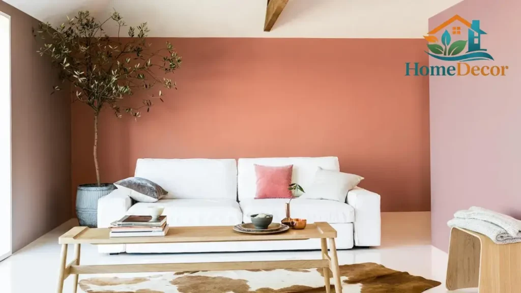
Homeowners keep picking colours that seem rooted in nature – earthy choices just feel simpler to live alongside day after day. Olive green shows up often, along with clay and terracotta; muted mustard joins warm tan, cocoa brown, and soft moss, too. Deep jewel-like hues appear next to steady earth tones in BEHR’s 2026 selection. Thoughtful colour makes its way back into Benjamin Moore’s vision for the coming year. Wood meets these shades without effort, much like linen, leather, stone, brass, or anything loosely woven.
A calm living space often finds its match in grounded tones. Though not flashy, these shades settle easily where comfort matters most. When wooden furniture warms the corners, or linen drapes catch soft light, the hues simply fit – no effort needed. Whether the style leans into handmade charm or untouched textures, the colour choice follows along quietly. Even if the look grows over time, layer by layer, earth-based pigments stay connected, never seeming out of place.
Muted Pastels
Soft pastels are another important trend for 2026, especially for homeowners who want a sitting room that feels fresh rather than heavy. Dusty blue, pastel sage, blush beige, misty lavender, and pale green can bring softness and light while still adding personality. BEHR’s 2026 palette includes soft pastels, which shows that gentle colour is still very relevant in modern interiors.
Muted pastels are useful in medium and small sitting rooms because they reflect light well and help the space feel more open. They are also a strong choice for interiors that need colour but not intensity. When paired with cream textiles, light wood, and simple furniture, muted pastel walls can feel calm, polished, and quietly stylish.
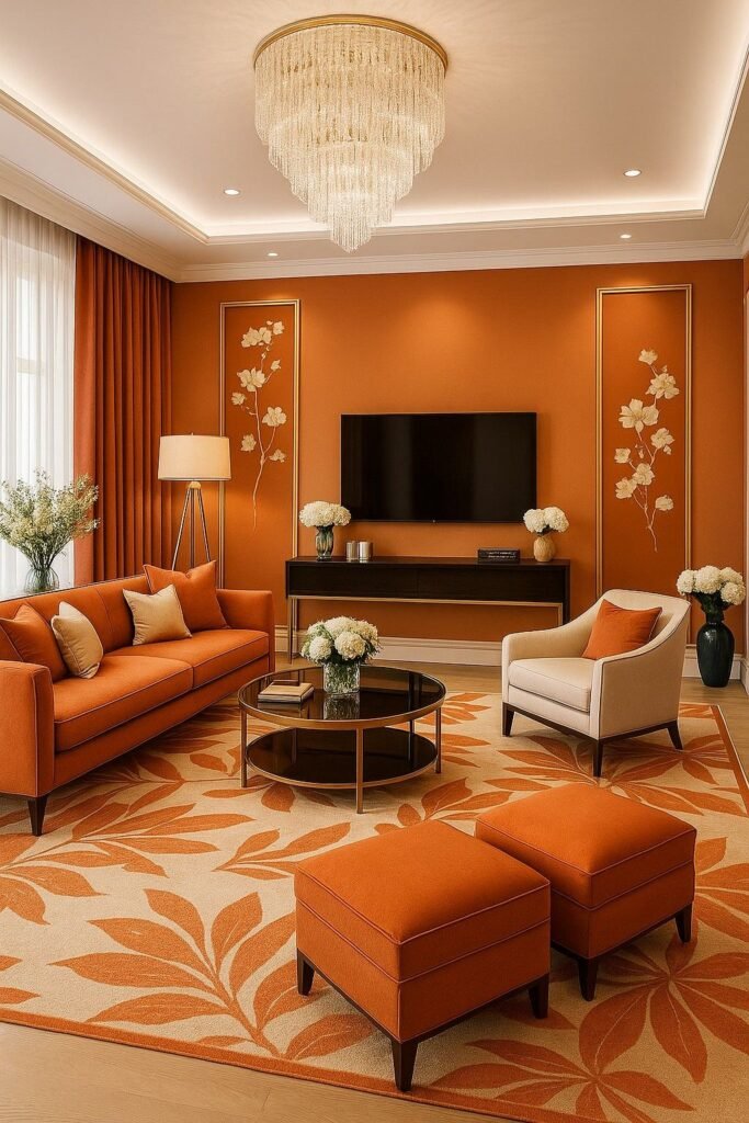
Dark Bold Colours
Deep, dramatic colours are still in style for 2026, but the way they are used has become more refined. Forest green, navy blue, charcoal grey, deep teal, and rich espresso can create a luxurious and cocooning effect. Benjamin Moore’s Silhouette AF-655 is a strong example of this direction, blending richness and restraint in a way that feels modern rather than overly flashy.
Dark colours work best when they are intentional. In a large room with good natural light, they can add sophistication and architectural weight. As an accent wall, they can bring depth without overwhelming the room. In small or dim spaces, they can still work, but they need careful balancing with trim, lighting, mirrors, and lighter furnishings. Farrow & Ball’s colour-drenching guidance also shows that deeper palettes can feel immersive when handled thoughtfully.
How to Choose the Best Sitting Room Wall Colours
Study the Lighting
Before Selecting A Colour, look closely at the way light enters the room. Lighting changes the way paint reads, and the effect is often stronger than people expect. Natural light, artificial light, shadows, and the direction of the room all influence the final result. That is why both BEHR and Farrow & Ball recommend paying attention to the room’s aspect and checking how the colour behaves across the day.
A practical rule of thumb is this: cooler light often benefits from warmer paint, while brighter and sunnier rooms can usually support cooler, deeper, or more muted shades. This is a guideline, not a command. The real outcome depends on your bulbs, window size, reflective surfaces, and furniture colours. Testing in the actual room is the only reliable way to know.
Match the Furniture and Flooring
Wall colour should support the existing elements in the room, not fight them. A room with warm wood flooring, tan upholstery, and beige textiles usually looks better with another warm or balanced tone. A room with cool grey seating, stone finishes, and chrome details may work better with neutral-cool or softly grounded shades. Benjamin Moore and Sherwin-Williams both point out that undertones matter because even neutral paints can lean warm or cool.
If the undertones clash, the room can feel disjointed even if every piece is attractive on its own. That is why it helps to place your paint sample beside the sofa, rug, curtains, and floor finish before committing. The most successful colour schemes usually have at least one connecting undertone running through the space.
Think About Room Size
Room size changes the psychological effect of colour. Light shades tend to open up a space, making it feel more expansive and breathable. Mid-tone colours can create balance in rooms of average size. Dark shades can bring depth and mood, especially in larger rooms or in rooms that already receive a lot of light. Sherwin-Williams and BEHR both note that lighter tones can make a space feel more open, while finish and sheen also affect how colour behaves.
For a small sitting room, the best approach is usually to stay close to light, warm, or soft neutral colours. That does not mean the room must be plain. It simply means the colour should help the room breathe instead of closing it in. For a larger room, you have more freedom to add depth, contrast, and mood.
Choose the Mood You Want
Before buying samples, decide what the room should feel like. That single question often narrows the choices quickly. If you want cosiness, choose warm beige, clay, tan, or muted terracotta. If you want modern calm, choose greige, sage, or soft grey. If you want a luxurious atmosphere, choose ivory, champagne cream, forest green, or deep espresso. If you want a light and airy feel, choose pale sage, dusty blue, or a softened off-white. Colour psychology is most useful when it is tied to a clear design intention.
Test Before You Paint
A single paint swatch tells only part of the story. When held up on its own, it can’t show how shade shifts across large surfaces. Light changes everything – morning versus evening, natural versus artificial. Try brushing some directly onto the wall instead. Different sides of the room reveal new moods in the hue. Furniture nearby alters perception, too. Big brands agree: real results come from seeing colour live. Watch how it interacts before deciding. That moment when sunlight hits it just right? That matters most.
Start by picking three to five tones near your ideal shade. Try these out when the sun rises, at midday, then again as it sets. Hold each next to your couch, drapes, floor coverings – see how they sit together. When you can, brush swatches across different walls, letting light and dark areas show their effect. A little time spent now might prevent a costly error later.
Best Sitting Room Wall Colours by Room Style
Modern Sitting Room Wall Colours
Modern sitting rooms usually look best with calm, understated colours that feel fresh but not sterile. Greige, soft beige, sage green, mushroom, muted grey, and warm off-white are all Excellent Choices. These tones create visual quiet, which gives furniture, art, and lighting room to breathe. Warm neutrals are especially effective in modern spaces because they add comfort without weakening the clean architectural lines.
For a modern scheme, try combinations such as greige walls with black accents, sage walls with white trim, mushroom beige with dark wood, or soft grey with brass décor. The goal is not to chase loud contrast. The goal is to make the room feel composed, refined, and current.
Luxury Sitting Room Wall Colours
Luxury often comes from depth, balance, and texture rather than from colour alone. Cream, ivory, champagne beige, charcoal, deep green, dark brown, and navy all support a high-end look. Benjamin Moore’s Silhouette AF-655 is a strong example of the sophisticated, rich palette direction that feels polished and timeless. Darker colours can feel especially luxurious when paired with soft textiles, sculptural lighting, and thoughtful trim work.
Luxury design also depends on finish. Sherwin-Williams says satin or eggshell works well in living rooms because it balances elegance with practicality. That is important because a beautiful colour in the wrong sheen can look flat, overly glossy, or less refined than intended.
Small Sitting Room Wall Colours
Small sitting rooms usually benefit from colours that feel light, calm, and spacious. Off-white, warm ivory, pale grey, dusty blue, and pastel sage are reliable choices because they help the room feel more open and less crowded. Light colours tend to expand the visual field, which makes a compact room feel easier to live in.
If you love darker colours, reserve them for one feature wall or use them in a room with excellent daylight. A full dark envelope can be beautiful, but only when the room supports it. In a tight room with limited light, too much dark colour can make the space feel compressed.
Bright Sitting Room Wall Colours
Bright sitting rooms give you more freedom. If the room gets a lot of sun, you can often handle deeper shades or cooler colours without the space feeling heavy. Benjamin Moore notes that cool colours such as green, blue, and purple can evoke calm, and the room aspect affects how those colours appear in natural light. That means sunny rooms can often carry more saturation than shaded rooms.
In bright rooms, consider sage, dusty blue, muted olive, soft teal, or even a deeper neutral like taupe or mushroom. These colours can counterbalance bright daylight and keep the room from feeling washed out. Bright light also makes undertones more visible, so sampling becomes even more important.
Cosy Sitting Room Wall Colours
If your goal is warmth, intimacy, and comfort, choose colours such as beige, caramel, tan, muted terracotta, clay, or soft brown. These shades naturally support a welcoming mood, especially when combined with warm lamps, textured upholstery, and wood elements. Sherwin-Williams’ colour guidance associates warm colours with cheerfulness and stimulation, which helps explain why they often make a sitting room feel inviting.
Cosy rooms also benefit from layered lighting and tactile décor. A soft wall colour becomes even more effective when it sits beside linen curtains, boucle cushions, wool throws, and warm-toned wood finishes. The whole room feels more settled and emotionally rich.
Best Colour Combinations for Sitting Rooms
A single wall colour can be beautiful, but a well-planned pairing often makes a room feel more finished. Combining a main colour with an accent wall, trim colour, or décor colour adds dimension without overcomplicating the space. Benjamin Moore describes complementary schemes as pairings that create visual contrast and intensify each other, which is useful when planning a sitting room palette.
A warm beige wall with olive accents can feel earthy and grounded. Soft grey with charcoal details creates a sharper, more modern mood. Cream walls with dusty blue accents feel airy and gentle. Greige with terracotta details creates warmth with a contemporary edge. Sage green with white trim feels fresh, balanced, and easy to decorate around. The secret is to keep the palette controlled so the room stays coherent rather than busy.
Two-colour rooms can also work very well. A cream main colour with a sage feature wall, a greige room with charcoal trim, or an ivory room with navy accents can all look polished when the undertones align. The best combinations usually repeat one colour family in more than one place, even if subtly. That repetition gives the room rhythm.
Finish and Sheen: Why It Matters
Colour is only half the story. Finish changes how the colour performs, how much light it reflects, and how practical it is for daily use. Sherwin-Williams notes that living rooms work well with satin or eggshell because those finishes balance elegance and practicality. The same company also explains that lower-gloss finishes hide imperfections better, while higher-gloss finishes are easier to clean.
For most sitting rooms, eggshell or satin is the best default choice. Matte or flat finishes create a soft, velvety look and can hide minor wall flaws, but they may be less forgiving in busy households. Semi-gloss is usually better for trim, doors, and architectural details rather than full walls. The finish you choose should support both the style of the room and the realities of how the room is used.
When to Use Matte
Matte is ideal when you want a soft, elegant, non-reflective surface. It works especially well on smoother walls and in rooms where you want the colour to feel rich rather than shiny. A matte finish can create a more painterly, layered appearance, which suits quiet neutrals and deeper tones particularly well. Sherwin-Williams’ sheen guidance shows that lower-gloss finishes are useful for hiding wall imperfections.
Mistakes to Avoid When Choosing Sitting Room Wall Colours
Picking a colour without testing it
This is the most common and costly error. Paint can Look Completely different once it is spread across an actual wall and exposed to your room’s light. That is why every major paint brand stresses sampling. Testing is not an extra step; it is part of choosing correctly.
Ignoring undertones
A beige can lean pink, yellow, green, or grey. A grey can lean blue or brown. A white can feel creamy or icy. If those undertones clash with your flooring or furniture, the room can feel slightly “off” even if each element is attractive on its own. Benjamin Moore and Sherwin-Williams both emphasise undertones in colour selection for exactly this reason.
Using too much dark colour in a small room
Dark walls can be stunning, but they are not automatically the best choice for every space. In a compact sitting room, too much dark colour can reduce the feeling of openness, especially when daylight is limited. Dark shades are often stronger as accents than as the only colour in the room.
Choosing pure white too quickly
Pure white looks crisp in some interiors, but it can appear severe in others, especially under bright daylight or cool artificial lighting. Softer whites, warm off-whites, ivory, and cream tones are often easier to live with in sitting rooms because they feel more forgiving and welcoming. This is one reason many designers now favour softened neutrals over stark white.
Using too many colours
A sitting room usually looks strongest with one primary colour and one or two supporting shades. Too many competing tones can make the space feel disjointed. A restrained palette usually appears more mature, more deliberate, and easier to decorate around.
Forgetting wall texture
The finish you choose affects not only the feel of the paint but also how visible wall imperfections become. Higher-sheen paints can highlight flaws, while flatter finishes are often more forgiving. That is why the condition of the wall matters as much as the colour itself.
Maintenance, Care, and Durability Tips
A beautiful wall colour should also be practical enough to maintain. Living rooms and sitting rooms are used every day, so the paint should be easy enough to care for without losing its finish too quickly. Sheen matters here as well: higher-sheen finishes are generally easier to clean, while lower-sheen finishes are better at hiding imperfections.
Simple care habits help keep the room looking fresh. Light dusting, gentle wiping, and avoiding harsh cleaners can preserve the surface appearance for longer. If the room is busy, choosing a finish with better cleanability can make a noticeable difference in day-to-day upkeep.
Smart and Future-Ready Colour Ideas for 2026
A fresh look at 2026 trends shows paint mixing tightly with how rooms are lit. Morning light might soften a hue, while dimmed bulbs at night deepen its mood – shifting perception without changing the shade. Lamps stacked in layers, targeted beams on walls, subtle LED strips – all shape what your eyes really see. Because of this shift, picking a colour now leans heavily on which lights will hit it. Farrow & Ball backs that up, linking each recommended tint to sunlight angles and bulb types.
Some clever choices suit living spaces particularly well – try cosy neutral tones alongside lights you can turn down low. Sage-colored walls come alive when matched with light wooden pieces, softened by gentle lamp glow. Deep green on just one wall stands out nicely against shiny brass fixtures above. Greige pairs smartly with staggered LED strips that add depth without flash. A single hue spread across walls, trim, and ceiling? That idea from Farrow & Ball still holds up for those chasing a quiet modern vibe. Uniform colour wraps the space in balance, feels put together, and is somehow peaceful too.
Practical Colour Ideas by Goal
Start with a shade like off-white if space feels tight. Warm ivory opens things up, while pale grey keeps walls from closing in. Soft beige does well by bouncing light around the room. Dusty blue works too, since it adds airiness without starkness. More reflection means less heaviness, so lighter tones stretch how big a place seems.
Start with greige if the goal is a fresher look, yet sage brings calm. Muted charcoal works when depth matters, while soft taupe slips in quietly. Each stays relevant by avoiding flashiness that fades too fast.
Luxury shows up in shades like cream or deep green when they’re given space to breathe. Because texture matters just as much, try arranging cushions and curtains that catch the light differently. Art leans into the mood, especially under a soft lamp’s glow. When colours meet materials this way, warmth takes root instead of dull repetition.
A touch of warmth hides in shades like beige, clay, terracotta, or tan when the aim is cosiness. Lighting plays along softly, while wooden touches bring quiet depth. Fabrics drape easily into place, adding layers without effort. These hues shine brightest where conversation flows, and people linger. Comfort settles in naturally once colour and texture work together.
Quick Pro Tips
Start by linking the wall shade to something you already own – maybe the carpet, throw pillows, or couch. A small range of hues works best: think two dominant ones, then a third to highlight. Look closely at hidden tones in each sample; they shift under different lighting. For living areas, go with eggshell or satin finishes – they handle wear without glare. Light changes everything, so watch how paint looks when the sun hits it early, midday, and late. Warm tones work best when sunlight is scarce through the day. Where bright light fills a room, neutral or cool hues tend to balance it out. Most big paint companies suggest similar ideas – light changes how colour shows up. Finish matters just as much as shade choice. Undertones shift under different conditions, often in ways people miss at first glance.

FAQs
Light neutrals, soft grey, pastel sage, and dusty blue usually work best for small sitting rooms because they help the room feel brighter and more spacious. Light colours generally reduce visual heaviness and make a compact room feel less enclosed.
Greige, soft beige, sage green, and charcoal accents are strong modern choices because they feel calm, polished, and current without being overly loud. These shades fit well with modern furniture, warm metals, and clean-lined décor.
Not always. A neutral main colour with one accent wall can add structure and depth without making the room feel busy. A single-colour scheme also works well when you want a quieter, more seamless look.
Not necessarily, but they are usually better as accent walls or as part of a carefully balanced palette. In a small room with limited daylight, dark colours on every wall can make the space feel tighter. In a bright, small room, however, a darker tone can still work beautifully if the rest of the scheme is handled well.
Warm neutrals are one of the strongest directions for 2026, especially greige, ivory, mushroom beige, and other soft, grounded shades. BEHR’s 2026 palette and Benjamin Moore’s 2026 direction both point toward colour that feels balanced, enduring, and easy to live with.
Conclusion
Pick wall colours for your sitting room based on how light moves through the space, what furniture lives there, the dimensions of the area, and the feeling you aim to build. Come 2026, Top Choices lean toward cosy beiges, soil-inspired hues, soft faded tints, alongside refined dark tones. Knowing hidden colour hints matters – try out swatches slowly, pick a sheen that fits how the room gets used. Done right, the walls might lift brightness, deepen warmth, bring quietness, open up welcome – all together. It seems minor, painting a wall, still in this part of the house, it holds the power to shift everything beyond just one corner.