Introduction
Your living room walls are more than just space; they set the tone for your entire home. Choosing the right wall pictures for the living room can instantly elevate your space, add personality, and create a stylish, welcoming atmosphere. Whether you prefer modern art, minimalist prints, large statement canvases, or cozy family photo galleries, the right wall pictures help define your living room’s style and mood.
In this guide, you’ll discover how to select the perfect wall pictures based on size, layout, colours, interior style, and the latest 2026 design trends, so decorating becomes effortless and visually stunning.
Why Wall Pictures Matte: The attention mechanism
In an NLP model, attention decides which tokens influence the final answer. In a living room, wall pictures are tokens with strong attention scores: they pull focus, anchor the composition, and help the brain form a coherent semantic summary of the space.
Practical translations:
• Create a focal point: A dominant art piece is an attention grabber that causes a viewer’s gaze trajectory to begin and return there. This reduces perceptual drift and makes the room feel intentional.
• Add personality and style: Like domain adaptation, art shifts the room’s style distribution from Scandinavian minimalism to maximalist boho, changing the feature distribution.
• Balance visual weight: Think of furniture and art as vectors; art can counterbalance heavy furniture vectors to achieve a low-loss configuration.
How to Choose the Right Wall Pictures: feature selection & semantic alignment
In machine learning, feature selection picks the variables that matter most. For wall pictures, your features are colour palette, scale, theme, texture, and emotional valence.
Match the colour palette
• Compute the dominant colours in your sofa and rug (visually or with a colour-picker app). Choose art whose embedding overlaps or intentionally contrasts.
• Complementary colours act like orthogonal features that increase discriminative power. Neutral rooms benefit from high-variance art; warm rooms pair well with cooler accent pieces.
Use prototypes and centroids.
If you have a collection of images you like, compute a “centroid” mentally: find shared elements (colour, subject, mood). Pick pieces near that centroid to maintain coherence.
Wall Picture Size Guide normalisation & scaling rules
Size is normalisation: you must scale art so it sits in the same visual coordinate system as the sofa, TV, fireplace, and wall.
Above the sofa
Rule: Artwork width ≈ sofa width × 0.66.
Example: sofa 180 cm → artwork ≈ 120 cm wide.
Vertical placement: centre of artwork should be ~145–150 cm from the floor (eye-level mean). This is like setting the bias term to align the activation peak with the human gaze.
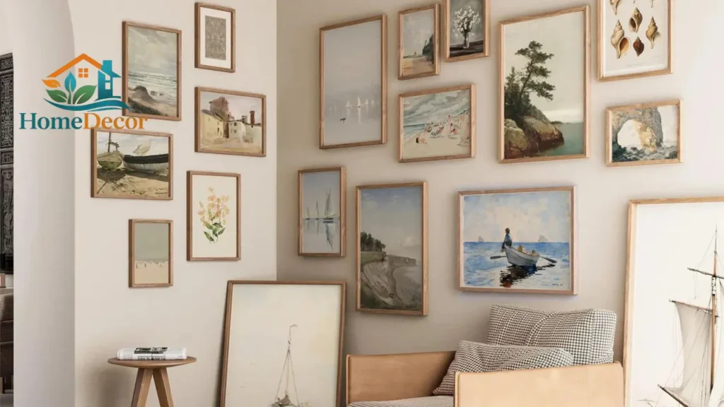
Gallery wall size planning
• Maintain equal spacing: 5–10 cm between frames. This regularisation prevents overfitting (i.e., clutter).
• Mix horizontal and vertical frames to add dimensionality. Standardise at least one attribute (frame colour or mat width) to maintain a shared prior.
Oversized statement art
• Use when the wall has few other tokens (minimal furniture). An oversized canvas is a high-capacity weight that can express a complex concept without a large ensemble.
Practical tips mockup as augmentation
• Use painter’s tape to mock frame dimensions. This is visual data augmentation: try multiple layouts on the “validation set” (the live wall) before making permanent changes.
Popular Wall Picture Layout Ideas: Graph Algorithms for Visual Design
Treat each piece of art as a node, and the space between them as an edge. Layout becomes a graph optimisation problem.
Single Statement Piece
• Simple: one high-attention node. Works in minimalist vocabularies and rooms with neutral priors.
Triptych (3-panel ensemble)
• A triptych is a sequence model where each panel is a timestep that together composes a coherent narrative. Place the most informative panel in the middle.
Grid Gallery Wall
• Uniform frames with equal spacing form a convolutional grid, great for photographic series or repeated motifs. The grid enforces translation invariance; swap rows and columns, and the effect remains stable.
Asymmetrical Gallery Wall
• Create a dynamic directed acyclic graph where sizes vary but shared traits (mat, frame colour) create regularisation. Asymmetry can enhance perceived creativity when a single anchor piece is present.
Leaning Wall Art
• Lean frames on consoles or shelves instead of hard mounting. This introduces a casual prior: lower commitment and easier iteration.
Best Places to Hang Wall Pictures node selection & context
Which wall to choose? In NLP, you choose context windows; in interiors, you choose key walls.
Above the sofa, the primary context window
• Classic location. Centre the artwork and leave a 10–15 cm gap above the sofa’s back.
Around the TV Wall, balance the strong screen token.
• Place horizontal pieces to frame the screen. Symmetry calms; an offset arrangement can make the TV feel integrated rather than dominant.
Above the fireplace, the architectural anchor
• Use a single large piece or a balanced pair. Accent lighting raises the activation of this node, like boosting a token’s attention weight.
An accent wall creates a localised embedding space.e
• A coloured or patterned wall is an ideal backdrop to anchor a curated set of art. The wall becomes a latent space with greater expressiveness.
Trending Wall Picture Styles for 2026 signal to follow
We’ll treat trend detection as monitoring evolving corpora. The following styles have high signal-to-noise in the current design corpus:
Neutral Minimalist Art low-entropy, high-utility
• Clean lines, limited palette. Great generalisation across rooms.
Botanical Prints natural priors boost calmness.
• Green tones add Freshness and support biophilic design cues.
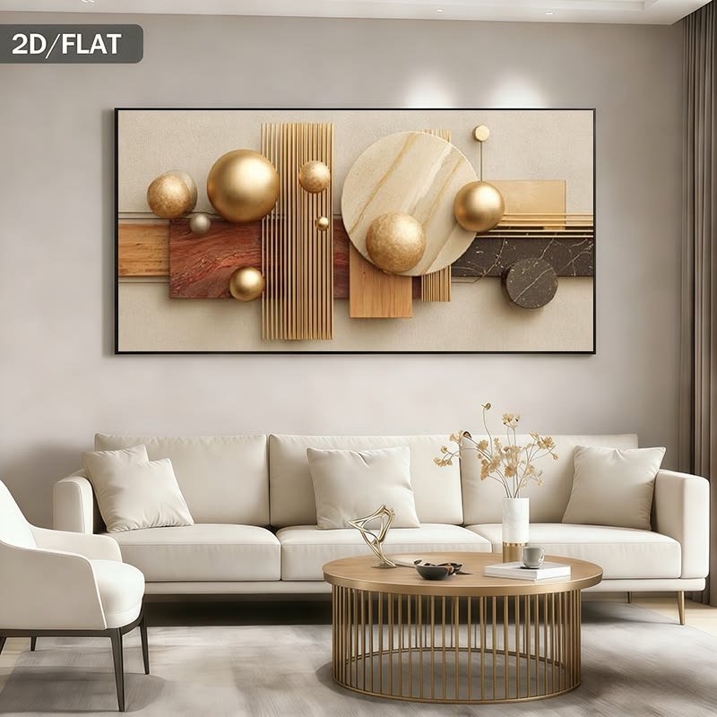
Oversized Canvas bold, single-token statements
• Continues to be popular for public-facing spaces and luxury interiors.
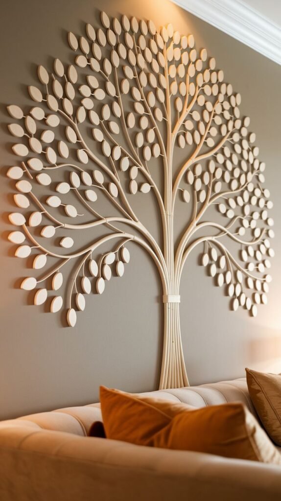
Textured Wall Hangings multi-modal features
• Mixed media (wood, metal, textile) adds a tactile dimension similar to using multi-modal embeddings in AI.
How to Create a Perfect Gallery Wall assembly as an algorithm
A gallery wall is an ensemble method: multiple weak learners (small frames) combine into a strong predictor (a compelling focal area).
Step-by-Step Guide
- Pick a theme (choose a dataset): decide on a dominant motif lour, subject, or mood.
- Choose frames (select classifier types): mix sizes, but keep a unifying element, such as frame finish.
- Arrange on the floor (run simulations): test permutations; this is cross-validation.
- Keep spacing consistent (regularise): 5–10 cm gaps are effective.
- Mix orientation (add dimensions): portrait and landscape prevent monotony.
- Anchor with a large piece (introduce bias) to prevent chaotic optimisation.
Layout heuristics
Minimise visual clutter (L1 regularisation for negative space).
Maximise contrast between the anchor piece and the surrounding miniatures.
Use odd counts (3, 5, 7) to avoid symmetry traps that feel static.
Budget vs Luxury Wall Picture Options: compute & cost tradeoffs.
Think of budget as compute budget; you can get reasonable performance with smaller compute if you augment smartly.
DIY Printable Art is the most cost-efficient: print, frame, and tune. Great for renters and iterative design.
Canvas Prints mid-range option: affordable, large format, decent fidelity.
Framed Artwork: a more professional final model with higher production values.
Original Paintings’ highest cost, unique weights like training a bespoke model from scratch.
Combine budget pieces with a single investment statement piece to achieve high perceived quality without matching the total cost of premium walls.
Mistakes to Avoid
Hanging art too high misdirects attention.
Using tiny pieces on big walls results in underfitting (weak signal).
Ignoring the low signal-to-noise ratio.
Overcrowding, walls overfitting, and cognitive overload.
Fixes are simple: remeasure, reframe, add lighting, and keep breathing room.
Interior Designer Tips, heuristics & best practices
Designers are essentially expert systems with heuristics compiled from many successful rooms.
Use art to amplify existing colours in textiles and cushions.
Match frame metal/wood Finishes to furniture hardware for consistent priorities.
Mix textures to add depth. Canvas, metal, framed prints, and textile hangings are complementary modalities.
Rotate art seasonally to refresh the room’s output.
When in doubt, default to a neutral anchor and introduce one accent piece for variability.
Room Style Pairing Examples mapping functions
Use a simple mapping between living room style and recommended art:
Modern Abstract canvases with bold geometric embeddings.
Boho Botanical prints, macramé, and mixed textures (high entropy).
Minimalist Black & white photography with sparse composition.
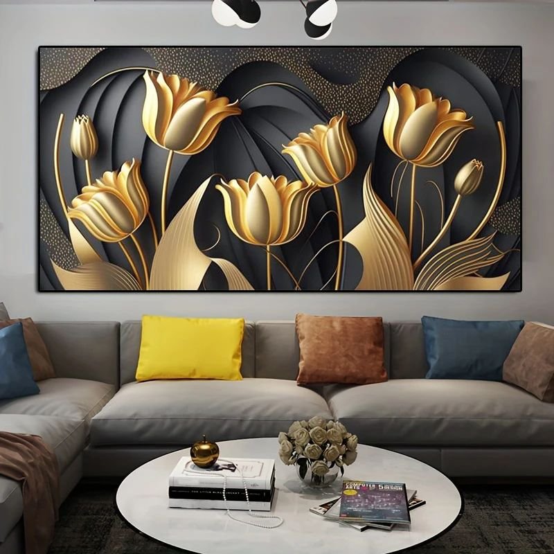
Luxury Large statement art, rich textures, and carefully curated lighting.
Quick Pro Tips: short prompts you can act on now
Measure before buying data first.
Mock up sizes with painter’s tape, a cheap augmentation.
Use accent lighting to boost attention weights.
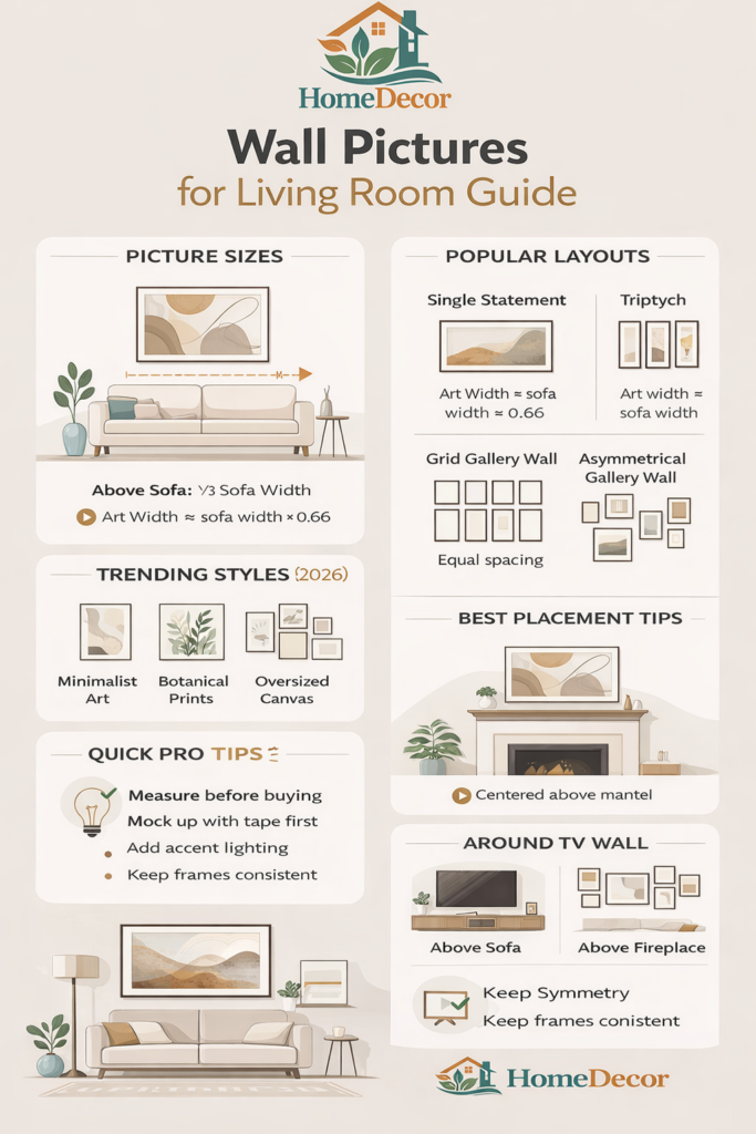
Keep consistent frame finishes, shared priors reduce noise.
FAQs
Ideally, 2/3 of the sofa width, at eye level (145–150 cm).
Yes, but maintain a colour or frame theme.
Odd numbers such as 3, 5, or 7 appear balanced.
Yes, if scaled correctly.
Dust regularly and avoid direct sunlight.
Conclusion
Selecting and Arranging Wall Pictures for your living room is both an art and a science. Like tuning a complex NLP model, every choice from size, style, and colour to placement, layout, and lighting affects the room’s overall “output”: how it feels, how it looks, and how it makes people interact with the space.
By following the principles outlined in this guide:
Size wisely: Ensure your artwork scales with furniture and walls.
Choose themes thoughtfully: Align colours, styles, and moods with your room.
Plan your layout: Single statement pieces, triptychs, or gallery walls each have their own logic.
Balance and placement: Consider focal points like sofas, fireplaces, accent walls, and TVs.
Incorporate trends carefully: Minimalist, botanical, oversized, or textured art can modernise your interiors.
Avoid mistakes: Keep art at the right height, don’t overcrowd, and use proper lighting.
Your walls can become more than decoration; they can express personality, enhance comfort, and create a cohesive, stylish space that feels complete.
Think of each picture as a high-weight “token” in the visual language of your living room. With careful selection, placement, and layering, you create a living space that communicates harmony, creativity, and intentional style.
Final Tip: Experiment, adjust, and let your walls evolve with your taste. A well-curated living room wall isn’t static; it’s a dynamic display that grows with you, your art, and your life.