Introduction
Choosing the right Artwork for Living Room walls is one of the simplest and most effective ways to elevate a space. A space often feels off until something speaks through color or shape. One well-chosen piece might calm a blank stretch of drywall, wake up a dim area, stand out boldly, or quietly connect everything else around it. Lately, rooms lean into flowing lines, soil-toned shades, surfaces you want to touch, and designs that whisper of forests or stone. This change gives wall pieces new weight – they set the pace, influence how light settles, shape what the eyes notice first.
Most write-ups on living room art barely scratch beneath the outside layer. Pictures flash by, quick notes name trends, maybe a tip drops about placement – yet none really say how to pick something that belongs there. Seldom touched are size relationships, frame choices, mood alignment, harmony with sofas or shelves, or smart buying when money talks. This one digs further. Built for lasting sense, it shapes decisions so your chosen pieces feel right today and keep making sense tomorrow.
A space gains meaning when it reflects who you are. Not every blank wall needs filling – some moments call for stillness instead.
Artwork in a living room adds a quiet presence
A single painting isn’t merely decoration. Instead, it shapes how a room speaks. Depending on the piece, the atmosphere shifts – peaceful, intense, refined, lighthearted, layered, intimate. Bold energy comes through a big abstract stretch of color. Meanwhile, gentle nature scenes soften everything around them. A collection of pictures on a wall gives a space depth, like memories stacked over time. Where folks come together – sit, talk, stay – the right mood shows up quietly, almost without notice.
Warmth creeps back into homes by 2026, nudging out sterile simplicity. Instead of bare walls, surfaces begin to breathe with character. Texture shows up not through stuff, but through choice. A single piece of art does more than decorate – it shapes space quietly. With it, emptiness gains purpose minus the noise. Even corners feel connected when colours talk across distances. Furniture, light, and form start listening to one another.
A single piece can shift a space – when matched to the couch, floor covering, window fabric, light sources, and color scheme. Done right, everything ties together smoothly. The arrangement matters more than size or frame type. Harmony comes from balance, not boldness. Look at how colors echo across surfaces. Notice where shapes repeat. That quiet rhythm makes a room feel finished.
Choosing Art for Your Living Room Walls
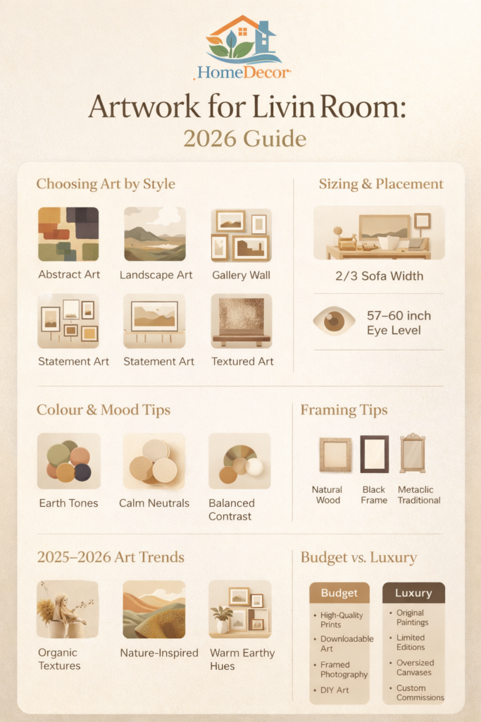
Match the artwork to the room style.
Art that fits right into a space tends to stand out quietly. A contemporary lounge? Try bold shapes, black-and-white images, single-line figures, or sharp design-driven works. Older styled spaces lean toward countryside scenes under glass, delicate plant studies, oil masterpieces from long ago, or dignified face portraits. When walls are bare and calm, keep pictures neat and uncluttered. Rooms full of texture, color chaos, or global trinkets welcome stacked frames, paint plus photo combos, even busy visuals that hum rather than shout.
Right now, spaces lean toward earthy simplicity, living textures, soft depth – art that echoes nature’s curves and gentle tones fits right in. Depending on whether a room should breathe calm, stand stiff, speak boldly, or hug close, pick pieces that move with that energy. What hangs on the wall grows from how the space lives.
Choose artwork based on room size and scale
A single Small Painting on a big blank wall often seems lost, like it forgot where it was going. Big art crammed onto a little wall tends to shout instead of speak. Instead of leaving pieces adrift in empty areas, match their size to the couch or table below. That connection – between object and surface under it – is what keeps things feeling right.
A popular approach? The two-thirds guideline when hanging art over furniture. Usually, the piece – or set of pieces – sits at roughly two-thirds the span of the couch beneath. That stretch helps things look steady, like the wall has weight instead of floating. Not a strict requirement, sure, yet a few tricks work better for dodging awkward sizing errors.
Think about colour and mood
A sudden shift in hue can change how you feel, right away. Beige, cream, sage – those quiet colors – tend to settle the mind, grounding a space without effort. Charcoal slips in quietly, bringing weight; navy follows close behind, adding layers of stillness. Plum, rich and shadowed, pulls light inward instead of reflecting it outward. When bolder pigments appear, energy rises – but balance matters, since too much intensity drowns out harmony.
Warm shades like beige, brown, mustard, olive, and deep green take center stage indoors come 2026 – cool grays fade into the background. Living spaces find rhythm with art tied to earthy tones, grounding the feel of the room. Pieces that mirror those soft hues blend quietly, sitting well beside the chosen colours already there. A touch of boldness works too, if it arrives with purpose – not noise, just intention. Texture plays a quiet partner here, adding depth without stealing focus.
Decide between original art, prints, and reproductions
One original piece carries a spirit you cannot copy. Its touch tends to connect deeper, as something meant just for you. When cost matters, prints step in – easy to find, simple to replace. Need several pieces? Copies make that possible without strain. A well-known scene gains new life, even if it does not break new ground.
A choice stands open, shaped by what matters most to you. Cost plays a role, true, yet so does where the space fits in your life. Picture how much attention it should draw – quiet or bold. Maybe the wall needs personality, perhaps just color and form without a story.
Best Artwork Ideas for a Living Room
| Art Style | Best For | Visual Effect | Budget Level | Works Well With |
| Abstract art | Modern, contemporary, minimalist homes | Bold, expressive, stylish | Low to high | Neutral sofas, clean lines |
| Landscape art | Scandinavian, calm, classic interiors | Peaceful, open, restorative | Low to high | Wood, linen, earthy tones |
| Gallery wall | Eclectic, personal, family spaces | Collected, layered, creative | Low to medium | Mixed frames and prints |
| Statement piece | Large walls, above-sofa focal points | Luxurious, dramatic, striking | Medium to high | Open walls, large furniture |
| Textured/mixed media art | Organic modern, boho, luxury interiors | Rich, dimensional, tactile | Medium to high | Natural materials, soft lighting |
This table is a practical starting point, but the best choice always depends on the room’s mood, the size of the wall, and the feeling you want the space to create. In 2026, artwork that feels organic, calm, and subtly expressive fits especially well.
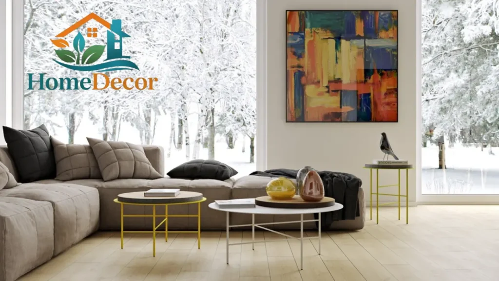
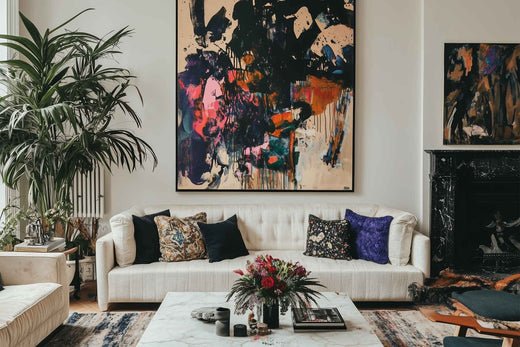
Bold abstract wall art
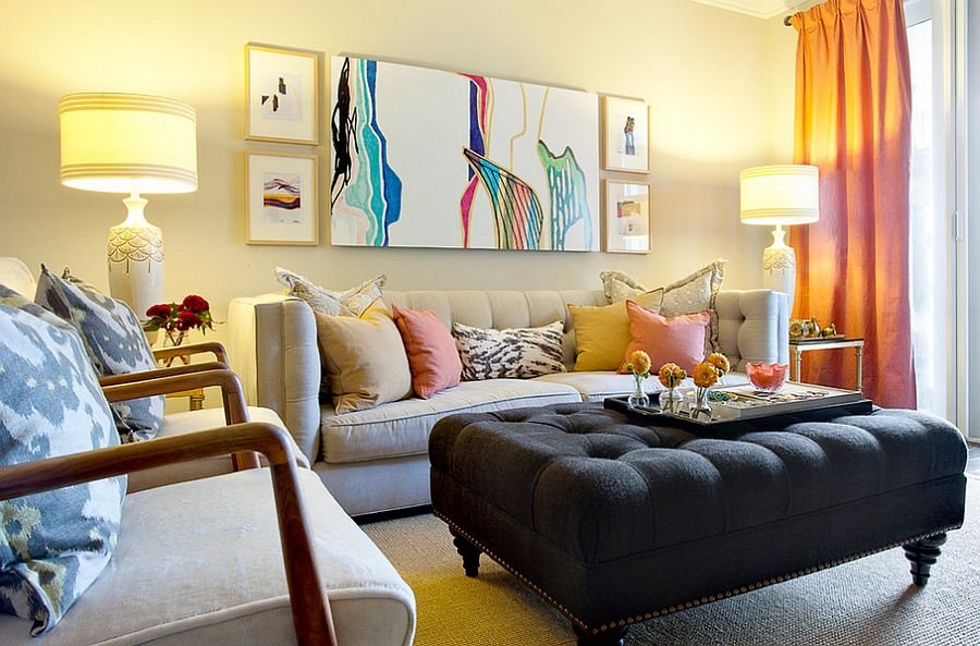
A splash of color here, maybe a bold shape there – abstract art slips into a living room like something meant to be. When furniture stays quiet, soft in tone, these pieces step forward, bringing rhythm through lines that twist or settle. Instead of telling a story, they offer feeling, motion caught mid-step. Big canvases do more than hang; they gather attention, almost by accident. In spaces unsure where to look, such artwork becomes the place eyes return to.
Still going strong, this look fits right into today’s spaces filled with rounded edges and earthy colors, instead of sharp lines. Quietly bold, an abstract piece brings warmth through shape and texture rather than stark minimalism.
Landscape and nature artwork
Right now, nature-based art fits well since plenty of living spaces focus on health-minded, life-connected, healing interiors. Open vistas, cloud patterns, plant sketches, flowing water images, soft terrain renderings – these offer space and quiet. A room might seem to breathe easier, tied somehow to what lies beyond walls.
A view of nature fits nicely where people gather at home, near chairs meant for books, or any spot that feels best when calm. When heavy designs fill a space – like bold cabinets or intricate moldings – a landscape steps in quietly, balancing what’s already there.
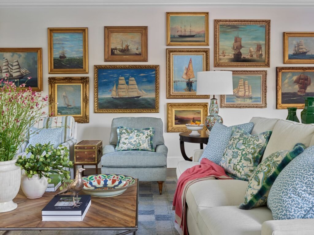
Gallery wall concepts
A space starts to tell your story when walls hold more than just paint. Photos live better beside sketches if something quietly ties them together. Think of how light hits each surface – that shared glow matters. One steady thread runs through everything: maybe it’s the way Frames Match, or how gaps stay even. Mirrors slip in without shouting because they follow an unseen rule. Paper shades echo across different artworks like a whisper. What holds the eye isn’t clutter but rhythm found in repetition. Each piece earns its place by belonging to a pattern only noticed sideways.
Start by laying out your frames on the floor. That way, you can adjust spacing without committing to holes in the wall. Think of each piece fitting like parts of a puzzle, not scattered snapshots. Try using paper cutouts if you want to test positions first. Step back often, seeing how shapes balance together across space. Aim for rhythm, not randomness. Let one frame lead the eye to the next. Hang slightly lower than expected – sometimes it feels more grounded that way.
Statement art above the sofa
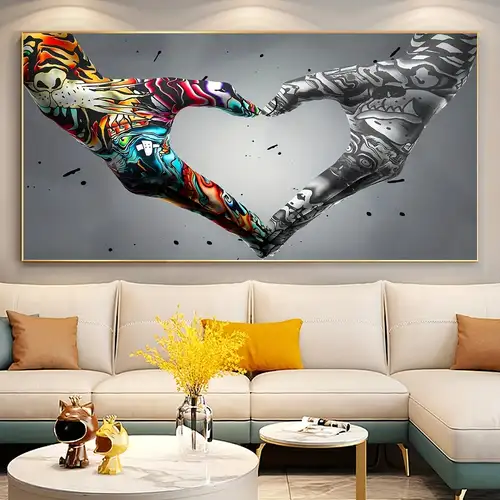
One large artwork over the sofa often looks sharper than several small ones. Because it draws the eye, it anchors the space without clutter. When placed well, it quietly tells you where the sitting area begins. In open rooms, this kind of detail makes zones feel natural, almost like an afterthought – yet clearly planned.
Size matters most. That artwork ought to match the couch, sitting balanced overhead instead of shrinking away or spilling beyond sight. Get the ratio right – just once – and a single bold image might outshine any cluster of little ones ever could.
Textured and sculptural wall art
Bumpy shapes, cloth-like creations, plus things that stick out from walls keep showing up more often – their thickness, gentle feel, and body add weight to quiet spaces. This fits right into how rooms will lean by 2026: touchable finishes, stuff pulled from nature, surfaces built in pieces. Out of nowhere, a rough painting turns blank sides into experiences you almost want to reach for.
A soft weave in one corner brings quiet depth when everything else sits sleek and still. Where sharp edges dominate, a chunky knit invites closer looks. This kind of detail slows the gaze down. Surfaces that beg to be touched shift how light moves through space. Even subtle ridges create pockets of shadow. A single rough-hewn item balances out too much polish.
Where to Put Art in Your Living Room
Most people find it easiest to view pictures when the middle sits between fifty-seven and sixty inches off the ground. Art feels more connected to a space when its height matches how we move through rooms. Above a sofa or shelf, the center might sit a little lower, yet the idea stays unchanged. Placement matters – too high looks floating, too low seems cramped. The goal? Let the piece rest where eyes go first without trying.
Leave space above furniture.
Above sofas or consoles, art benefits from space that links it softly to the furniture beneath. Some six to eight inches often works well – enough room to avoid pressure but still feel paired. Designers sometimes pick this range simply because it looks balanced. The distance tends to let both pieces breathe while staying part of one arrangement.
Groups come first if you’re handling more than one piece at a time
Hang multiple pieces like they form a single shape, not individual items. Space each part the same distance apart. Match the middle of the whole arrangement to average eye height. Move away now and then, look from afar to see if it feels right. Let the layout appear thoughtful, never packed too tight.
Colour Lighting and Framing Tips
Colour strategy
A splash of color in a painting might echo what’s already around – pillows, floor coverings, window drapes, even lighting fixtures – to tie things together. Sometimes, though, going against the flow adds spark, just not recklessly. Balance matters, even when mixing opposites.
Earth tones take center stage by 2026 – olive, fir green, ocher, brown, cream, plus soft neutrals dominate. Rooms gain a sense of now through artwork using such hues. Grounded moods emerge where color flows quietly together.
Lighting strategy
Bright spots matter. When shadows stretch too far, paintings fade like whispers. Sunlight does its part during mornings, though fixtures near the walls shift everything after dusk. A glow here, a beam there – suddenly colors sit right in the space. Details emerge where they once hid. Lamps placed just so pull frames out of corners. What was background becomes something felt. Evening light shapes mood differently than noon ever could.
Framing strategy
A wooden outline shapes how the piece speaks. With light oak, the vibe leans natural, fitting homes that breathe calm simplicity. Crisp White Walls? Black borders click right into place. Traditional corners hum better when gold swirls edge the glass. When the border feels off, the whole image slips – no matter its quality. Treat the rim like you treat the art: thoughtfully.
2025–2026 Living Room Art Trends You Should Know
Current interior direction points toward softer, warmer, more organic spaces. Curved furniture, natural materials, layered textures, and earthy colour families are all prominent. For wall art, this means the strongest trends are less about loud statements and more about calm impact, texture, and meaning.
The leading trends right now include:
- Neutral abstract art with gentle movement
- Large-scale statement pieces for open spaces
- Textured wall art and textile compositions
- Nature-inspired art with a wellness feel
- Personal pieces that make the room feel collected
- Warm, earthy hues such as olive, brown, ocher, cream, and deep green
These trends are valuable because they feel modern without depending on a gimmick. They also have longer staying power, which makes them better for rooms that should age gracefully.
Budget-Friendly Artwork Ideas
You do not need a high-priced original painting to make a room feel stylish. Many affordable options can look expensive when presented well.
Smart budget-friendly choices include:
- High-quality prints in simple frames
- Downloadable digital art printed locally
- Framed photography
- DIY abstract canvases
- Marketplace pieces from emerging artists
- One larger, affordable artwork instead of many small,l weak pieces
Budget art looks best when the scale is right, the frame is clean, and the colours fit the room. Most of the time, a piece looks low-end because of poor framing, awkward sizing, or a style that clashes with everything around it.
Premium and Luxury Artwork Ideas
If the living room is your main entertaining space, investing in one strong artwork can have a dramatic effect. Luxury does not only mean expensive. It means the piece feels deliberate, crafted, and finished with care.
Premium choices include:
- Original paintings
- Limited-edition prints
- Hand-finished mixed media works
- Oversized canvases
- Sculptural wall art
- Custom commissions
Luxury interiors often benefit more from one powerful artwork than from many smaller pieces competing for attention. This is especially true in living rooms that already feature strong furniture, rich materials, or distinctive architecture.
How to Choose Artwork for Different Living Room Styles
Modern living room
Choose abstract art, monochrome pieces, line art, or oversized prints. Keep the frame simple and the palette restrained. Clean shapes work best here.
Scandinavian or organic modern living room
Choose soft landscapes, nature-inspired art, understated abstracts, and light wood frames. This style connects beautifully with warm neutrals, white oak, linen, and soft curves.
Traditional living room
Choose framed landscapes, botanical prints, portraits, or classic paintings. Gold, walnut, or dark wood frames work especially well. Keep the artwork elegant rather than overly trendy.
Boho or eclectic living room
Mix prints, textures, and personal pieces. A gallery wall works especially well in this setting. Use repeated frame colours or one dominant tone to keep the wall coherent.
Small living room
Choose one medium or large piece rather than many tiny ones. Small rooms often look better when the art is simple and visually calm. Too many small pieces can make the wall feel cluttered.
Family living room
Choose warm, approachable, durable pieces. Landscape prints, abstract prints, and personal photo walls work well. In busy spaces, it is wise to avoid fragile pieces unless they are protected and placed safely.
Common Mistakes to Avoid
Choosing art that is too small
This is the most common error. Small Art makes the wall seem unfinished and can make the sofa or room feel oversized in comparison. Scale matters more than many people realize.
Hanging art too high
If art floats too far above the furniture, it loses its connection to the rest of the room. Keep the placement grounded and visually linked to the furniture below it.
Ignoring the room’s mood
A loud, busy artwork can feel wrong in a calm space. A dark, heavy artwork can feel too intense in a bright, airy room. The emotional tone needs to align with the room, not just the colour.
Overcrowding the wall
More pieces do not automatically create a better design. One strong artwork can be much more effective than a crowded wall. In 2026, the aesthetic direction is intentional, not cluttered.
Forgetting about frame quality
A poor frame can weaken a strong piece. Framing is not just protection. It is part of the presentation and should support the overall design.
Quick Pro Tips
Measure the wall before buying art, not after.
Keep the frame style aligned with the room style.
Use one large artwork when the room already has many elements.
Choose calm art for a busy family room.
Choose bold art when the rest of the room is minimal.
Test layouts with paper cutouts before making holes.
Treat a gallery wall like one large composition.
Simple Buying Checklist Before You Order
Before purchasing, ask yourself:
Does the size suit the wall and furniture?
Does the artwork support the room’s mood?
Is the frame appropriate for the space?
Will the colours still feel right in six months?
Is the total cost reasonable after framing and shipping?
Will it work with the room’s lighting?
If most of the answers are yes, the piece is probably a strong fit.
FAQ About Artwork for the Living Room
The best size depends on the wall and the furniture, but a reliable rule is to choose artwork that is about two-thirds the width of the sofa or furniture beneath it. That proportion usually creates balance and keeps the piece from looking too small.
A good guideline is to keep the centre of the artwork near eye level and leave a practical gap above the furniture below it. The 57 to 60 inches eye-level rule is a common starting point in galleries and home design.
Yes. Abstract art works especially well in modern and contemporary living rooms because it creates energy, colour, and a strong focal point without being too literal. It also fits the current movement toward organic, soft, and expressive interiors.
Nature-inspired artwork, soft landscapes, neutral abstracts, and muted colour schemes usually create a calmer atmosphere. These choices align well with the broader 2025–2026 move toward restorative and wellness-led interiors.
One big piece is usually better if you want a clean, high-end appearance. Several smaller pieces work well when you want personality, memory, and variety, especially in a gallery wall. The best choice depends on the wall size and the mood you want.
Conclusion
Picture a wall without anything on it. A good piece for your main room does more than catch eyes. Not too big, not too small – just right for the space around it. Colours that match how you want to feel when sitting there. Sometimes held by a slim border, sometimes none at all. Where it hangs changes everything – the height, the angle, the gap between furniture and edge. Look closely. Style talks quietly but clearly alongside sofas, rugs, and lights. Put every part in step – size meets shade, shape finds its spot – and suddenly it’s not just something hung up. The whole area leans into it. Pulls together because of it.
A fresh wave of home design in 2025–2026 leans into softness, natural touch, earthy tones, and rooms that feel alive – so picking artwork matters more than ever. Instead of just hanging anything, go for pieces that breathe with the space: maybe a bold painting, perhaps several small frames grouped, something rough under your fingers, or a still scene of trees far off. Artwork can transform an ordinary living room into a space that feels refined, expressive, and beautifully complete.