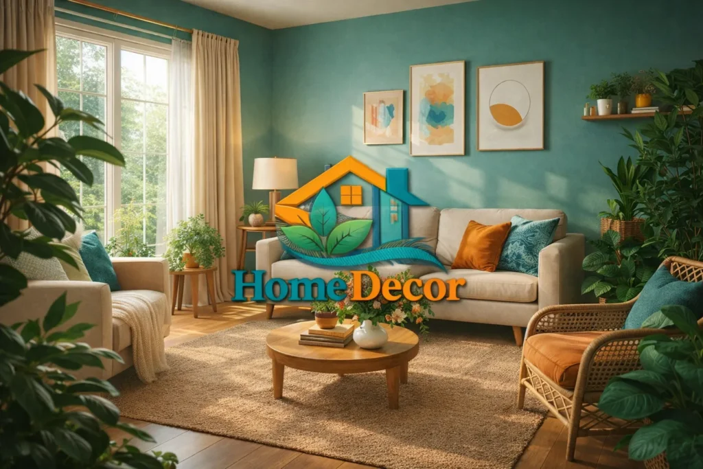
Living Room Paint Colors
Do you think there are a lot of Living Room paint colors to pick from? Are you trying to determine which color will make your home feel nice and also look modern? You are not the only one who feels this way. Choosing the paint color is not just about what you like; it is also about considering the lighting in the room, the size of the room, how you want to feel in the room, what style you like, and how you will use the room. If you take some advice, you can make your living room feel nice, modern, and nice for a long time.
This guide will give you all the information about Living Room Paint Colors for 2026. We will discuss what is popular, how to pick a color, and some tips from experts. We will also discuss some mistakes to avoid and some colors that will help you sell your house for a price.
How to Choose Living Room Paint Colors
Picking paint colors is more than just picking a color that looks good. It is actually about how the color makes you feel. Paint colors can also determine how big or small a room looks and how pretty it is. To ensure that you are satisfied with your paint color, you can use this list to help you decide before you buy the paint:
Lighting (Natural & Artificial)
Every color reacts differently depending on light exposure. Understanding how your space is lit is crucial.
Natural Light:
- North-facing rooms: These rooms receive cooler, muted sunlight, which can make colors appear bluish. Opt for warm tones like soft beige or creamy taupe to add coziness.
- South-facing rooms: Abundant natural light enhances warmth. You can experiment with cooler shades such as light gray or soft sage to balance brightness.
Artificial Light:
- Warm LED bulbs (2700K–3000K): Make colors appear warmer and more inviting. Ideal for social spaces like living rooms.
- Cool LED bulbs (4000K+): Enhance brightness and crispness. Works well with modern or minimalist aesthetics.
Pro Tip:
Always test paint samples in morning, afternoon, and evening light to see the full effect.
Room Size & Ceiling Height
The dimensions of your living room influence color perception. Here’s a simplified approach:
| Room Type | Best Color Strategy |
| Small Room | Light neutrals, pastel shades, soft off-whites |
| Large Room | Deep, bold, or saturated tones |
| Low Ceiling | Light, airy colors to create height |
| High Ceiling | Richer or darker hues to balance vertical space |
Example
A compact living room will feel more expansive with Light Greige Walls Combined with white trim and minimalistic décor.
Furniture & Décor
- When you are selecting furniture and items to put inside your room, you have to make sure that they go well with the color of your walls.
- You don’t want your furniture and room accessories to look bad with the color of your walls.
- Your furniture and room accessories should look good with the color of your walls.
- If you have furniture made of wood, it would be best for you to choose wall colors that are sandy beige, taupe, or warm ivory.
- These colors are warm and calm, so they will look good with your wood furniture.
Mood & Function
Color profoundly affects mood. Consider the psychological impact:
| Color Type | Mood / Effect |
| Warm tones | Cozy, sociable, inviting |
| Cool tones | Calm, tranquil, modern |
| Neutral tones | Balanced, timeless, versatile |
Insight: Since living rooms are hubs for social interaction, warm neutrals or calming cool shades often work best.
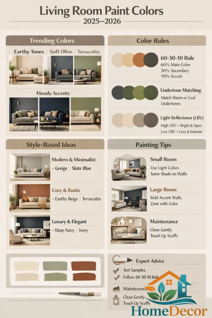
Trending Living Room Colors for 2025–2026
The upcoming 2026 trends emphasize comfort, nature-inspired calm, and timeless sophistication.
Earthy & Nature-Inspired Hues
These tones connect the indoors with nature, creating peaceful, grounded spaces:
- Warm beige
- Soft olive green
- Terracotta undertones
Why it works:
Biophilic colors reduce stress and make rooms feel nurturing.
Moody & Deep Accents
Perfect for accent walls or bold artistic details, adding drama and depth:
- Charcoal gray
- Deep navy
- Forest green
Pro Tip:
Use these darker shades sparingly on a single wall, niche, or architectural feature.
Modern Neutrals
Neutral doesn’t mean monotonous. These shades provide versatility:
- Greige (gray + beige)
- Muted taupes
- Warm off-whites
These pair beautifully with almost any décor palette and maintain timeless appeal.
Best Paint Colors by Category
Breaking down colors into categories helps you select based on mood, Style, and Function.
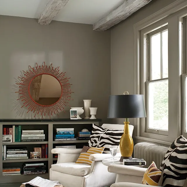
Timeless Neutrals
Neutral colors are eternal and work in virtually every style:
| Color Name | Mood | Recommended Use |
| Classic Off-White | Bright & welcoming | Full walls |
| Light Greige | Soft & balanced | Entire room |
| Warm Beige | Cozy & timeless | Living room & hallways |
Visual Idea: Light greige walls with light oak floors, soft linen curtains, and warm ambient lighting.
Warm & Cozy Tones
Ideal for social, inviting spaces:
- Dusty Plum is elegant and soft
- Warm Ochre earthy, Grounding
- Soft Terracotta rustic and soothing
Visual Idea: Terracotta accent wall paired with a cream sofa, wooden accents, and ambient lighting.
Bold & Statement Colors
For accent walls, niches, or architectural features:
- Deep Navy
- Stormy Teal
- Muted Lavender / Blush
Visual Idea: Deep navy accent wall with brass lighting fixtures and light-colored furniture creates a sophisticated focal point.
Cool & Modern Hues
Perfect for contemporary or minimalist schemes:
- Slate Blue
- Sage Green
- Soft Blue-Gray
Visual Idea: Sage green walls with black metal décor, white trim, and neutral furniture for a calm, modern vibe.
Designer Color Rules That Actually Work
Designers rely on foundational rules rather than fleeting trends.
The 60-30-10 Rule
Balance a room using proportioned color distribution:
- 60% → Primary wall color
- 30% → Secondary furnishings/furniture
- 10% → Accent accessories
Example
- Walls = greige (60%)
- Sofa and rug = muted taupe (30%)
- Accent pillows = stormy teal (10%)
Undertone Matching
Paint undertones must harmonize with furniture and flooring:
- Warm undertones. Pairs with wood, leather, and brass
- Cool undertones complement metal, glass, and gray textiles
Light Reflectance Value
LRV indicates how much light a color reflects:
- High LRV reflects more light, making spaces feel larger
- Low LRV Absorbs light, Creates cozy, intimate environments
Tip
Choose high LRV shades for smaller rooms to enhance openness.
Living Room Color Ideas for Different Styles
Match paint color choices with your design style:
Modern & Minimalist
- Greige
- Soft gray
- Slate blue
Style Notes:
Clean lines, matte finishes, minimalistic accessories.
Cozy & Rustic
- Earthy beige
- Warm cinnamon
- Soft terracotta
Style Notes
Wooden beams, woven rugs, warm lighting.
Luxury & Elegant
- Charcoal Accents
- Ivory luxe
- Deep navy
Style Notes
Velvet furniture, metallic accents, layered lighting.
Painting Tips for Small & Large Rooms
Small Room Tips
- Stick To Light Colors
- Paint All Walls the same hue
- Keep trim neutral
Reason
Light shades trick the eye into perceiving more space.
Large Room Tips
- Highlight focal walls with deeper colors
- Try color zoning to define areas
Common Mistakes to Avoid
Avoid these pitfalls to maintain a professional look:
Painting without testing samples
Ignoring how light affects color
Using multiple clashing bold tones
Misaligned undertones with furniture
Overlooking mood implications
Paint Colors That Boost Resale Value
If planning to sell, choose colors with broad appeal:
| Category | Buyer Appeal |
| Warm neutrals | Inviting, widely accepted |
| Greige | Modern, timeless |
| Deep accents | High-end luxury feel |
Budget & Premium Paint Ideas
Budget-Friendly
- Use test boards before painting full walls
- Limit bold hues to accent walls
Premium
- Invest in high-end, washable paints
- Consider custom color matching
Maintenance, Durability & Care
Cleaning Tips
- Use mild soap and a soft cloth
- Clean scuffs promptly
Paint Finish Guide
| Finish | Best Use |
| Matte | Hides imperfections |
| Satin | Easy maintenance |
| Semi-Gloss | Trims and accents |
Smart & Future-Ready Design Ideas
Smart Wall Tech
Apps that virtually preview paint colors can prevent mistakes and ensure harmony with furniture.
Future Trend Predictions
- Biophilic tones inspired by nature
- Muted, sophisticated shades replacing bright neon
Quick Expert Tips
Test colors in all lighting conditions
Record color interactions with furniture at different times
Match the paint with the room function
Begin with neutrals and layer in bold accents later
Frequently Asked Questions
Match undertones; warm furniture pairs with warm wall hues.
Yes, dark shades feel cozy, but they can reduce visual space if overused.
Neutral is balanced; warm neutral contains red or yellow undertones.
Yes, both natural and artificial light affect perception.
Satin balances durability and a soft, polished feel.
Conclusion
Picking a color for your living room is a big decision. It is more than just picking a color you like. You have to consider the lighting in the room, the mood you want to create, and the style you are trying to achieve. Living room paint color is a big deal.
You can begin with colors such as white or gray. These living room Paint Colors are good because you can add colors to them easily. You can then add some color with accessories such as pillows or rugs. This is a good way to add some Personality to your living room.
You should always test the color before you paint the room. The color you pick will make Your Living Room feel nice. It will also make your home more attractive to other people. The right living room paint color will make your home worth money.