Introduction of Living Room Paint Ideas
Your living room is the heart of your home, where comfort meets aesthetics, family connections thrive, and friends gather to create memories. When exploring the best Living Room Paint Ideas, it’s important to understand that selecting the ideal paint palette is more than choosing a favorite hue. The right color can completely transform the perception of space, making it feel more expansive, more intimate, more contemporary, or more timeless.
With myriad shades, finishes, and design philosophies available, choosing the right color can be daunting. This comprehensive guide will provide a step-by-step roadmap for selecting, applying, and styling paint in your living room. From understanding color psychology and following 2026 trends to blending paint with furniture and avoiding common pitfalls, you’ll be prepared to craft a space that feels uniquely yours.
How to Select the Ideal Paint Shade
Choosing the right paint hue is not just about personal preference. It involves understanding the emotional resonance of colors, their interaction with lighting, and how they complement room proportions, furnishings, and décor.
Understanding Color Psychology
Colors have an undeniable influence on our emotions and perception. They can invigorate, calm, or make spaces feel more spacious or cozy. Here’s a practical overview:
| Color Type | Emotional Effect | Ideal Application |
| Warm (Terracotta, Rust, Soft Red) | Inviting, energizing, cozy | Social spaces, family zones |
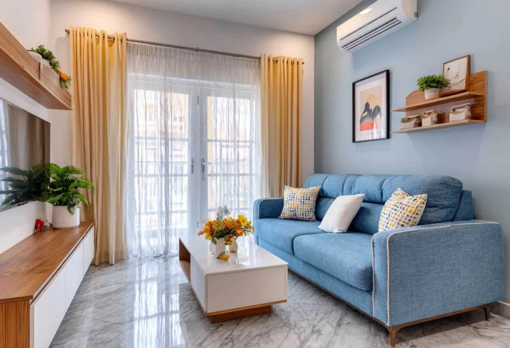
| Cool (Blue, Green, Soft Gray) | Calming, tranquil, expansive | Relaxation areas, serene living rooms |
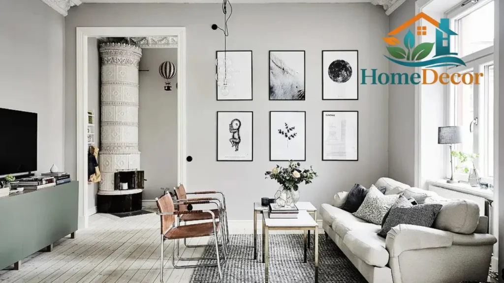
| Neutral (Beige, Greige, Cream) | Balanced, timeless, versatile | Multipurpose living areas |
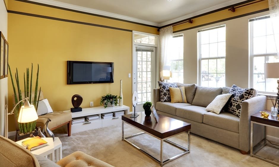
| Bold (Teal, Burgundy, Mustard) | Dramatic, stylish, commanding | Accent walls, statement features |
💡 Pro Tip: Utilize warm shades in spaces meant for conversation and gatherings, while applying cool hues in areas intended for relaxation and unwinding.
Considering Your Room’s Attributes
Every room has unique characteristics that influence how paint appears. Factors such as size, natural lighting, ceiling height, and existing furniture should guide your color choice.
| Room Feature | Suggested Palette |
| Compact Room | Light neutrals, soft pastels |
| Low Light Areas | Soft cool tones for brightness |
| Open-Plan Living | Harmonious palette with subtle contrasts |
| High Ceilings | Darker shades to create visual balance |
| Fireplace or Feature Wall | Warm, earthy, or jewel tones for emphasis |
Light and Its Impact
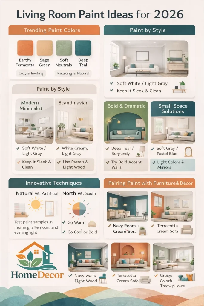
Color perception fluctuates depending on light type, time of day, and directionality. Test your paint samples in multiple conditions:
- Morning sunlight
- Afternoon brightness
- Evening lamp or LED illumination
Room orientation also matters:
- North-facing rooms: tend to feel cooler → choose warm, welcoming shades
- South-facing rooms: brighter naturally → cool or bold hues work beautifully
Trending & Timeless Living Room Colors in 2026
2026 is all about merging comfort with style. Designers are gravitating towards earthy tones, serene blues, and bold statement shades. Here’s an extensive breakdown:
Earthy & Nature-Inspired Tones
These shades evoke warmth, grounding, and balance.
- Terracotta & Warm Rust: Ideal for cozy gatherings, complements wood elements, indoor plants, and soft textiles. Perfect for lively social spaces.
- Olive & Sage Green: Relaxing, natural, and harmonious. Pairs beautifully with rattan, wicker, and organic materials in both contemporary and classic interiors.
Calming Blues
Blue hues are perfect for creating an airy, tranquil environment:
- Soft Sky Blue: Makes rooms feel expansive, light, and open.
- Deep Navy: Luxurious, rich, and intimate. Works excellently on accent walls or ceilings.
Cozy Neutrals
Neutrals provide flexibility and timeless appeal:
- Greige: A sophisticated blend of gray and beige, adaptable to various décor styles.
- Cream: Soft, warm, and inviting, perfect for creating a relaxed ambiance.
- Taupe: Subtle and elegant, pairing well with colorful or metallic accents.
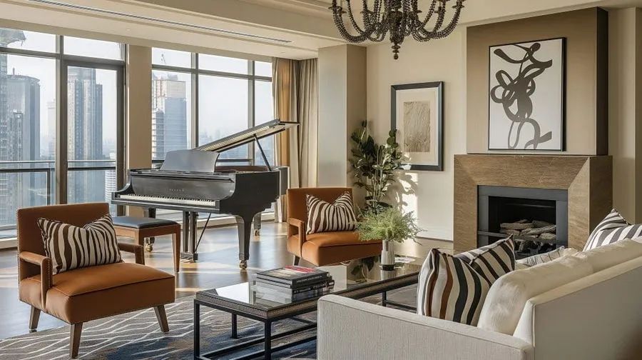
Bold & Statement Hues
Bold colors deliver personality and drama when used thoughtfully:
- Deep Teal: Contemporary and rich, creates a high-impact accent.
- Burgundy: Warm, luxurious, ideal for refined spaces.
- Mustard Yellow: Energetic, lively, best in moderation on focal walls.
Paint Ideas by Home Style
Different interior design aesthetics demand tailored paint strategies.
Modern Minimalist
- Base: Crisp whites, very light grays
- Accent: Black trim, charcoal walls
Tips: Maintain simplicity, use clean lines, and choose furniture with minimalistic forms.
Scandinavian-Inspired
- Base: White, cream, light gray
- Accents: Soft pastels, muted greens, oceanic blues
Tips: Emphasize natural light, incorporate wooden furniture, and layer with soft textiles.
Bold & Dramatic
- Focus Colors: Deep teal, emerald, burgundy
- Tips: Feature walls, pair with metallic finishes like brass or gold, and rich wood tones.
Small Space Solutions
- Best Colors: Cream, Soft Gray, pastel blue
- Why: Light tones enlarge the perceived space. Add mirrors to reflect light and create depth. Introduce a single accent wall for focus.
Creative Painting Techniques That Add Dimension
Beyond standard paint, innovative techniques can enhance the room’s aesthetic, making walls visually compelling.
| Technique | Description | Ideal Application |
| Color Drenching | Same color across walls, trim, and ceiling | Bold, modern interiors |
| Accent Walls | Highlight a single wall | Behind the sofa, fireplace, or entryway |
| Two-Tone Walls | Horizontally split colors | Adds depth and interest |
| Ombre / Gradient | Color transitions from light to dark | Artistic, contemporary spaces |
Harmonizing Paint with Furniture & Décor
A wall’s color should complement furniture, décor, and flooring.
Smart Combinations:
- Navy walls + light wood furniture
- Terracotta walls + cream-colored sofa
- Olive green + rattan or woven accessories
- Greige walls + vibrant cushions
Quick Rules:
- Neutral walls → colorful accessories
- Bold walls → understated furniture
- Flooring tones should balance or contrast with wall colors
Typical Painting Mistakes to Avoid
Even minor oversights can disrupt your design vision. Common pitfalls include:
- Not testing paint samples in the room
- Relying solely on digital or online swatches
- Ignoring existing furniture, flooring, or architectural elements
- Using more than 2–3 main colors → leads to visual chaos
Budget-Conscious Paint Solutions
Revamping your living room doesn’t have to break the bank:
- Retain neutral walls and rotate seasonal décor
- DIY accent walls using painter’s tape
- Refresh trims, doors, or moldings with contrasting shades
- Opt for cost-effective, washable paints in high-traffic areas
Premium & Luxury Paint Concepts
For an upscale, designer look:
- Matte or satin finishes for sophistication
- Textured paints like Venetian plaster, metallic, or stone effects
- Full-color drenching for a bold, modern feel
- Complemented with statement lighting and bespoke furniture pieces
Maintenance, Longevity & Care Tips
Living rooms see daily use. Ensure lasting beauty with these tips:
- Use washable paints in busy zones
- Matte finishes look elegant but require careful cleaning
- Semi-gloss or satin is perfect for edges, doors, and corners
- Limit direct sunlight on bold walls to prevent fading
- Plan repainting cycles every 5–7 years in high-traffic homes
Smart, Eco-Friendly & Modern Ideas
2026 emphasizes sustainable, intelligent, and flexible home design:
- Low-VOC, eco-friendly paints for better indoor air quality
- Stain-resistant finishes for children and pets
- LED lighting to accentuate Color At Night
- Layered effects (textures, gradients, and subtle metallics) for dynamic walls
FAQs
A: Light neutrals, soft pastels, cream, or pale blue create the illusion of a larger space.
A: Use light, cool tones like soft gray or pale blue to reflect available light.
A: Yes! Accent walls or feature areas work well, especially when paired with neutral furnishings.
A: Colors appear differently under natural vs artificial light; always test samples in multiple lighting conditions.
A: Earthy tones (terracotta, rust), calming blues (navy, sky blue), cozy neutrals, and bold jewel tones (teal, burgundy).
Conclusion
Selecting the perfect living room paint involves more than aesthetics; it’s about mood, lighting, décor, and personal taste. Whether you prefer earthy, soothing palettes, Bold Statement Houses, or minimalist modern designs, 2026 offers versatile and stylish options.